I have to admit that I was just a bit disappointed with St. Paul's Cathedral. Perhaps it was just because I had visited Westminster Abbey a couple of days before. But, while St. Paul's was opulent, ornate, and huge, it somehow didn't appeal to my sensibilities to the same extent as Westminster Abbey.
St. Paul's, designed and built under the guidance of Christopher Wren, is beautiful. Here are a few photos of the exterior of the dome taken from a shopping center to the east.
I liked how the glass structure of the shopping center provided a double reflection of the dome. I'm confident that the shopping structure was built specifically with this effect in mind.As stated, I thought the interior was a bit dark. Here are a couple of wide-angled shots.
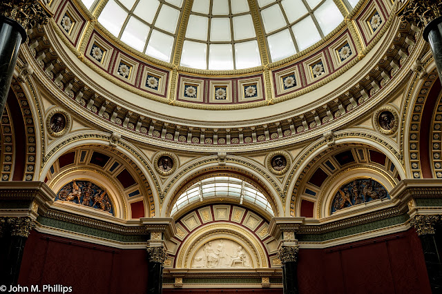
A huge amount of artistic work went into the ceiling above the cathedral's main space.
Here are some detail photos of the art work.
And of course there was an abundance of stained glass.
I can't recall now where I took the following photo, but I liked it for its relatively simplicity and light.
My daughter-in-law Bei accompanied me on our visit to St. Paul's, and we both agreed that our favorite sculpture was the following abstract by Henry Moore, entitled "Mother & Child." Note the "halo" above the child.
John.


