Tuesday, December 9, 2014

ST. JOSEPHAT'S IN POST PROCESSING

Last week I visited another old architectural friend, the Basilica of St. Josephat.  It's a gorgeous venue that I have shot several times previously.  I actually took about 50 shots during this visit, but I am only showing a handful of those here.  I have complained many times that shooting interiors poses special problems because of the light one must work with.  Those problems can be divided into two main categories, white balance and dynamic range.

White balance refers to the nature--primarily "warmth"--of the available light.  Incandescent light is much warmer, for example, that midday sunlight or fluorescent lighting.  This problem is fairly manageable if you shoot in RAW.  This is because in RAW the camera is simply recording the actual quality of light that strikes its sensor.  It is then up to post processing to modify that light to make the image look similar to how our eyes interpret the scene.  Put another way, our brains automatically interpret, say, incandescent light to make it "whiter" than it actually is.  A camera doesn't do that.  But we can tell the camera (or our computer in post processing) to make that interpretation.  In any event, in this instance white balance was not a major problem.

Dynamic range is more of a problem with interior spaces, particularly religious venues that often are lit almost entirely by the natural light streaming through the (often stained glass) windows.  As a consequence, the windows tend to be too bright and the interior surfaces too dark.  This is where a camera is no match for the human eye.  We can distinguish a much greater range of brightness than can a camera.  This means that a camera struggles where the image includes brightly lit windows alongside dimly lit interior surfaces.

In this post I decided to illustrate some of the challenges I encountered on my visit to St. Josephat's and how I tried to cope with those challenges by showing both "before" and "after" images.

Let me start with one of the ceiling shots I took.  One of the most prominent aspects of the basilica is its domed central ceiling.  But in this case I was focusing on a ceiling along one of the sides of the nave.  Here is the shot as taken.


I took this shot by placing the camera on the floor pointed up and triggering the shutter via remote.  Not a bad shot, really.  One of the issues I was struggling with was how much to rotate the camera so the rectangular ceiling was not "squared up."  In this case in post processing I decided to make fully vertical the up-and-down ribbing and have it bisect the image.  I also felt that the image was a little dull, so I increased the contrast somewhat.  Finally, I reduced the intensity of the the stained glass window in the lower left to gain a little definition there.  Here is the result.


Better, but not that much different.

Here is a second ceiling shot.


In this case the shot was not quite centered on the ceiling: There is more archway on the right than on the left.  Also, once again, I thought the image could use more contrast.  Here is the result.


I liked the result here, particularly because the central dome is just visible in the lower part of the image.

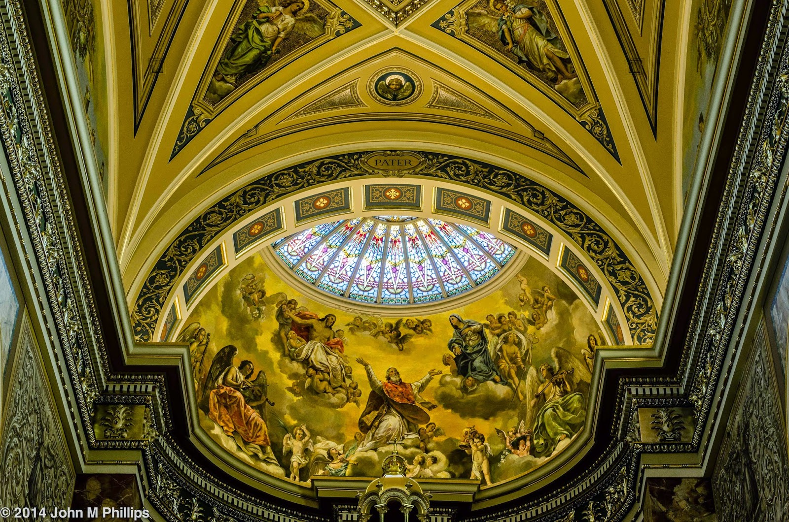
The third photo in this sequence, a shot of the apse ceiling, illustrates the problems with dynamic range.


There were a number of problems with this shot.  First, it is not quite symmetrical or level, so I had some leveling and cropping to do in post processing.  But more importantly the light coming through the apse ceiling window had "fooled" the camera into a shorter exposure.  As a result, even though the window is overexposed, the walls, particularly along the sides, are quite dark.  So in post processing I lowered the exposure of the window and increased the exposure on the walls.  I also stepped up the contrast a bit.  Here is the result.


The window is still a little bright, but overall a much improved image, I think.

The next shot was of a small cherub sitting above one of the confession booths along the side of the nave.


I admit that I took an embarrassing number of shots of this sculpture . . . and never did get it right.  The first thing I did was to shoot the cherub with the aperture wide open, to soften the background, in order to separate better the subject from the background.  But in this shot there is still confusion between the dark cherub and the relatively dark section behind the cherub's extended arm.  I should have moved to the left so that the cherub was positioned in front of the much brighter mural behind the cherub's wing in this shot.  But I failed to do that.  Moving further to the left would also have avoided the problem that this photo features the cherub "facing" out of the shot rather than into it.  What to do?  First, I cropped the image as a square to reduce the "facing" problem.  I also brightened up the sculpture, which was quite dim and lacked definition.  Here is the result.


The next shot was of the basilica's main rose window, which sits behind the pipe organ at the back of the choir loft.  This shot clearly illustrates the dynamic range problem I referenced earlier.


Even though the image appears significantly underexposed (and probably is at least to an extent) there was so much light coming through the window relative to the interior that parts of the window are "blown out," losing any usable definition.  In looking at a shot like this, you have to have some confidence that the information is there, it just has to be brought out.  For the most part, in post processing I reduced the brightness of the window while increasing the brightness of the interior surfaces.  Here is the result.


It may seem difficult to believe, but these are the same image.  Now the organ's features are clearly shown, including an array of horizontally projecting pipes appearing in front of the lower part of the window.  And there is archwork over the window now that serves to frame the scene.

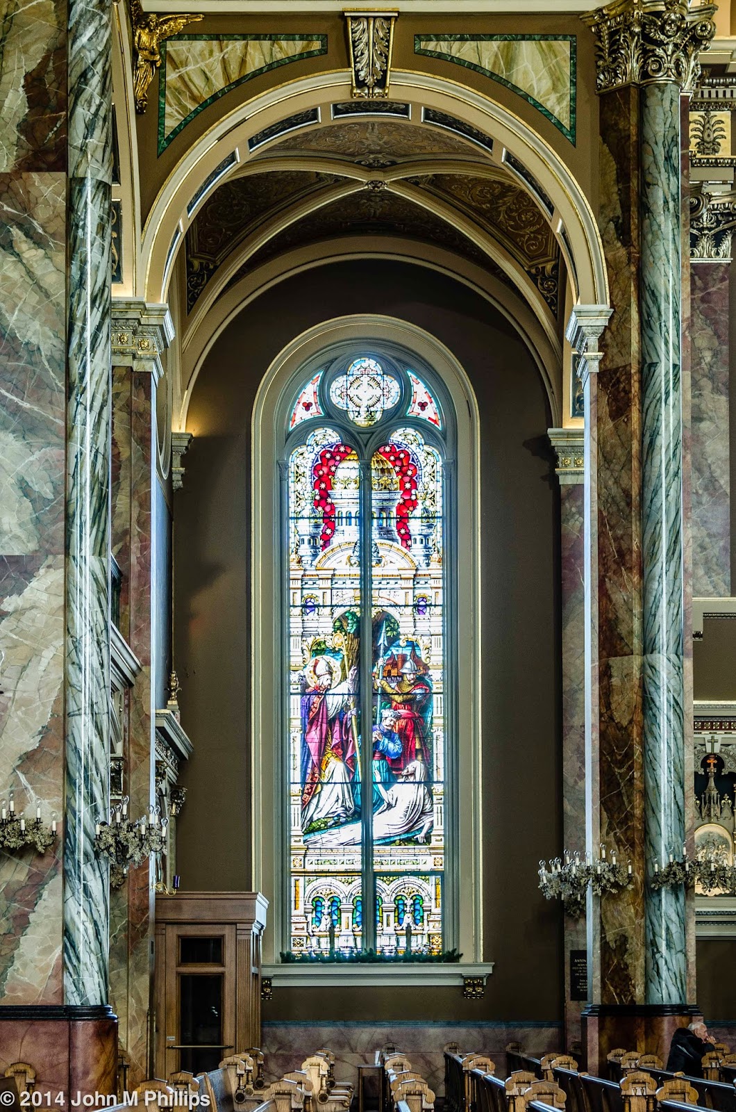
Finally, here is another shot of a vertical stained glass window.


In this case I wanted not just to feature the window but to provide context in the form of the pillars and archway surrounding the window.  But that meant having to deal with the dynamic range issue.  The shot isn't terrible, but the window is clearly too bright and the interior too dark.  There is also just a bit of a verticality issue.  Here is the result of post processing.


Again, both of these images are from the same shot.  One more thing: Because I was shooting up, this caused a perspective issue with the pillars seem to be leaning in slightly.  This is another fix I could make in post processing, with the pillars now appearing much closer to vertical.

Bottom line: Even though I need to do all that I can in setting up a shot to make my post processing job as easy as possible, it is surprising what can be accomplished with modern software, in my case Lightroom 5.

John

Tuesday, December 2, 2014

OLD FRIENDS

Maybe it was because the late fall weather had been so disagreeable or maybe it was because I kept thinking I could find something new to say about some of the local interior spaces I have shot in the past.  But whatever, recently I found myself returning to some architectural haunts I have photographed before . . . many times.  Old friends.

First up was the downtown branch of the Milwaukee Public Library.  What I found interesting was the fact that few if any of the visitors patronizing the library were paying any attention to the architectural features that the space offers.  And that surely had been my experience as well until I got interested in photography.  For that I am grateful.

The highlight of the entrance to the library is the rotunda ceiling, and I have shot it numerous times in the past.  Here is one of those shots that I take by setting the camera on the floor pointing up to the center of the ceiling.


I like the symmetry of this shot that I cropped as a square, but I keep regretting not having wider angle capabilities with the camera and lenses that I currently have.  One thing I decided to do was to rotate the camera 45 degrees to get the following.


Suddenly a lot more interesting, I think.  Sure, I had to give up the round features in two of the corners, but I've gained a lot more, I think in bringing in some of the side features.  Despite my best efforts, I didn't quite nail the positioning of the camera.  It's not as easy as it might seem, since the camera must not just be in the geographical center of the floor, it must also be pointed directly up.  So I needed to crop the shot slightly to make it fully symmetrical.  However, I realized that if I cropped the shot more narrowly, I could extend the ends just a bit more, making the shot a little more abstract.


Here are a couple more shots that emphasize the border between the rotunda dome and the side walls.


Again, I thought the narrow crop on this last shot helped to create an abstract quality that I was seeking.

Although the dome is the star of the show, some of the other architectural details are worthy also.


Next stop, the Cathedral of St. John the Evangelist.  These first shots are familiar ones, including the second floor archways above the side aisles at the back of the nave.


What I thought helped the above shot was the quality of light on the lowest of the arches.

There are a number of most unusual features in this church, including the fact that the pipe organ is at the front rather than the rear.  I took this shot with the intention of converting it to a black & white to emphasize the reflections off the cylindrical pipes.


I shot this as an asymmetrical image, but decided in post processing that it worked better when cropped symmetrically.

Among the church's more attractive features are the pairs of supporting pillars and arches along the side aisles, and I have shot them a number of times before.  This first shot below is very typical of the kind of composition I have used in the past, except, for some reason, my camera recorded the image as a black and white.  I decided it worked OK anyway.  Again, I was employing my camera-on-the-floor-pointing-up technique.


But I also decided to take another shot with the camera rotated about 45 degrees.


Once more, I thought I lost something but that I also gained something by this orientation.

One of the subjects I have worked on in the past has been that of a handsome statue along one of the sides of the nave.  Last time I realized I could get a much more interesting image by shooting the statue between one of the pairs of supporting pillars.


In this case, I moved close to the pillars, set the aperture wide open, and focused on the statue behind the pillars.  This served to blur out the pillars some, allow the statue to pop.

Stained glass windows can be very difficult photographic subjects.  First, they pose extreme dynamic range problems, since they can be very highly lit by exterior sunlight, while the surrounding interior can be very dimly lit.  There is also a great temptation simply to shoot the window, not leaving much in the ay of context.  Here I thought I was able to find an attractive way to frame one of the stained glass windows.


Never mind that there was a light fixture hanging in front of the window and that the arch crops out the upper portion of the window.

Finally, is a shot of the altar that sits nearly in the center of the nave.


In this case I darkened the background to set off the altar's white marble and ramped up the contrast, creating a chiaroscuro effect.

Then it was on to the Calatrava addition of the Milwaukee Art Museum.  But first a scene looking west down Wisconsin Avenue from the museum, showing off the eclectic nature of the Milwaukee architecture.


I walked over to the museum just as it was opening at 10 a.m. and had not realized that the museum raises the brise soleil at that time each day, so I happened to catch it in mid-rise in the following shot, something I didn't realize until I had downloaded the shots to my computer.  A little weird, maybe, but I liked the contrast between the light on the north and south sides of the structure.


I have photographed the interior of the Calatrava addition so many times that I find it difficult to find new compositions.  This first is simply a symmetrical shot looking up at the ceiling, not exactly unique, I'm afraid.


At least the fact that the next shot is asymmetrical makes it different.


Not bad, actually.

I wanted to catch some of the patrons and their reflections on the polished floor.


Didn't quite work.

In looking over the shots, I found that some of them were pretty standard, mundane really, but others at least are not cliched, not the sort of shots that the typical visitor might expect to come away with.

John

Monday, November 10, 2014

MINNEAPOLIS INSTITUTES OF ART: SCENES

In my last post I featured some of the works of art at the Minneapolis Institute of Arts.  In this post I wanted to include a few images of the facility itself or at least where the artwork was not the primary subject of the photo.

A feature of the museum was the system of hallways leading through the galleries, and the museum was savvy enough to position prominent sculptures at the end of those hallways, as in the following.


I also found myself looking down from the upper floor at the scenes below.


I would have liked to have been directly above the statue in the following image, but that was physically impossible.


Surprisingly, some fall colors were hanging on the Minneapolis, and here is a shot of the park outside the museum.


Barely OK, I thought.  Perhaps I should have incorporated more of the support pillar on the left.  However, then I realized I could shoot the city skyline through an interesting decorative wire screen.  I took a bunch of shots, focusing either on the screen or the skyline and at varying focal lengths with my 24-120 mm lens.  Here was what I thought was the best of those.


This was shot at a middling focal length of 58 mm.  I shot this at the narrowest aperture available with this lens, f/22, with the focus on the skyline.

I saved for last my favorite shot of this visit.


To me this looks almost like a painting, something by Edward Hopper, perhaps.  But in fact I made very few modifications to this shot other than some minor cropping.  There simply wouldn't have been anything to shoot without the figure, who might have been texting his girlfriend.

John

MINNEAPOLIS INSTITUTES OF ART: ART

On our most recent trip to the Twin Cities, we paid another visit to the museum at the Minneapolis Institutes of Art, and again I was extremely impressed, both with the facility and with its collection.  In this post I am going to focus on some of the artwork that we saw.

The museum has a substantial collection of Asian art, and that is where we began our visit.


For the above piece, which was a life-sized terra cotta Chinese figure, I wanted to focus on the figure's hand, which was in an unusual and striking pose.  So I opened up the lens's aperture to f/4, forcing the remainder of the figure to go out of focus and allowing the hand to "pop" somewhat.


The above sculpture was behind glass, so I placed my camera lens directly against the glass to reduce glare.  Loved the ears.


I wasn't as successful in avoiding glare with this photo of a horse.  The reflection of my left hand can be seen above the figure's hind quarters.  Still, I thought this beautiful and dynamic piece worked well as a black & white.

The museum also included a large collection of Pacific region art, although it vintage was generally much more recent.


I particularly liked the above piece, which I though worked best by only showing a portion of the figure's face.


The image above represented only one side of a two-handled wooden bowl.


I thought the above pottery piece was very representative of Pacific/Australian art.  The same could be said for the following, which reminded me somehow of a sleepy Dr. Seuss figure.


Even though these pieces were not particularly old (generally less than 100 years), they are much more primitive that Western art from much older periods.  My question then is whether such primitivism was stylistic and intentional or whether the artists simply didn't have the skills that European and mainland Asian artists had.  Compare the above, for example, with the following.


Not only is this sculpture of John the Baptist (I think) more anatomically correct, but there is a great deal more emotional expression.

Speaking of antiquity, below is a beautifully transcribed page from the Qur'an from around 900 CE.


OK, on to some more modern art, beginning with a stylized weathervane of a horse jumping through a hoop.


And below is a portion of a large pottery vase.  Here for some reason I chose to create an abstract by featuring the near side of the top of the vase, allowing the far side to fall out of focus.


I liked the following piece, again as an abstract, which is difficult to interpret in the absence of its explanatory placard, which describes it as stoneware covered in pigments and a glaze.


Then there was this large "cloak" that was comprised of many hundreds of dog tags, creating a powerful image.


Perhaps even more powerful was the following photograph of Jewish concentration camp prisoners, which was shown as the sole exhibit in one of the museum's alcoves.


I liked the large semicircular stained glass piece shown below that apparently originated in a Jewish setting.


This window was situated well above eye level, and I spent some time in post processing rectifying its perspective to avoid converging lines.


The above was a portion of a painting by Joan Miro entitled,  "Head of a Woman."  I didn't get it, but I did like the painting for some reason.

Finally, a couple of 19th century American paintings.


I very much liked the treatment of the subject's eyes in the above painting.  I'm not sure I can say the same for the eyes of the child shown in the photo below.  But then this was described as a posthumous painting of a young boy who had died.


During our visit I took nearly 200 photos, keeping about 60.  I consider the selection for this post to be an interesting, and in some ways arbitrary, subset.  We spent nearly three hours at the museum on our visit and probably saw less than half of the collection.  Hopefully, we will get back for another look in the near future.  Perhaps the most amazing thing is that this museum is free to the public.

John