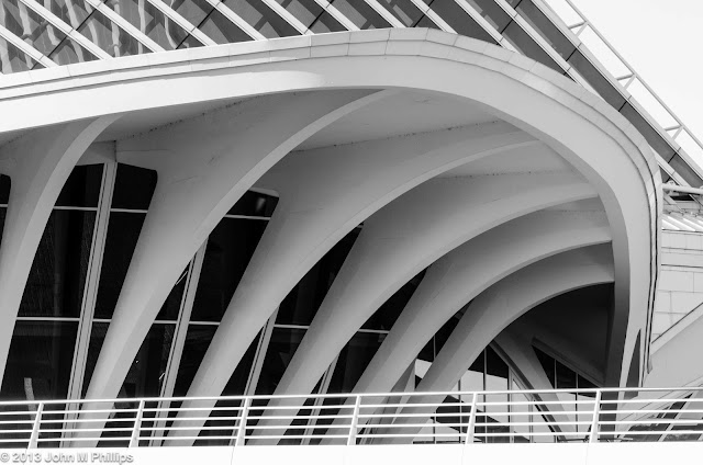
Last week I found myself in downtown Milwaukee on a warm and sunny evening looking for something to shoot. I finally wound up near the Milwaukee Art Museum and noted that the Calatrava addition's brise soleil was raised. This was unusual in that the distinctive structure is usually lowered in the evening. I was early enough to capture the full evening sun before it slipped behind the downtown buildings, putting the Calatrava in shadow. So I got in a few shots before the sun got too low in the sky.
There is a foot bridge leading up to the museum addition that is precisely lined up with the brise soleil, and I have shot the addition from that vantage point numerous times in the past, but never with the sun behind me and the brise soleil in the up position.
I took a number of shot and this was the best of the lot. A bit disappointing, actually. First, I didn't quite get the camera lined up perfectly with the cables that presumably support the structure, not the ones going diagonally but the ones that should essentially be invisible from my vantage point. Second, and more noticeably--at least to me--the top edge of the brise soleil does not appear to be level; it declines slightly to the right. I'm not taking the blame for that. I think it may be a minor mechanical issue with the structure. Perhaps a bit nit-picky, as the light was otherwise excellent. The sky appears darker toward the top of the image, but that is not due to any sort of graduated filter or intentional vignetting. It is simply how the clear evening sky appeared.
I, as well as hundreds of thousands of other people, have shot so many photos of this architecture that I was trying to find just a little different perspective. I'm sure the next couple of shots are not unique, but they are different for me, so here they are.
But the best shot I got was much more traditional.
What made this shot was not the perspective but the lighting. All of these shots were handheld, but there was ample light to shoot at f/9 at 1/400 second. Again, the gradation in the light from the sky also served to add a bit of drama. I was really happy with how crisp the lines are and how uncluttered the overall scene is.
OK, one more fun shot of the shadows of a couple walking in front of the west wall of the addition.
Ideally, I would have included the couple in the shot as well as their shadows, but they were simply too far from the wall to make that possible. Still, I liked it.
John


No comments:
Post a Comment
Note: Only a member of this blog may post a comment.