Tuesday, September 23, 2014

DOORS OPEN MILWAUKEE 2014: GRAIN EXCHANGE

This is the third time I have visited the Grain Exchange as part of the annual Doors Open Milwaukee event.  It's a stunningly beautiful space, and I always enjoy trying to capture part of that beauty in photographs.  This year the day I visited was rainy and cloudy and quite dark inside the Grain Exchange.  I could have benefitted from a tripod, but I made do with handheld.  The space seems almost cubical, and seemingly every surface has been decorated.

Some of my early shots were attempts to capture the room's sense of space.  Not an easy task.  Here are some of my attempts.


This first shot points out a subtle issue with the room's symmetry, or more accurately lack of symmetry.  The internal pillars appear to divide the room into thirds, and that is probably the case.  However, when you look carefully at the first floor (arched) windows, you will note that they are not spaced evenly across the far wall.  Moreover, the largest pillar on the far wall is not centered between the two internal pillars.  For someone who is a bit obsessed with symmetry, this was frustrating until I realized the problem was not mine.

Here are a few more shots in which I avoided the symmetry issue by featuring a corner.


A couple of points.  First, although the interior surfaces were quite dark, the light coming through the windows was bright, at least in a relative sense.  This is a common problem with interiors, and the best I could do in post processing with Lightroom was to reduce the window exposure and increase the wall exposure.  The effect is not bad.  The other point is that in the second of these two shots I wanted to include a least a portion of the floor.  My thought was that this would add context to the shot.  There were a fair number of people wandering the floor, and I decided to crop them out and still retain a bit of the floor.

Here is a "smaller" shot of another corner of the room.  I thought the vertical structures next to the windows provided some depth to the shot.


Almost incredibly, the Grain Exchange also includes elaborate stained glass windows, something that is pretty rare outside of religious venues.  And, they are gorgeous.  Here is a shot of a double-bank of those windows.


One thing to note is that the stained glass, as well as much of the rest of the decorative art in the Grain Exchange, has a grain motif.  For example, the woman featured in the upper window on the right is holding a sheaf of grain.  

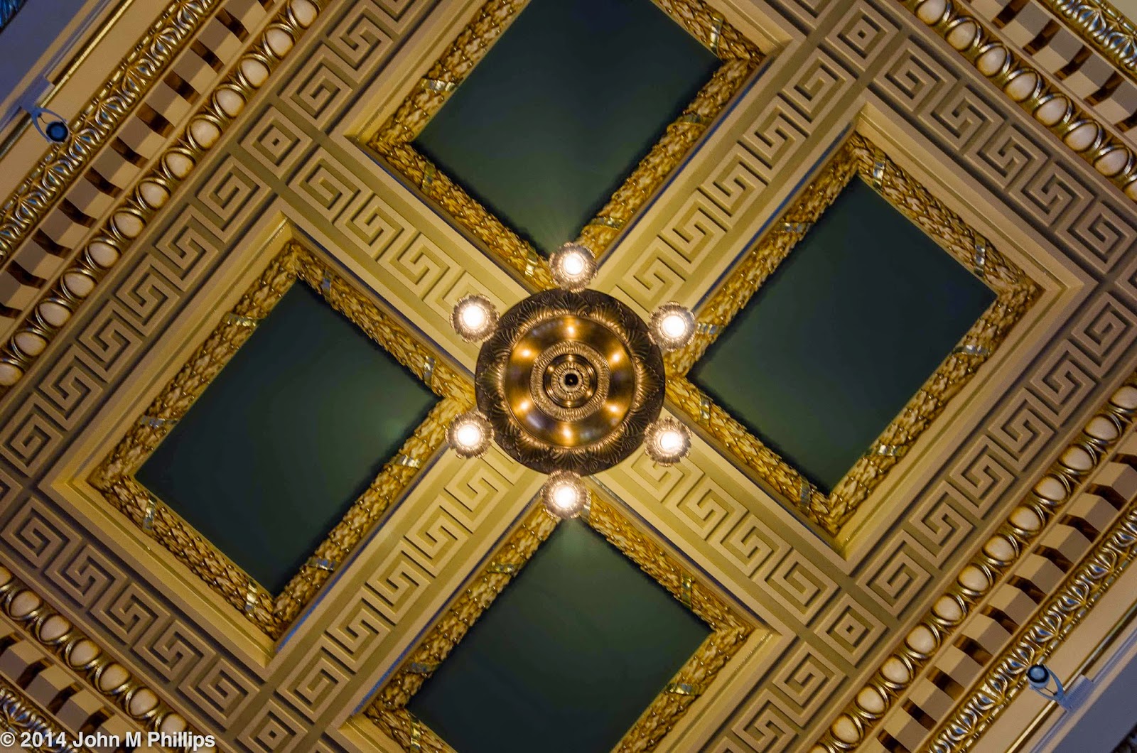
This motif is carried through, as well, in the ceiling panels, as is evident in the following two shots of the underside of the internal arches.


Really quite impressive.  And a close look even of the shot below of a tympanum over the entrance to the room reveals more grain, though one needs to look carefully.


Two final shots of the Grain Exchange.  First, I discovered that I could set my camera on a ledge at the base of one of the internal pillars and shoot straight up.  Since the camera was stable, I didn't have to worry about camera shake.  This was a 1.3 second exposure.


The last shot I took was a "glimpse" of the Grain Exchange framed by the entryway to the room.

  
Not perfect, but it does provide some framing.  In addition, I don't think it hurt having other patrons in the image.

John

DOORS OPEN MILWAUKEE 2014: CENTRAL SEVENTH-DAY ADVENTIST CHURCH

A new venue this year for Doors Open--Milwaukee was the Central Seventh-day Adventist Church, located on the near east side.  The church is actually a large residence that was built in 1912 for $300,000 as a gift by a wealthy gentleman for his bride.  In 1942, the residence was sold to the SDA church for $20,000, a huge bargain, even for the late-Depression era, considering the building's size, location, and craftsmanship.  My guess would be that the building had seen a good deal of neglect.  Even so, most of the building's finer points had remained intact.

Unfortunately, from the point of view of photography, I didn't find a lot to shoot.  Much of the home's fine woodwork, though nicely preserved, was quite dark, and I simply am not good at capturing the detail of such dark surfaces.  What I got instead were a few other detail shots that, while not telling much of a story, I liked OK as stand-alone images.

The first is a detail of a concrete pillar on the building's front porch.


It was a dark and rainy afternoon, and the pillar was in heavy shade.  I wound up shooting this at an ISO of 800.  What worked here was not so much the detail but the early fall color behind.  Even though I shot this at f/11, the background was nicely out of focus.

Unlike the dark woodwork throughout the residence/church, the ceiling in what had been the formal dining room was quite light, and I shot the following two semi-abstracts of it that I converted to black & whites.  Mildly interesting, particularly the first of the two.


To avoid perspective distortion, I tried to shoot these from directly underneath.

The home had been equipped with some sort of first-generation intercom system and one of the transmitting/receiving stations had been retained, I assume simply as a curiosity.


It's difficult to see, but a few of the options refer to the Front Hall, the Library, and the Billiard Room,  among others, reminding me of the childhood game Clue.

Finally, there was stained glass--sort of.  What caught my eye was not the lead designs around the glass but the fact that one of the panes was cracked.


the circular pane on the left is actually missing, making visible some sort of pink area behind.

The sanctuary for the church, created by knocking out room partitions on the second floor and eliminating a portion of the third floor to create a two-story space, was very modestly appointed.  Having spent a good deal of time photographing the interiors of Catholic as well as other mainstream Protestant churches, I was surprised at how little adornment this facility included.  But that is in keeping with the point of view of Seventh-day Adventism, the religion in which I was raised.

John

DOORS OPEN MILWAUKEE 2014: LOYALTY BUILDING

Doors Open--Milwaukee is a popular annual event at which for one weekend in September various venues, primarily in the downtown area, open their doors to allow the public into spaces that are otherwise not generally available.  This is not strictly true, as some of the buildings are publicly available in any event, and the Loyalty Building is one of those.  Originally it served as an office building, but recently it was converted into a boutique hotel, the Hilton Garden Inn, so essentially anyone can walk in, which I have done in the past.

The building's greatest attraction is its central atrium, which has evidently undergone extensive restoration as part of the conversion to a hotel.  Not having a true wide-angle lens, I found my attempts to capture the space ending up a bit short.  Even so, following are a few shots that may provide some sense of the atrium's beauty.


The bronze railings for the atrium's stairs and the walkways are also noteworthy.  The newel posts are topped with conical brass ornaments, as shown in the following shots.


And the railings themselves also boast interesting details.


Following is a shot of another railing leading to a lower level of the building that is different from the design of the other railings but also interesting to photograph as a black & white.


Finally is a shot of the base of the stairs that I also rendered as a black & white.


The Loyalty Building is a hidden gem in the true sense of that phrase.  The exterior of the building, clad in a granite facade, is pleasant but undistinguished.  It is not until one enters the building that the beauty of the atrium is revealed.  Well worth the visit.

John

MILWAUKEE COUNTY HISTORICAL CENTER, AGAIN

Situated on the west side of the Milwaukee River, the Milwaukee County Historical Center was built in 1913 as a bank.  The building was briefly featured as a bank in the 2009 movie, Public Enemies, that starred Johnny Depp as John Dillinger.  I had done a post on this building once before and decided to return to see if there was anything new.  Not much.

The building is roughly triangular, consisting of a main floor and a broad perimeter walkway on a second floor.  Here is a shot looking at the first floor reception area that provides a good idea of the overall plan and features of this modest-sized building.


Probably the building's best feature is its ornate ceiling, visible in the above shot and shown in more detail in the following shots.


This latter shot illustrates the architectural challenges in designing a building that is triangular rather than rectilinear in shape.

Following is a close-up of one of the rectangular ceiling panels.  To avoid issues with lining up the sides of the panel within the limits of my camera's sensor, I took this shot on an angle.  That worked.


The building also features distinctive wrought iron railings on both the stairways and balcony areas that I also wanted to capture.  I played around with the following shot, experimenting with various apertures, with the thought of keeping the railing sharp and letting the background go out of focus.


This was actually shot at f/22 (with an exposure of 5 seconds).  Even so, the background is quite out of focus because of how close I was to the railing.  (Recall that the closer the focus, the more rapidly the background falls out of focus.)

John

Friday, September 19, 2014

BACK TO ST. JOHN'S CATHEDRAL

Last month I returned to the Cathedral of St. John the Evangelist to do some photography.  However, unlike the first time, I did not bring my tripod.  As a result, I had to ramp up the ISO to very high levels to minimize camera shake, and the shots included quite a bit of noise.  I was able to tamp down that noise in post processing, but the overall result was some loss of crispness.  Earlier this week I decided for return, this time with my tripod, to see if I could improve the quality a bit.  I think I did.

Here, first, is a standard wide-angle shot toward the sanctuary from the earlier session.


And here is a similar shot from the more recent visit.


There are some evident differences between these two shots.  First, the earlier shot is a bit more color-saturated and shows greater contrast.  It is also cropped a bit tighter and shows more of the floor and less of the ceiling.  But what I could see this time around on close inspection was a lot less noise and greater crispness as a result.

Here are two similar shots focusing on the back of the crucifix from just in front of the sanctuary, the first from August, the second from September.


Again, the earlier shot is cropped a little tighter, and again the second shot is less noisy, more crisp, and a bit brighter, at least in my view.  And I think the wider angle gives a bit more context.

For anyone curious, following is a shot of the front of this most unusual of crucifixes.


Yes, the crucifix is not located on the building's midline.

Among the better features of the cathedral are the rows of twin pillars on either side of the nave, and once more I took nearly identical shots in both sessions, again, first August and second September.


In looking over the two sets of photos, I am beginning to wonder if I need to think more about possible shots to get a bit more variety in what I shoot.  And I will admit that part of my problem is my semi-compulsion to look for symmetries.

Another feature of the cathedral that I am attracted to are the archways on the second floor to either side of the choir loft at the back of the nave.  This time I do think I did a better job of capturing that feature.  Here is what I thought was the best of those attempts.


I thought this shot also worked well as a black & white.


Finally, one of the best statues in the cathedral is one halfway up the nave on the left side.  Part of the reason for its attraction is because of the neutral background and lighting.  Here is the shot I got from my August visit.


OK, I thought.  However, on the more recent visit, I happened to spy the statue between two of the pillars and caught the following shot.


This, I feel, is a much more interesting shot, as it brings the pillars into play and also presents a bit of intrigue.  There's a lesson here, I think.

John

Tuesday, September 9, 2014

MACC FUND CAR SHOW: 2014

I returned to the MACC Fund Car Show again this year.  Same show, similar cars as the last time I went in 2012.  Here are some of what I got, starting with more traditional shots.


It was a sunny afternoon, and many of the cars were highly polished.  Occasionally in the past I have tried to minimize the reflections in the cars' sheet metal.  Here I decided that it might be preferable to emphasize those reflections, to bring attention to the high gloss, something I could enhance to an extent in post processing.


I found myself liking the effect, which had some of the appearances of high dynamic range (HDR) shots, but without having to combine multiple images to achieve the effect.

This show had its share of novelty cars, and  I caught a few.


I thought the following plate also fit into this category.


Historically, grilles have been a point for design emphasis, and here are a few.


The paint job on this last car was extremely well done.

My favorite shot, though, was an abstract of a grille showing the grille bars as reflections in the sheet metal below.


John