Thursday, July 28, 2011

CALATRAVA ADDITION TO MILWAUKEE ART MUSEUM

The field trip on Saturday, July 23, for our travel photography class included a visit to the Calatrava addition to the Milwaukee Art Museum.  This addition, designed by Santiago Calatrava, was completed in 2001 and, since its creation has truly represented the leading architectural icon for the city of Milwaukee.  The structure offers any number of opportunities for interesting photographic images.

I came downtown early for the field trip and was able to take a number of shots of the Calatrava addition without having any people being present.  The weather was overcast, not ideal conditions, but I tried to make the most of what I had.  Here are a few of the shots I took of the exterior.  The first shows more or less the entire structure, from south of the structure, looking to the north.  The next two are detail shots.


The overall structure evokes a nautical theme, in keeping with its location on the Lake Michigan lakefront.  The white striped panels, known as a brise soleil, are movable and are raised during the day to create the appearance of spreading wings.  The overall effect is compelling.

Looking at the structure from the west when the panels are down evokes a very futuristic feeling.  Here are a number of shots I took early before the crowds arrived:


Although these photos almost look like drawings, they are actually close to the original images, with very little modification.  The trees tucked under the structure on the right side of the last photo help to provide perspective on the overall size of the structure.

The interior of the addition is just as dramatic as the exterior.  Here are a couple of shots I was able to get when we went inside:


The first is of a series of triangular structure elements.  The second is a shot looking up at the ceiling of the central atrium, rising to a height of 60-75 feet above the floor.  Very dramatic.  I know that all of these shots have been taken thousands of times, but I still enjoy that I was able to capture them also.

Because of the light color of the structure and the many lines that it creates, it works to convert images to black and white studies also.  Here are a few that I converted to B&W:


I especially like the last photo showing the brise soleil set against the somewhat ominous appearance of the sky early in the day.  Lake Michigan is visible in the background.

Tuesday, July 26, 2011

PHOTOGRAPHY CLASS: MCKINLEY MARINA

I am taking a photography class focusing on travel photography.  On Saturday, July 23, the class took a field trip to Milwaukee's Lakefront.  Our goal was to take photos that demonstrate a "sense of place," that show creative composition, and that evoke a response in the viewer.  I recognize that these are not strengths of mine, which is one of the reasons I am taking the course.

As a group, we started at McKinley Marina and then worked our way down toward the Milwaukee Art Museum before ending in Milwaukee's Third Ward.  I took a lot of photos and will break this up into a number of posts.

I had never spent much time at the McKinley Marina and was impressed by the number of boats that are docked there.  In keeping with the idea of creating a sense of place, I took a number of shots that gave information regarding location, at least.  Here is one of those:


I was attracted by the Milwaukee name and the yellow plastic cans and their reflections in the water.  In the end, the picture is too cluttered, but at least it gives a sense of place.

There were any number of cliche shots, such as this one of three sailboats:


I liked the balance of this shot, including the rocks in the foreground.  But I would have liked the morning to have been calm so that I could get better reflections of the boats in the water.

Here's a shot of the ubiquitous life preservers:


I continue to prefer showing only a portion of the life preserver.

I was also attracted by the reflections of the sailboat masts in the waters of the marina.  Here is the best of those shots.


I do feel that this shot provides a good sense of place, and I like the wavering lines that the reflections make in the water.  For some reason, it was not going to work to show the boats casting the reflections.  That would have made the image more powerful.  I do feel that the image works as a "recognizable abstract," though the overall balance could have been better.

Here is another reflection shot that is even more abstract--perhaps too abstract.


Here the water was very quiet.  I toyed with the idea of turning this shot upside down.

I have been working on the use of "negative space"--the use of expanses in the image that do not contain much, if any, content but that focus attention on the remainder of the image that does provide content.  Here are two of those shots:


In both shots the water occupies more than 50% of the frame, and the more or less featureless sky represents another 30%.  Nevertheless, the balance of content in the images is, I believe, adequate to give a sense of place and to evoke a response in the viewer.  The morning was overcast, making the photography more challenging, but I was able to capture some warmth in the color of the water.

On the stroll south from the Marina toward the Milwaukee Art Museum, we passed the lagoon, which I believe is a manmade feature created many years ago.  It affords recreational activities, such paddle boat rides, and serves as a pleasant foreground for a portion of Milwaukee's less than stunning skyline.  Here is a cliche shot of the lagoon:

Saturday, July 2, 2011

HARRINGTON BEACH STATE PARK--REVISITED

On our first visit to Harrington Beach State Park last week, I noted a number of possible subjects that I wanted to explore further, so later in the week I went back up to the park by myself with my tripod and all three of my lenses to see what I could capture.

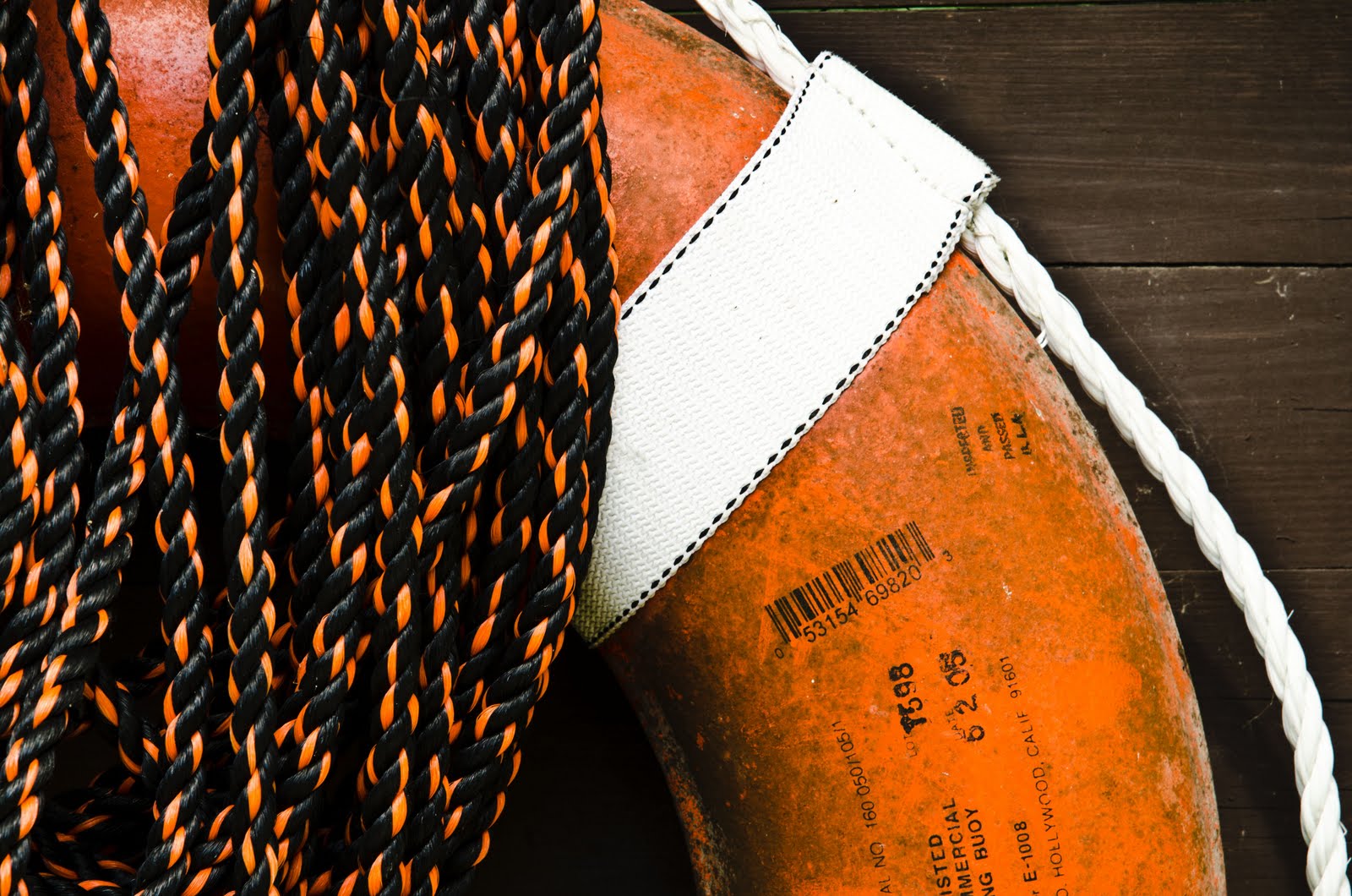
One of the items I had photographed the first time had been one of the orange life preservers that are scattered around the quarry lake located in the park.  I took several more shots of one of the preservers (not the same one as the first time).  I'm not sure if the issue was the light or simply the layout of the preserver and black and orange cord in the wooden structure housing the preserver, but I felt that none of the photos the second time had the same quality as the one from the earlier visit.  Here are a couple of the shots:


And here is the shot from the earlier visit.  


I liked the printing on the preserver in the first two shots above.  However, overall, the balance between the preserver and the cording is better in the earlier shot, and the background is darker, which, I felt, added something to the emotion of the shot.

Another item that had caught my attention the first time was an old hand-operated water pump.  The pump had seen a lot of use over the years and had most recently been painted blue.  I didn't care for the color, but I liked the configurations made by the mechanical parts of the pump.  Here is a shot of a major portion of the pump.  I had set the aperture at f/4 in an attempt to reduce the distraction created by the trees in the background.  But that really did not work.


The optics of lenses is such that the wider the angle of the shot, the greater is the depth of field.  So by moving in, I was able to reduce the distraction of the background.  I began to concentrate on one of the cotter pins holding the mechanism together, as in the following shot:


I liked this shot quite a lot, as it drew attention to the cotter pin, but the other pieces added interest.  Moreover, the background was sufficiently out of focus to eliminate that distraction.  Unfortunately, when I looked more closely at this shot, I noticed that there was some sort of piece of vegetation extending from one of the ends of the cotter pin across the face of the bolt holding two pieces of the pump together.  I noticed this problem before I took further close-ups of the cotter pin and removed it.  I should have taken the time then to retake this shot.  Next time, perhaps.  The lesson here is that I need to look more closely at the shot to ensure that I remove as best I can elements that are going to create a distraction, such as spider webs.  I removed the distracting piece of vegetation before taking the next shot, taken from a closer range:


This, I thought, was the best shot of the pump.  I liked the rust on the ends of the cotter pin, as well as the flaking paint above and to the right of the pin.

I did take a couple of extreme close-ups of the cotter pin with my macro lens, but I didn't feel they held the same interest as the one above.  Here is one of those:


I also paid another visit to the transitory creeks on the beach draining into Lake Michigan.  I took a couple of shot of footprints (or pawprints) in the sand.  However, they just didn't have enough going for them.  I think the problem was that they were in sand rather than in mud, so they did not have the definition that I would have liked.


I also took another couple of shots of mold accompanying the streams draining into Lake Michigan.  I really liked the following couple of shots:


I realize that, all in all, the shots I took would not be considered "typical" of photos taken at a state park on Lake Michigan, but they fit my style. 

Saturday, May 28, 2011

UTAH: A FEW TECHNICAL NOTES

For the most part, the earlier posts on our Utah trip were intended simply as a photographic record of the trip.  One of the things I learned (or relearned) is that I need to work on providing more of a narrative of the trip, not just present a series of photos that may (or may not) have some artistic quality.  In any event, I did want to describe my thought processes with respect to a few of the images that I took on the trip.

Subject Matter and Depth of Field.


On the first afternoon we took a walk through a lovely garden area connected to the University of Utah. Many of the shots I took were of the flowers that were in bloom in the gardens.  There were some challenges in that regard because I did not have my macro lens or a tripod, so obtaining extreme close-ups was pretty much out of the question.  At one point we passed some crimson-leafed plants back-lit by the sun that caught my attention.  I tried a shot at a high f-stop (small aperture) of f/22 in an effort to maximize depth of field to put in focus as large a portion as possible of the leaves.  However, there was a breeze that kept the leaves in motion, blurring the shot which had to be at a very slow shutter speed (1/4 second) to maintain an adequate exposure.  Moreover, that put the background in at least partial focus, taking attention away from the crimson leaves, which were the real subject of the shot.

I finally decided that, since the real point of the shot was the back-lit color of the leaves, I would open up the aperture (to f/4.5, as it turns out).  This had the effect of blurring most of the red leaves, as well as the background.  However, it allowed for a significantly faster shutter speed (1/60 second) so at least some portion of the leaves were in focus, which helped to identify what they were.  The background was pretty much fully blurred out, and I felt that its predominantly yellow color actually complemented the crimson of the leaves.  So I wound up with a recognizable abstract in red and yellow.


On our hike to Landscape Arch we walked along a variety of beautiful red sandstone walls.  Although I took a series of shots of what I felt were interesting textures in the rock, at one point there was a dead sapling along one rock wall that presented an opportunity to capture both the sapling and the wall.  Initially, I tried to capture both the texture of the rock and the detail of the sapling by taking a shot at a small aperture of f/20 to create greater depth of field and keep both the wall and sapling in focus.  However, in the end I decided to make the sapling the primary subject and the wall secondary by reducing the aperture to f/7 and focusing on the sapling.  This softened slightly the focus on the wall but kept all of the sapling in focus, which I felt made it "pop out" better from the background.  My only regret was that I wish the sapling had had more complexity.


Sunlight and Texture.

As I stated before, I like to capture textures because they can provide an opportunity to create an image that is both abstract and recognizable.  In some cases the texture is dependent on lighting, namely, sunlight and shadows, to make a statement.  The following image taken during our visit to Canyonlands NP I think illustrates such a situation:


However, for other situations, the texture of the surface is interesting enough without reliance on the contrast provided by sunlight and shadow and, in fact, sharp shadows would actually detract from the aesthetics of the image.  I took the following images, all in Arches NP, during times of overcast because I felt the texture (or simply the color) was strong enough in and of itself.  (Sometimes, of course, you don't have a choice of sun or overcast and you have to take what is available.)


Cropping.

One of the benefits of having more megapixels to work with is that you can crop images to eliminate distracting elements or to emphasize those elements to which you want to draw attention.

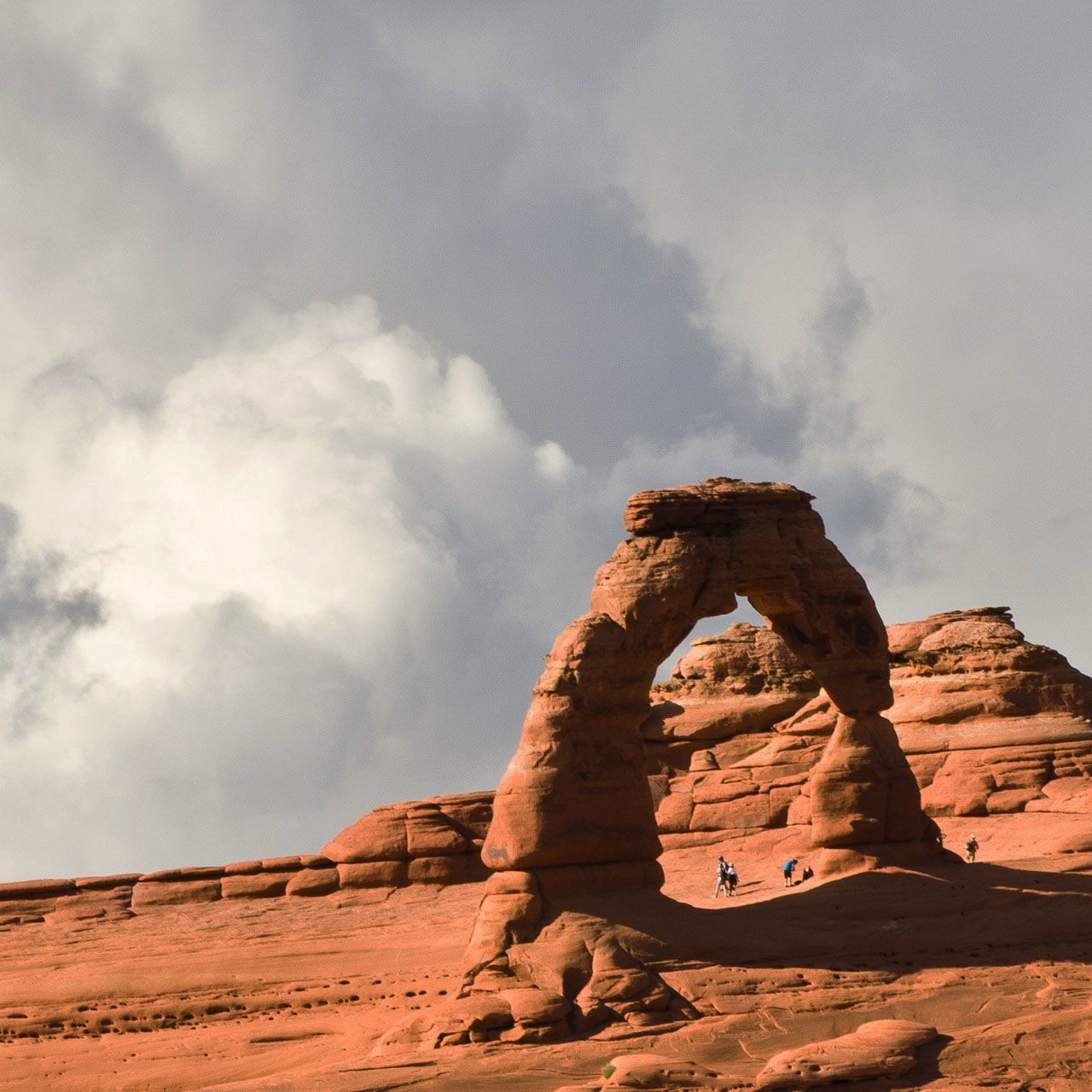
When we visited the "remote" viewing sites for Delicate Arch, the iconic arch was well positioned for photo opportunities but at a considerable distance.  As a result, even with my zoom lens, the arch occupied only a relatively small portion of the overall image.  Here is one of the shots as originally taken.


This was actually taken with the lens at 165mm.  It shows a substantial foreground expanse of slickrock that I thought simply took attention away from the intended subject.  In retrospect, it might have been better to have positioned the arch in the lower portion of the image to eliminate the slickrock and to focus on the sky, which was getting "interesting," including a number of lightning strikes.  In any event,  I thought the rock formations to the right of the arch actually added some helpful context to the shot.  In the end, I chose to create a narrow image that I felt improved the overall effect:


I liked the fact that the land was on a slope.

Here is another shot (taken at 300mm) from a slightly closer viewing area:


At first I thought the rock formation in the foreground would add context and interest; however, I did not like the fact that I had placed the arch in the middle of the image, and the arch still appeared pretty small.  As stated, the sky was becoming "interesting," and it was great that the clouds behind the arch were complex and relatively dark and yet the sun was out creating a nice contrast in the texture of the rock.  I finally decided to focus on the sky as a strong secondary subject for the image and cropped the shot fairly tightly around the arch.  I placed the arch in the lower right-hand corner of the cropped image to allow for more attention on the clouds.  Here is the shot as cropped:


I thought having people in each of these shots actually helped to provide scale to the size of the arch.

Friday, May 27, 2011

DELICATE ARCH

Delicate Arch is truly iconic.  It appears on most of Utah license plates and, because it stands isolated from other rock formations, is terrific to view from almost any angle.  There are two basic ways to view the arch.   You can take a fairly rigorous hike to walk right up to the arch, or you can drive to a more remote viewing area and, following a brief hike, view it from a greater distance.  We did both.

The hike to Delicate Arch is about three miles roundtrip and includes an elevation gain of about 500 feet.  The last section of the hike involves walking along a somewhat exposed ledge for about 200 yards before turning a corner and coming on the arch from a distance of about 100 yards.  One's first view of the arch is breathtaking, especially after the long hike to get there. The snow-capped mountains in the background added to the majesty of the view. I must have take about 40 shots of the arch in all.

Although the main viewing area for Delicate Arch is about 100 yards from the arch, it is quite easy to walk from there right to the arch, and when we first got to the viewing area there were a number of people standing or sitting under or next to the arch.  They provided some perspective on the size of the arch, which is 45-50 feet high.


It was nice to be in a shot with the arch, but in some ways that created a misleading impression regarding the size of the arch.


Eventually, we went over to the arch and took some shots from a different perspective.


Ultimately, we were able to get some shots of the arch that had no people in them.  [This was after we were treated to a group of lacrosse players who, while standing next to the arch, chose to moon their photographer (photo not shown).]  One of the places to view Delicate Arch was actually another arch situated in the main viewing area.  We scrambled up to that arch and I got a nice shot of Bei relaxing while viewing Delicate Arch.


Following our hike back, all four of us visited the remote viewing area to get a different perspective on the arch.  Except for being much farther away, this provided some equally interesting views.