Friday, September 29, 2017

BACK TO ST. JOSEPH CHAPEL

St. Joseph Chapel, part of the School Sisters of St. Francis campus on the South Side of Milwaukee, is a true hidden architectural gem.  I have photographed the chapel twice before and took the opportunity to revisit the venue during the Doors Open Milwaukee event in late September.  Here is some of what I shot.

First, a couple of classic shots from the rear of the nave, one featuring a couple of the supporting pillars and one a bit closer to the sanctuary.


I modified both of these shots in post processing to rectify the vertical lines for perspective distortion.

During my visit, I spoke to a young woman with a camera who also seemed intent on getting some shots of the facility.  It turned out that she was affiliated with the School Sisters and "authorized" me to visit the balcony to get a couple of shots, so long as I stayed out of sight of other visitors.  "Hiding" behind a pillar in the balcony, I took the following oblique shot of the main space.


I also took a shot of the stairway leading up to the balcony that I liked for the pattern of stair railings.


The apse ceiling makes a terrific architectural semiabstract.


And here is a shot of the ornate altar.


The space features a modest glass dome.  Here is a shot of that feature (somewhat flawed because of lighting issues).


Finally, a shot of the rear of the chapel from the sanctuary.


Most of these images were shot with my new lens, with which I am quite happy, even though I am still learning its uses.  Lighting in an interior is virtually always difficult, and I did not have a tripod, so I am particularly pleased with the overall quality of these shots, given that limitation.

Considering that it is well over a hundred years old, the chapel is in terrific shape.  And the facility's light color palette adds to its attractiveness.  If you have not visited the chapel previously, I recommend doing so if you have that opportunity.

John

Wednesday, September 27, 2017

ST. NIKOLA SERBIAN ORTHODOX CHURCH

Milwaukee held its annual Doors Open Milwaukee event last weekend, and the first venue that I visited was the St. Nikola Serbian Orthodox Church, located in a quiet residential neighborhood in Cudahy.  The modest sized church was, in my opinion, delightful both inside and out.

Here, first, is an exterior shot.


But it was the many murals that covered the interior ceiling that showed the church's emotion.


Here is a mural, presumably a depiction of Christ, over the sanctuary.


The stained glass windows were also interesting, including the wording written in Serbian.


Finally, a couple of details of the exterior, including the front entrance and the steeple.


The Serbian orthodox congregation purchased the church, then vacant, in 1963 and transformed it over the subsequent years to the church that it has now become.

John

Tuesday, September 26, 2017

WASHINGTON, D,C, ODDS & ENDS

I thought I would wind up the posts for our recent visit to Washington, D.C. with some photos that didn't fit in any of the other posts.

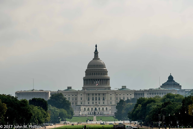
First some so-so shots of a few Washington icons, the White House, Capitol, and Washington Monument.


We had also visited the Smithsonian Institution Building, sometimes called the Castle.   The building, which was completed in 1855 and which houses some of the Smithsonian administrative offices, is notable primarily for its Romanesque and Gothic architectural style.  Here are a couple of shots of the interior.


The Castle's architecture can be contrasted with a newer Smithsonian museum, the National Museum of the American Indian.  Here is a semi-abstract of the eastern facade of that building.


It was not all buildings, museums, and monuments on this trip.  I also tried to capture some of the late summer foliage.


Finally, a shot of Washington's Metro subway.


John

Monday, September 25, 2017

RETURN TO LIBRARY OF CONGRESS

I made my first visit to the Library of Congress during our visit to Washington, D.C. in 2016, and it was love at first sight.  This September when we visited our daughter in D.C., we spent a couple of nights at a hotel only a couple of blocks from the Library, and I had a chance to return armed with my new wide angle lens.

Here first is a shot of the west facade of the main building, the Thomas Jefferson Building, a photo that I converted to a black & white--not an especially remarkable exterior for a government building completed in the 1890s.  It is the interior that is stunning.


The great entrance hall, populated with numerous supporting pillars and covered with murals, is spectacular, if difficult to capture in a photo.


Visitors have an opportunity to walk up a flight of stairs at the back of the great hall to a glass-paneled overlook of the library's main reading room.  Because the overlook viewing area is relatively confined, visitors are generally limited to viewing the reading room for only a few minutes at a time so that others can have a chance to look.  The room is a bit difficult to capture in its entirety, even with a wide angle lens, as it sits beneath the building's dome.  Another reason to return to the building on a future trip.


My understanding is that anyone looking to use the reading room or to view documents must obtain special permission in advance.

There is a separate room on the north side of the entrance hall that houses historical exhibits, including a display of antique maps.  The ceiling of that section is interesting, though challenging to photograph.


This shot illustrates the distortion that wide angle photography can create, as the ceiling I was photographing was actually the same width for its entire length.

At the far end of the room was a separate circular ceiling mural that I shot.


But what really garnered my attention were the ceilings in the main hall.

First, the central ceiling, which I shot on an angle as well as rectilinearly.


A shot of the ceiling above the corridor running across the front of the great hall.


And finally a shot of a ceiling on a stairway leading from the main hall to the reading room overlook.


I shot all of these with my lens set at 15 mm and, despite the visitors milling around, was able to use the technique that I often rely on when photographing ceilings--placing the camera on the floor pointed up and triggering the shutter using a remote.

John

Sunday, September 24, 2017

NATIONAL GALLERY OF ART, EAST BUILDING

As I pointed out in the prior post, the National Gallery of Art's Main Building houses most of its traditional art, while the newer building to the east, the East Building, includes its more contemporary art.  Here I am posting photos of some of those works.

A detail from an Edward Hopper work.


An unusual piece from Georgia O'Keefe.


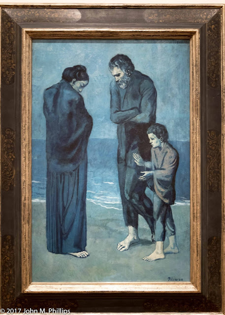
A couple of paintings from Picasso's earlier periods.


Wire art from Alexander Calder.


A characteristic Modigliani portrait.


And a few pieces where I failed to take note of the artists.


The blue rooster, located on an exterior pavilion, was huge.

Not forgetting the contemporary personality of the East Building itself, here are three shots of that, including a ceiling detail, a stairway, and a lighted underground passageway between the Main and East Buildings.


The stairway shot is more confusing than it seemed when I took it, probably because of the reflections in the glass railing panels.  But I liked it for its M.C. Escher feel.

John


Saturday, September 23, 2017

NATIONAL GALLERY OF ART, MAIN BUILDING

The Smithsonian's National Gallery of Art is world class.  It is actually housed in two separate buildings, one that includes traditional art and the other that focuses on contemporary art.  The architecture of the buildings reflect their respective collections.  The main building is very traditional both on the exterior and the interior, and the works of art are laid out in a logical progression.  The contemporary building--the East Building--has sharp angles and the interior spaces vary greatly in size and arrangement of art.  I am dividing the posts into the traditional and contemporary components.

The entrance rotunda for the main building is dominated by a sculpture of Mercury.


I took several shots of the piece, trying to capture it as well as its setting.  Difficult.

We spent much of the time in the main building in the Renaissance section.  I liked the following two pieces, which were done in typical religious style.  Check out the mature face of the child in the first piece.


Note the texture in this latter piece, which I have cropped to emphasize detail.

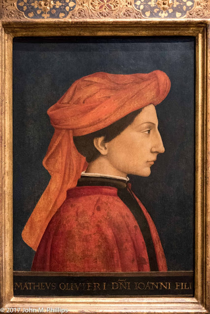
The Renaissance section also featured a lot of portraiture, which I found myself liking for the subjects' personalities that the artists were able to capture.  Here are some of those.


More recent was this bust of Louis XIV.  Note the locks.  What a fop he must have been.


Next, a few pieces from the French Impressionist period.


The middle one of this group was a self-portrait of Paul Gauguin, and the last a more familiar self-portrait of Van Gogh.

Finally, a black & white of a reclining nude that I thought was well done and well positioned.


John