Friday, July 31, 2015

A LITTLE NIGHT PHOTOGRAPHY

Recently I got inspired to do a little night photography, something I have neglected for the last couple of years.  So last week I traveled downtown to capture some of the lights along the Milwaukee River.  It was a lot of fun.

One of the first things I realized is that exposure times can make a difference in how reflections appear. To illustrate, here are a couple of shots of the same scene that have different exposures.


The first shot was taken at f/8 for 1.3 seconds (with an indicated underexposure of 2/3 f-stop).  The second was taken at f/16 for 8 seconds.  Note how much smoother the water appears in the second shot.  Of course, the desired amount of exposure time will depend on how quiet the water is, but generally I found that an exposure of 8-10 seconds was sufficient to calm the appearance of the waters.

One of my compositional concerns was whether to crop the tops of the office towers, as in the above shots.  Here is a similar shot in which none of the buildings was not cropped.


Not sure that cropping makes much difference in this situation.  It depends on the compositional goals.

One of the issues I had to deal with was that I took some of the shots from a bridge crossing the river.  That should have been OK, except that each car that drove across the bridge set up a subtle vibration.  This can potentially be a problem on a longer exposure taken with a tripod.  I found myself timing my shots to avoid times when a car was crossing the bridge.  My other alternative was to take shots from the approaches leading to the actual bridge, as in the following.


Not as symmetrical but it did give me a chance to include the converging pedestrian walkways in this case on the east side of the river.

All of the foregoing shots were taken looking north.  A couple of nights later I was back down, this time shooting toward the south.  Here are a couple of those.


Not all the shots were panoramic.  Some were a little tighter, as in the following.  One of the "attractions" downtown is a life-size bronze statue of Henry Winkler, who played The Fonz in the 1970s TV show, "Happy Days," which was set in Milwaukee.  In my humble opinion, the statue is fairly hideous.  But there it is, so I took a shot of it with the river scene as a backdrop.


Here are a few more less panoramic shots.


I particularly liked the above shot for the railing and the row of streetlights.

Finally, away from the river I noted an older building that had been converted to an Italian restaurant on the first and second floors.  My guess is that the upper floors have remained vacant.  The building was nicely lit and I caught the following.


The white streaks at the bottom of the image are actually the headlights of cars that passed by during the shot's 15-second exposure.  The Wrong Way sign was an added compositional bonus.

A couple of final comments.  It goes without saying that, with exposures ranging up to 10 seconds or longer, a tripod is a necessity, even though it may look a little strange in a crowded urban area.  Even with a tripod, lighting can be a challenge, as the scene is essentially dark but with punctuated spots of relatively intense light.  Fortunately, post processing can brighten the dark areas while calming down the lights.

John

Thursday, July 30, 2015

A FEW EVENING URBAN SCENES

A couple of evenings last week I wandered downtown to get in a little night photography.  Both evenings I got downtown a little early and took a few evening shots waiting for the sky to darken.  One of my favorite subjects is the Calatrava addition to the Milwaukee Art Museum, which can take on an interesting feel in the evening.  Here is what I got.


I took this handheld, so it isn't as crisp as I would have liked, but I do like the pastel quality of the sky in the evening light.

Here is another icon of downtown Milwaukee--City Hall.


I came across this unusual shot because I spied a couple of other amateur photographers working on the same shot, and we wound up chatting cameras a bit.  The attractive aspect of this shot is the illumination of the clock faces.  I wanted to include the building on the right to frame the shot.  I would have preferred to exclude the less interesting building in the lower part of the image, but further cropping of the shot would have hurt the composition more, I think.  On the other hand, a darker sky a little later in the evening would have helped, I think.

I also spent a little time in the atrium of the Milwaukee Center, a complex of buildings that include a hotel, an office tower and a couple of theaters, a venue that a security guard asked me to leave a couple of years ago.  Again, these were handheld.


Waiting for the sun to go down, I also took a couple of shots of typical downtown office towers.


There was something about the evening light that I thought added something to these shots.

John

HOLY HILL BASILICA

The Milwaukee area is blessed with two basilicas, the over-the-top Basilica of St. Josaphat on the city's south side, and the Holy Hill Basilica 40 miles northwest of the city.  Earlier this week I made another pilgrimage to Holy Hill to get a few shots.

The basilica sits atop one of the higher hills in the Kettle Moraine and is visible for miles in all directions.  Here is a shot I took on the approach to the facility.


The facility has a number of spires, including this copper one with a nice green patina.


The main entrance is interesting and I was hoping to get some nice shots on the bright sunny morning.  However, I happened to come on a day when the parish had extended a large banner above the entrance, which I did not want to include in the shot.  So I limited the shot to the doors and some flowers to one side.


Looks a little weird, but I liked that the door was ajar.

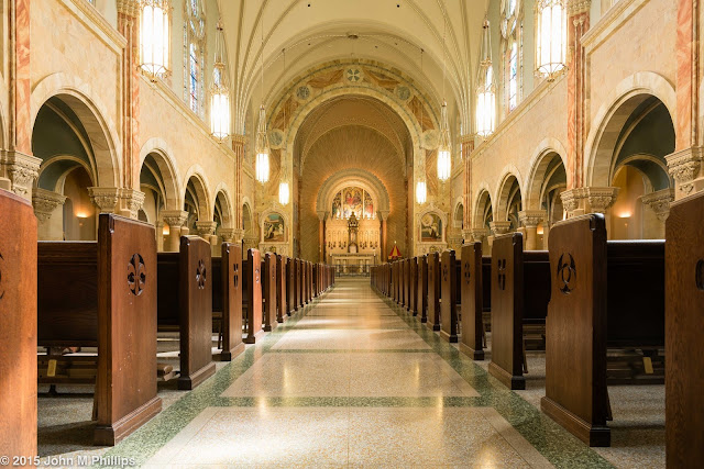
Now to the interior.  This first is a traditional shot from the rear of the nave.


White balance is always an issue with lighted interiors.  Since I always shoot RAW, the white balance setting is theoretically irrelevant, since the file that the camera creates accurately records the actual color of the light.  However, all that I can actually see is how the camera white balance is set, interpreting that color.  So the key is to come as close as I can either at the time of shooting or in post processing to what I am actually saw at the time.  Often I set the white balance on Auto and make adjustments from there, and that is what I did for this shoot.  I wound up warming the colors a little and think I got the white balance just about right.

The other comment I have on this shot is that I have been shooting such central symmetrical compositions from a low angle.  I shot this from about 18 inches off the floor.  I think the lines of pews help to create nice perspective lines.

Here is a shot of the very beautiful, albeit typical, sanctuary visible in the center of the above shot.


Later I sat on the steps in front of the sanctuary in the above shot to get another symmetrical shot of the rear of the church.


Again, I took this from a low angle.  I would have liked to have included more of the ceiling above the nave.  However, to do that I would have had to sacrifice some of the floor of the central aisle.  I have learned that when I don't "ground" my shots, the composition feels like it is missing something.

Often the most interesting photos in a religious venue are of the side aisles, either featuring the space created by the columns separating the aisles from the nave or of the ceiling components.  Those features at Holy Hill are OK, but not great.  Here is one of the ceiling shots.


And one of the centered on the aisle and supporting pillars.


This was of only a portion of the side aisle, as I found that the entire length of the aisle created a perspective that was too narrow.  Here is another longer view of an aisle that I took off-center to emphasize the columns.


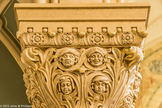
I chose to position the closest column as a foreground object.  I think it helps to make the image work, even though it occupies about 40% of the overall image.  It also serves to show off the interesting bas relief sculptures embedded in the columns.  Here is another shot that shows off some of that artistry.


A little whimsy that I had not noticed on previous visits.

John

Wednesday, July 29, 2015

PORT WASHINGTON SCENES

Port Washington is about 25 miles north of Milwaukee, close enough to the city that it serves as a bedroom community for many who work downtown but far enough that it has its own identity.  In that respect it is truly a port, not to mention being the county seat of Ozaukee County, the geographically smallest county in Wisconsin.  The town is blessed with an established harbor and a relatively large, affluent marina.  I spent a couple of hours there last weekend looking for photo ops.  Here are a few of the shots that I got (and kept).

One of the reasons I went to Port Washington was to do a little photography in St. Mary's catholic church, a venue that I have visited a number of times before.  This was the first time that I found the church to be locked.  So I was relegated to exterior shots.  I took a couple of symmetrical shots from directly in front of the church, but the one I liked best was the following, taken from an oblique angle.


The little bit of clouds available actually added a bit of drama to the shot.  However, I would have preferred not to have the tree branches on the left side of the image.  Maybe if I had taken the shot from the other side?

Then it was down to the harbor, which includes a very long stone pier/breakwater leading out to a lighthouse.  A number of people were fishing on the pier, one of whom showed me a couple of large fish (including a trout and a tuna) that he had caught.  It was difficult to capture the fishing and the pier in photos, and the following don't really do justice.


I also took a number of shots of the marina, but the only one I am including here is of a dock that I thought provided some interesting lines and that I converted to a black & white.


Finally, below is a (heavily cropped) photo of the lighthouse at the end of the pier.


I realize this is an unusual composition, but I was trying to make the best of a less than ideal image.  I should have used more of a telephoto, so that I wouldn't have to crop so much.  Also, it might have been preferable to show the stone pier/breakwater as extending further across the image (in other words, to center the shot to the left of the lighthouse rather than to the right).  However, there was a closer breakwater that extended into the image on the left and this was as much as I could spare cropping on the left without including that breakwater.  In the end I wanted to include the essentially empty sky as negative space in the shot.  Finally, I probably wouldn't have saved the shot at all were it not for the pair of individuals fishing in the shadow of the lighthouse.  Maybe I will try this shot again.

John

Tuesday, July 28, 2015

BACKLIT THISTLES

The vacant fields in our greater neighborhood are blessed with a large population of thistles.  Yup, thistles, as in weeds.  These things are huge, some seven or eight feet tall.  The other day I noted that a number of the thistles were being backlit by the morning sun and got the following.


In this shot I wanted to isolate the line of thistles from the background, so I set my aperture at f/4.  As a result, not all the thistles were in good focus, but I thought that overall the shot worked.  I also liked the mixture of new and old thistles.

Later in the day I noted that the afternoon sun was again backlighting a different set of thistles in another field.  This time I focused on individual plants, as in the following shots.


What I found that I liked were the bilateral horizontal "leaves," as shown in the following shots.


These perhaps could have been a bit crisper if I had used a tripod, but I was just too lazy and took these handheld.

John

THIRD WARD SCENES

The Third Ward sits just south of Milwaukee's commercial district.  Originally, it was largely an industrial area, and until a couple of decades ago it was cluttered largely with abandoned factories and warehouses.  But more recently it has been going through a renaissance, with many of the old buildings being replaced with or converted to restaurants, shops, and condo developments.  Earlier in July I spent a weekend morning in the Third Ward looking for photo opportunities.  Here is some of what I found.

I have this romantic infatuation with alleys, and certainly there are plenty of alleys in the Third Ward.  However, they don't seem to have the panache that I had hoped for.  Here is an alley scene that I did retain.  Meh.


Perhaps the following technically is also an alley shot, or at least an alley wall shot.  I liked it because of the shadows cast by the horizontal support structures and the texture of the bricks in the wall.


Maybe I shouldn't be put off by dumpsters and random refuse.  Maybe I should give up on aesthetically interesting scenes and just document the alleys.  But to what purpose? . . . I'm not sure.

One of the more popular restaurants in the Third Ward is Cafe Benelux.  Here is a shot of its interesting al fresco tables and chairs.


The area includes a variety of architectural styles from the last 120 years, as in the following shot, where I wanted to feature parts of three different building styles.


There there were a few shots I turned into black & whites:

Shadows on a spiral walkway.


Fire escape stairways.


And an unusual metal grate.


John

Thursday, July 23, 2015

A BRIEF NOTE ON STORM CLOUDS

This summer the weather in Milwaukee has been unusually quiet.  My preference is for storms, particularly those accompanied by thunder and lightning, assuming of course that I am inside at the time.  We have had a couple of modest storms in the past few weeks and I made an effort to capture some of the clouds accompanying those weather events, one in the early morning and the other in the late evening.

Admittedly, I was a little late to the game both times.  For the morning storm I headed to Concordia University on the shores of Lake Michigan.  Even though the storm was approaching from the west, I thought I would have a better view of the cloud formations over the lake.  I confess that I took about 20 shots and this was the only one that I kept.


The sun was wholly obscured, and as a result, there was little in the way of color, except for a narrow band of unattractive orange between the horizon and the clouds.  In the end I thought the image worked better as a black & white.  Just OK, I thought.

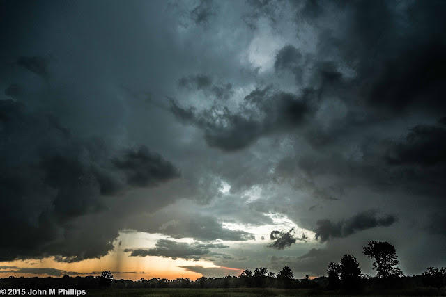
The evening storm was a bit more interesting.  This time I looked to the west to capture not just the clouds but the beginning of a clearing light beneath the clouds.


Again, I took perhaps 20 shots and kept this as the best of the lot.  I did like the fact that I was able to catch a bit of the rain, showing in the lower left of the image.

One thing I learned was that I need to retain more of the ground in the image to provide context for the overall composition.  I thought that the barest amount would suffice, but in post processing I realized that I could have used more, particularly in the second shot, despite the fact that everything was essentially in silhouette.  Foreground objects would have been even better.  Next time.

The other note is that I needed to underexpose these shots.  Of course they are dark, but I think that helps to establish the mood, and, after all, it was dark.

John

MILWAUKEE IN BLACK & WHITE


Admittedly, Milwaukee's skyline is below average for a city of its size.  Sure, one can photograph the downtown from the south shore to catch the commercial buildings along the lake, highlighting, let us say, the Milwaukee Art Museum's Calatrava addition.  But, objectively speaking, the city's huddle of office and high-end residential towers is modest in size, somewhat spread out, and generally unremarkable in architectural distinction.  That is in keeping with the city's blue collar and industrial roots.  Over the past few weeks I have made efforts to capture some of the more traditional aspects of the city's architecture, much of which has seemed to work better when rendered in black and white.  I thought I would post some of those photos here.

I shot a number of the buildings straight on.  I thought that technique worked fairly well when the subject building, large or small, could be isolated from its neighbors, as in the following shots.


A few included smokestacks, which I assume are no longer functional.


In other cases I shot the buildings at an oblique angle, either because I couldn't easily isolate an individual building or because I wanted to incorporate the larger scene.


And in a few instances I contented myself with a shot of a portion of a facade, as in the following.


I think what strikes me most about this collection is the fact that so much of Milwaukee's urban architecture was created at a time when masons took pride in their workmanship and creativity.  In recent decades glass and steel have largely supplanted the brick and mortar of a hundred years ago, but  there is much to be said for the detail in construction that is no longer economically feasible.

All of these structures, whether humble or ornate, are no longer in use or at least not in use for their original purpose, but each of them has a story to tell.

John