I also decided to reflect on the post processing changes I made to some of the images I took, to illustrate the choices available in my post processing software of choice, Adobe Lightroom, as well as to add a word or two about why I made the changes I did.
First is a shot of a man in a corridor making a call on his cell phone. Here is the unedited RAW file.

I did like this shot. However, it had a few problems. The white balance was very blue; the camera was not quite vertical; and the image was underexposed. I also thought it could use a bit more contrast. Here is the result.

The most obvious change is in the color, which is one of the easiest changes to make. One of the big advantages in shooting RAW is that when I take a picture the camera doesn't alter the original image. That leaves me with the maximum flexibility in modifying the file in post processing.
The next shot was of a marble bust in a glass case in the stairwell leading to the parking garage.

Again, there were problems, not the least of which was that in this instance the white balance was much too warm (as opposed to being too cool in the prior photo). I also had problems with reflections off the glass case, both front and back. There wasn't too much I could do about the reflections. In the end, I decided to convert the image to black & white. I also cropped it a bit to center it more. Here is the result.

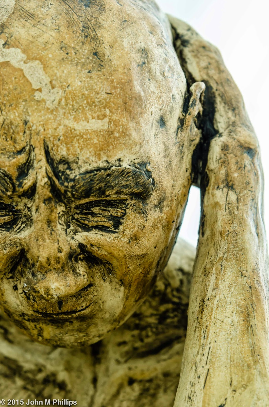
The next image is of a smallish bust of a very intimidating Puritan with piercing eyes. I took a number of shot of this guy, who was a very glossy black. Here is one of those shots.

Well, first, the background color is simply wrong and, worse, unpleasant. In addition, I was hoping to highlight a bit more the reflections off the sculpture's shiny surface. In the end I decided to convert this image to a black & white also. In addition, I ramped up the contrast to accentuate the reflections. Finally, I centered the sculpture in the edited image.

The next image was of an artwork I have shot a number of times, a large nude located in one of the side corridors. It was important to me to isolate the statue from other pieces situated in the corridor. To do that I had to shoot it against the bright background. Here is the result.

The first problem was that the statue was leaning a little, an easy fix. More troublesome was the fact that the dark statue was underexposed because of the backlighting and contained little apparent definition. However, in post processing I was able to lighten the statue considerably without blowing out the background. Finally, I warmed up the color a little.

Quite a bit better, I think.
Next up is a shot of one of the Calatrava addition's strangely shaped corridor windows, which I like for their abstract quality.

Again, not quite straight or centered but, again, an easy fix. I also decided to crop the image down a little. This image doesn't really have much color, other than that center "bump." In the end I decided the bump color was distracting and to convert the image to a simple black & white to emphasize the clean lines.

What appears to be cotton is actually a layer of snow covering the outside of the window. I like the futuristic look of this image, although my wife says it reminds her of a bathroom fixture.
I also took some photos of the glass skylight in the Quadracci pavilion. The brise soleil above the pavilion was extended, and I liked the contrast between the bold support ribbing between the glass panels of the skylight and the more subtle tubing of the brise soleil. Here is one of the shots.

Not bad for a "different" shot, but I thought I could improve it by increasing the contrast and warming up the white balance.

Finally, I noticed the distorted reflections in one of the side corridors and thought the scene would make an interesting abstract. The original shot, though, was a little dull.

I did like the way the lines drew the eye to the upper left of the image. I felt, though, that I could improve the shot by warming up the white balance a bit and, more importantly, increasing the contrast. I also thought the darker area in the upper right corner was a bit of a distraction, so I cropped it out of the final image. There is a colored reflection in the lower right of the image that I wish was not there, but I couldn't figure out any easy way to remove it.

Still, not a bad shot.
To complete this post, I thought I would add a few other photos that I took during my visit. First are a couple of shots of a simple mobile set against the typical Calatrava addition background.


Although the mobile was the presumed subject of the photos, the backgrounds shared honors. And then there were a number of slightly bizarre sculptures located in one of the corridors.


As I often do, I zoomed in on only a portion of the latter two pieces because I wanted to emphasize their unusual lines.
Finally, here is a shot of the parking garage on my way out.

I liked the juxtaposition of contrasting lines as an abstract.
John
No comments:
Post a Comment
Note: Only a member of this blog may post a comment.