First, here is a not very good shot of the Alhambra from a distance, before the rain had stopped.
Our guide for the tour was, as usual, outstanding. However, because we had to keep moving from space to space, and because I was preoccupied in trying to capture the architecture photographically, I never got a sense for the overall layout. But, in fact, because the Alhambra was added to over the years, there is not really an overall coordinated plan to its layout.
Here, first, is a detail of a very atypical piece of bas-relief sculpture that is obviously non-Islamic because of its representational subject matter and so must have been added by Christians following the 14th and 15th century Reconquista. But it did show nicely following the afternoon sun's reappearance.
Our first introduction was to a large circular two-story courtyard ringed by pillars, and I got the following two shots that I thought worked quite effectively.
I particularly liked composition of the black & white featuring one of the other patrons.
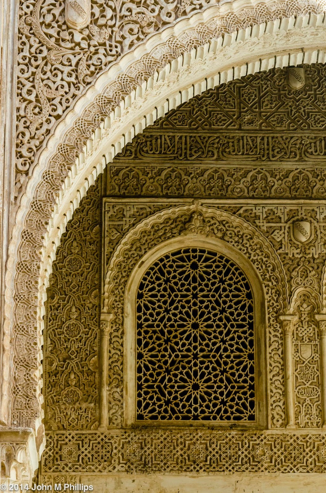
Characteristic of Islamic architecture were the many pillars and intricately carved archways, as in the following sunbathed shots.
Because Islam takes seriously the prohibition against representational art, artistic talent was poured instead into geometric designs, which would appeal particularly to anyone with a mathematical bent. Here is an example that I converted to a black & white to emphasize the lines.
Related to the abstract geometric patterns, one of the features that the Alhambra is especially notable for are the many intricately carved arabesques, highly stylized Arabic writing that has been converted to patterns that seem to be a blend of writing and abstract art.
To give an idea of how intricate this stonework is, here is a closeup of a portion of the prior image.
Note how the "knot" on the left of the closeup consists of one continuous line of "rope" coming in at the top and continuing down following the "knot." Note, too, the fine carving in the "mottled" portions of the arabesque, which also have a carefully planned structure. Finally, note how the background had been painted a glossy blue. Truly amazing workmanship. When I took these photos, I was impressed by their beauty, but it was only after I later took a close look that I realized just how amazing they were.
The Alhambra is notable also for its honeycombed-stalactite arches and ceilings. These were amazing to see in three dimensions but proved difficult to capture in two-dimensional photographs. To illustrate, here is a shot of the ceiling of one of those spaces.
One gets some sense of what's involved but the image simply doesn't do it justice; there's just too much going on.
And here is an archway that reflects the same architectural technique.
A little better perhaps, but again there's just too much to absorb. Here is a symmetrical shot of the arch in the lower right of the above image.
Now one can at least get a sense for all of the planning that had to go into the rendering of this wall. As I did above, I decided to show a closeup of this shot to give a better understanding of how this was created.
Now the honeycombing is more visible. Note the remnants of blue painting in the honeycombing.
Following are a few more examples, this time of some of the archwork that illustrate these same arabesque and honeycombing techniques.
I particularly liked the composition of this last shot.
Following is a detail shot of one of the pillared arches.
And, again, here is a closeup of that shot, nicely showing the intricate honeycombing-stalactite technique.
Again, I think it was only after I looked at the detail in these images that I understood how just incredible this architecture really is.
The Alhambra also includes a number of beautiful open courtyards, and here are a few of those.
One of the courtyards is built around a reflecting pool, an obvious photo op. We first passed through one end of the courtyard tempting us to take photos, but our guide advised us that the best opportunities would be at the other end because of the sun's position. So later we were at the other end, and, taking my turn, I got the following standard shot. I found that the best angle was from only about 18 inches above the level of the pool.
Note the horde of visitors huddled at the other end trying to get similar symmetrical shots.
My favorite courtyard shot, though, was the one I got in the Court of Lions, named for the fountain in the center supported by a ring of lion sculptures (obviously a later Christian addition to the space).
Although the fountain is impressive, it is the courtyard's 124 elegant pillars that create the beauty of the space and made the shot.
John


No comments:
Post a Comment
Note: Only a member of this blog may post a comment.