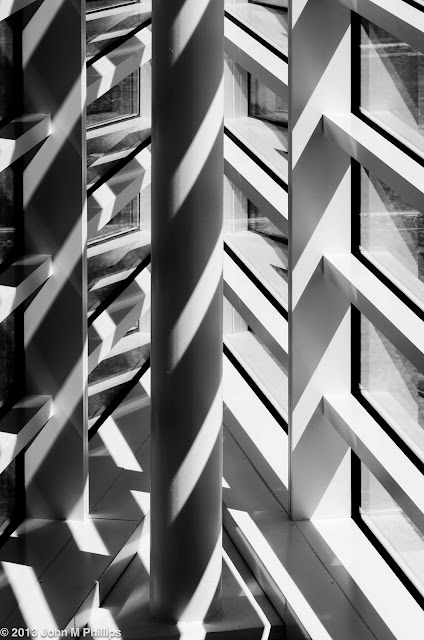
Sometimes when I am photographing architecture or abstract art (or nature macro, for that matter), my goal is not simply to capture the art or the architecture. Rather, it is to create a pleasing abstract (or what I think is pleasing), by taking advantage of the art or architecture. And I found myself doing that--in varying degree--on my most recent visit to the Museum of Wisconsin Art (MOWA) in West Bend.
Here are a few architectural details of the museum building. The first is a shot of the interior of the building's sharply acute north corner.
Strong morning sunlight was streaming through the slotted windows and I felt that converting to a black & white would accentuate the contrast, creating a confusion of light and shade.
The second is of metal pegs on a plain white wall, serving as a coat rack. (Here I cheated, rotating the photo 90 degrees clockwise.)
The third is of the top of a stairway on the building's south side.
There was glass paneling on the outside of the handrail, and I liked the way the light reflecting off the glass was, in turn, reflecting off the landing at the top of the stairs, creating a nearly symmetrical abstract.
On the art side, the following are roughly in order of abstraction, beginning with a portion of a very stylized painting of human figures . . .
followed by a portion of a chest of drawers that was painted in stark black and white stripes.
And here is a portion of one of the components of a sculpture hanging in the museum's "triangular" area.
The image below is of a collection of glass plates.
The following are close-ups of a portion of a glass vase . . .
and of a portion of another piece of art glass hanging on one of the gallery walls.
I liked the way the light filtering through the glass's internal cross-hatched "webbing" was reflected off the wall beneath the glass.
Finally is a close-up of a compelling tapestry that was abstract and remarkable in its detail.
Wild.
In compiling these I have realized that in most cases I have created the abstract by photographing only a portion of the object, obscuring it overall character. For some reason that fits my sensibilities.
John


No comments:
Post a Comment
Note: Only a member of this blog may post a comment.