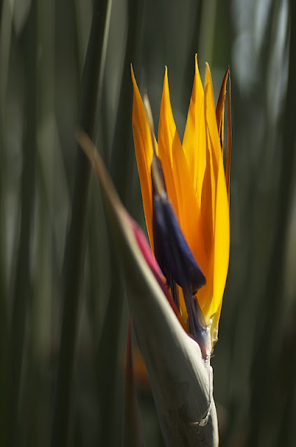
One of the early shots I took on this visit was of a bird of paradise blossom. Usually these showy flowers are photographed from the side because of their distinctive shape. However, the orange petals of this particular flower were being backlit by sunlight coming through the dome, and the only way to capture that light was to take the photo head-on rather than from the side. Here is the shot as originally taken.
There were two problems. First, the flower was quite a distance off the path and I had been cautioned to keep my tripod on the path and not in the flowerbeds (although I found myself violating that rule at times). Second, there was substantial foliage close behind the flower that was creating clutter. I opened up the aperture to f/3.2 to try to compensate for this. However, it is evident that the background foliage was still a factor. At the same time, the wide open aperture really "softened" the focus of the flower itself. However, I still liked the rich, bright orange of the shot and felt that the shot might have interest simply for its strong colors.
The first thing I did was to crop the shot down to the flower itself and, in fact, left out the upper tips of the orange petals. In addition, I increased the overall contrast, which served to darken the background and accentuate the orange and purple of the flower. I also did some sharpening which brought out the texture of the orange petals, a portion of which proved to be in pretty good focus. Here is the result.
There are still problems with this photo, but these changes, I felt, served to accentuate the shot's positive aspects. I don't mind that the tips of the petals have been cropped out; everyone knows that they are there.
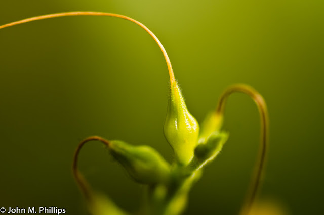
This was actually a very small plant, but I liked the three stems that were extending off in various directions. I knew that I could not keep all of the stems in good focus, at least not without creating a lot of visible clutter in the background, and wound up taking this shot at f/5.6. Usually, I find myself "working the shot," taking several shots at slightly different angles and at various apertures. In this case I took only a single shot, thinking there probably wasn't much to this shot (and maybe there isn't).
First, I cropped the shot to reduce the distracting orange object in the lower right, though I did not eliminate it totally. Second, I thought the photo was a bit washed out and ramped up the contrast to some extent. I initially sharpened the photo, but then noted that this enhanced little hairs on the surface of the center portion of the plant, so I reduced the sharpness rather than enhanced it. I like this shot, even though only small portions of the plant are in good focus.
The following flower caught my attention because it had not opened up. Here is the shot as originally taken.
I also liked the delicate ribbing spiraling around the white blossom. The background was relatively dark, but there was still evident clutter, even though I took the shot at a wide open f/3.5. Initially, I thought it would be best to position the flower off-center. However, I later concluded that it worked better positioned centrally. So I cropped the shot more narrowly to exclude a portion of the left side of the image. Second, I darkened the background by increasing the contrast. Third, I worked hard to retain and, if possible, enhance the spiral ribbing. Here is the result.
There is still too much clutter in the background, particularly the long green leaf on the right, but it would be too much work to get rid of those, and, arguably, they provide context for the shot.
Here is shot of another specimen of the same plant where the flower has opened up nicely.
One thing I noticed in post processing was that there was a big chunk of debris right on the front edge of the flower. If I had noticed it before taking the shot, I would have removed it before snapping the photo. I did manage to remove it (or most of it) through post processing. There was also quite a bit on clutter behind the flower. However, it was pretty dark and I was able to darken it much more by increasing the contrast. I had to work hard to maintain definition in the white "petal," as I felt it was critical not to let the white get "blown out." I also cropped the bottom and right side of the image just slightly to center the flower better in the photo. Here is the result.
I particularly like the green stripe running up the center of the white portion of the flower.
What attracted me to the following shot was the ring of dark pink spots surrounding the center of this flower. I wound up taking quite a few shots in an effort to get it "right." Here is one of my unedited shots.
There was some backlighting in the center of the flower, which created some contrasting darkening of the "business" portions of the flower. I focused on the stamens and took this shot at an aperture of f/14.
So what did I do in post-processing? First, I increased the exposure and the contrast to bring out more of the central backlighting. Second, I decided to crop away the wedge of empty area on the left and in the lower right. I decided to keep the open area in the middle right. I also sharpened the flower's edges.
I like that the pistol and stamen are in good focus while the pink spots remain "soft." I did try to darken the remaining wedge on the right, but that's a lot of work and I wound up feeling this shot was not worth it.
Here is another shot of the same flower taken from a slightly different perspective and at a very narrow aperture of f/45.
Here the petals, as well as the pistol and stamens, are in sharper focus. Otherwise, this shot is quite similar to the last one. In this case I decided to crop out the dark wedge in the lower left. I also did not like the defects in the left of the image as well as the white wedge on the right. In the end, I thought I would crop this more tightly and as a 4x5 rather than a 4x6 to eliminate these issues. I also increased the exposure a bit, as well as the contrast, similarly to the last shot. Here is the result.
Again, even though there is great depth of field in this shot, the pink spots still appear "soft," which was attracted me in the first place. Nice, I think.
Here is another familiar flower.
Here were what I thought were the problems with this shot. First, there were some distractions in the background. These included not just the nondescript clutter directly behind the flower but also the leaf in the lower right and lower left. Second, the red portion of the flower was pretty blown out--there just was not a lot of texture. Third, the right side of the central "stalk" was also pretty "blown out," with no definition.
To try to remedy these problems, I cropped the shot to eliminate the little green in the lower left. It was simply not possible to eliminate the green in the lower right. However, I was able to reduce the clutter elsewhere in the image by darkening the background. I also worked hard to bring out some texture in the red portion of the flower. I worked, as well, to bring some definition into the right side of the stalk but was not fully successful. This the modified image.
Here is unedited shot of a plat that caught my eye because of the way the sunlight was illuminating the central portion of the leaf.
The background was naturally dark, although it was lighter toward the top and right of the image. What attracted me was the variation in the translucence of the leaf's central portion. A problem with the shot was that the tip of the leaf was too close to the top edge of the photo. I decided to abandon the top of the leaf and crop the shot to show just the central portion. This served also to eliminate the problem with clutter near the top.
There was already good contrast within the leaf, but I did darken the background some to eliminate any additional distractions. I also sharpened the image some. Finally, I cropped out the bit of green in the very lower right of the photo.
Finally, here is a shot of a flower (actually I think there are two flowers here) that caught my attention because of the large drop of water hanging off a portion of the flower. In addition to the water drop, I liked the curving stems extending into the image.
All of the portions of this flower were more or less in a plane, so it was convenient to try to get everything is good focus without creating too much background clutter. I actually took a large number of shots of this flower (15 or so, I think--embarrassing). This was one of the best of those shots.
In post processing, I decided there was too much open space on the left side, so cropped the image to reduce the left side without losing the curving stems on the right. This required that I crop it as a 4x5 rather than a 4x6. I also increased the contrast quite a bit, which gave the the shot more "punch." Finally, as usual, I did some sharpening of the edges of the flowers. Here is the result.
I regret the circular white spot in the lower left, but there wasn't much I could do about it without taking heroic measures. I regret not giving myself more cropping options to work with when I took the shot. That is a lesson that I will have to learn to apply going forward. I have plenty of pixels to work with without worrying about cropping too many away.


No comments:
Post a Comment
Note: Only a member of this blog may post a comment.