Saturday, February 25, 2012

SNOW DAY: COLOR VS. B&W


Thursday night marked the first major snowstorm of the season.  We got seven or eight inches in Mequon, and it was the wet, heavy sort that clings to the branches and trunks of the trees.  Even though it was still snowing early on Friday morning, I decided I needed to get out to capture what I could before the sun and wind promised for later in the day took away those opportunities.  I headed over the Virmond Park hoping that the snow still in the air would help to isolate subject matter from background.

This didn't work out as well as I hoped.  Because the wind was up and driving snow from the northwest and the temperature was nearly at the freezing point, I was concerned about getting snow (that is, water) on the surface of my lens.  So I felt I had to take my shots facing away from the wind.  I also had some concern about getting my camera wet.  Most of the shots I took were very forgettable.

Here is one of the shots that seemed to have some promise.  This is how it looked as originally taken.


Unlike with some of the other shots, there is good separation between the subject clump of trees and the background trees that are washed out by the snow in the air.    The shot was not without problems.  As taken it looked dim and washed out.  I had forgotten that all of the white snow in the image had fooled my camera's light meter into underexposing the shot, so the white snow was rendered gray.  I knew I could increase the exposure in post processing.  I also wanted to crop it slightly to eliminate the stake sitting in the lower right of the image.  I felt that there was so little color in the shot that it would work best as a black & white.  Here is how it looked after post processing.


By increasing the contrast and sharpening the image, I was able to bring out a lot of the detail of snow in the branches of the huddle of trees.

I showed this to Geri and showed her the comparison with the original shot.  She stated that she actually liked the color better than the B&W.  So I reconverted the image to color and worked some on it.  I warmed up the white balance a bit and increased the color saturation.  Here is the result.


I have to admit that I like the color shot better also.  I think it is because there is contrast between the green of the evergreens and the brown of the background trees.

Here is another shot from Virmond Park of a tree that I have photographed in the past.


Again, very underexposed and a little "cold" in terms of white balance.  First, I decided to crop to eliminate much of the foreground snow and decided to position the tree to the left of center.  There is the roof of a home visible to the right of the tree that I wish was not there but there wasn't much I could do about that.  I converted the shot to a B&W, increased the exposure and contrast, and sharpened the image.  Here was the result.


Not terrible, but I wish that I had left more space around the tree in the shot as originally taken.  Here is the shot converted back to color.  As with the other shot, I warmed it up a bit and ramped up the color saturation.


Again, I like this result, although in this case I think I like the B&W version better.

Our subdivision includes a small patch of woods set behind a pond.  On my way back from Virmond Park, I noticed that the wind had left snow on the east side of the tree trunks and thought the effect might be interesting.  Again, here is the shot as taken.


Although this shot had some problems, I felt it also had good promise.  Although it is underexposed, I knew I could remedy that.  There are two small evergreens in the shot, but I knew when I took the shot that I would crop out the evergreen on the right.  I also decided to crop out the edge of the pond which is visible at the bottom of the image.  I decided it would be better to show the snow in the foreground as simply a pure white--almost as if the trees are suspended in air.  Finally, when I converted it to a B&W, as usual, I increased the contrast and sharpened it some, to come up with the following.


I like this shot quite a bit, as I feel it does a good job of showing how the snow covers one side of the tree trunks and not the other.  However, again I also turned it back into a color shot, warming it up some and increasing the color saturation.


This shot is similar to the one at the beginning of this post, but this one is helped a lot by the evergreen on the left.  In addition, it is simply sharper than the earlier one.

Wednesday, February 22, 2012

GRANVILLE PETROLEUM TERMINAL

There is a large petroleum terminal in the very northwest corner of the city of Milwaukee, an area that goes by the historical name of Granville.  the terminal includes a large number of large petroleum tanks.  We pass the terminal on our occasional trips to Mayfair Mall.  Last weekend I noted that many of the tanks, nearly all of which are painted white, have spiral exterior staircases that create an interesting pattern against the tank surfaces.  I decided to return on Sunday morning, the 18th, to see what might be available.

I immediately ran into a problem.  The tanks were all set behind a high chain link fence.  I had my telephoto lens, which helped.  However, it meant that either I had to stand a considerable distance back from the fence and shoot over its top or I had to stand next to the fence and shoot directly through it.  I chose the latter.

Here is one of the early shots that I got.


The stairs and the shadows they cast against the white walls of the tanks provided interesting patterns that made them naturals for B&Ws.  I liked this shot quite a lot, but there were some elements in the upper part of the image that I thought might be distracting and so also took this as a horizontal.


I liked the amount of "negative space" incorporated in these shots.  Also, I felt the "521" on the right served to balance the stairway on the left.  In nearly all of these shots, I increased the contrast to create more "pop," particularly with respect to the shadows.

Here are a couple more B&Ws.


The above shot included one of the few tanks that was not stark white.  I liked the composition for the two stairways that were curving in opposite directions.


The dark space in the upper left of the above shot is actually the blue sky with a single puffy cloud.  I was able to darken the blue sky in this B&W to provide contrast with the white tanks.  Again, I liked the use of negative space to provide focus on the curve of the stairway.

I did not turn all of the shots into B&Ws.  In the following two shots I was attracted by the contrast between the bright yellow of the stair railing and the stark blue of the sky.


As with the other photos in this group, these shots are very simple and perhaps could not stand on their own.  But as part of this series, I think they provide some interest.  Again, the use of negative space works well here.

Unfortunately, at about this point in the shoot, I was approached by an individual who demanded to know who I was and why I was taking pictures and who informed me that I was trespassing on private property and would have to leave.  Since he outweighed me by at least 50 pounds, I just meekly got in my car and left the property.  I did take one more shot (from a greater distance, of course) that featured more exaggeration in the shadows created by one of the stairways.  Here is how that shot looked as initially taken.


What attracted me was the way the stairway shadows became more stretched out the further up the tank they were.  Since I was so much further away, I had to crop the shot substantially.  I also turned it into a B&W and increased the contrast to emphasize the shadow pattern.  Here is the result.

Tuesday, February 21, 2012

MACRO: SOME POST-PROCESSING NOTES

On February 20, I returned yet again to the Mitchell Domes for some more macro photography.  In reviewing the photos following the shoot, I realized that I had come to enjoy some of the post-processing work I do (in Lightroom 3, the software I now use).  When I download my photos from my camera I now make a backup file to an auxiliary drive, so I retain the shot as originally taken, as well as having the image as I have modified it in post processing.  I thought it might be interesting to show what changes I make to the photos in post-processing.

I took about 45 photos on this visit but retained only about a dozen that I made modifications to and retained in a folder, discarding the rest.  I find myself making some sort of modifications to all of the photos that I retain, but some changes are more dramatic than others.

One of the early shots I took on this visit was of a bird of paradise blossom.  Usually these showy flowers are photographed from the side because of their distinctive shape.  However, the orange petals of this particular flower were being backlit by sunlight coming through the dome, and the only way to capture that light was to take the photo head-on rather than from the side.  Here is the shot as originally taken.


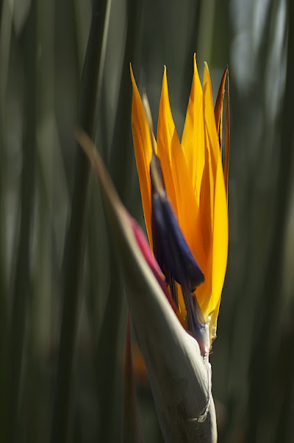
There were two problems.  First, the flower was quite a distance off the path and I had been cautioned to keep my tripod on the path and not in the flowerbeds (although I found myself violating that rule at times).  Second, there was substantial foliage close behind the flower that was creating clutter.  I opened up the aperture to f/3.2 to try to compensate for this.  However, it is evident that the background foliage was still a factor.  At the same time, the wide open aperture really "softened" the focus of the flower itself.  However, I still liked the rich, bright orange of the shot and felt that the shot might have interest simply for its strong colors.

The first thing I did was to crop the shot down to the flower itself and, in fact, left out the upper tips of the orange petals.  In addition, I increased the overall contrast, which served to darken the background and accentuate the orange and purple of the flower.  I also did some sharpening which brought out the texture of the orange petals, a portion of which proved to be in pretty good focus.  Here is the result.


There are still problems with this photo, but these changes, I felt, served to accentuate the shot's positive aspects.  I don't mind that the tips of the petals have been cropped out; everyone knows that they are there.

Here is another somewhat funky shot that I took.


This was actually a very small plant, but I liked the three stems that were extending off in various directions.  I knew that I could not keep all of the stems in good focus, at least not without creating a lot of visible clutter in the background, and wound up taking this shot at f/5.6.  Usually, I find myself "working the shot," taking several shots at slightly different angles and at various apertures.  In this case I took only a single shot, thinking there probably wasn't much to this shot (and maybe there isn't).


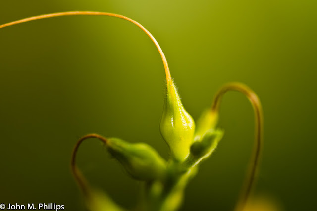
First, I cropped the shot to reduce the distracting orange object in the lower right, though I did not eliminate it totally.  Second, I thought the photo was a bit washed out and ramped up the contrast to some extent.  I initially sharpened the photo, but then noted that this enhanced little hairs on the surface of the center portion of the plant, so I reduced the sharpness rather than enhanced it.  I like this shot, even though only small portions of the plant are in good focus.

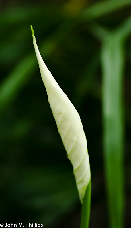
The following flower caught my attention because it had not opened up.  Here is the shot as originally taken.


I also liked the delicate ribbing spiraling around the white blossom.  The background was relatively dark, but there was still evident clutter, even though I took the shot at a wide open f/3.5.  Initially, I thought it would be best to position the flower off-center.  However, I later concluded that it worked better positioned centrally.  So I cropped the shot more narrowly to exclude a portion of the left side of the image.  Second, I darkened the background by increasing the contrast.  Third, I worked hard to retain and, if possible, enhance the spiral ribbing.  Here is the result.


There is still too much clutter in the background, particularly the long green leaf on the right, but it would be too much work to get rid of those, and, arguably, they provide context for the shot.

Here is shot of another specimen of the same plant where the flower has opened up nicely.


One thing I noticed in post processing was that there was a big chunk of debris right on the front edge of the flower.  If I had noticed it before taking the shot, I would have removed it before snapping the photo.  I did manage to remove it (or most of it) through post processing.  There was also quite a bit on clutter behind the flower.  However, it was pretty dark and I was able to darken it much more by increasing the contrast.  I had to work hard to maintain definition in the white "petal," as I felt it was critical not to let the white get "blown out."  I also cropped the bottom and right side of the image just slightly to center the flower better in the photo.  Here is the result.


I particularly like the green stripe running up the center of the white portion of the flower.

What attracted me to the following shot was the ring of dark pink spots surrounding the center of this flower.  I wound up taking quite a few shots in an effort to get it "right."  Here is one of my unedited shots.


There was some backlighting in the center of the flower, which created some contrasting darkening of the "business" portions of the flower.  I focused on the stamens and took this shot at an aperture of f/14.

So what did I do in post-processing?  First, I increased the exposure and the contrast to bring out more of the central backlighting.  Second, I decided to crop away the wedge of empty area on the left and in the lower right.  I decided to keep the open area in the middle right.  I also sharpened the flower's edges.


I like that the pistol and stamen are in good focus while the pink spots remain "soft."  I did try to darken the remaining wedge on the right, but that's a lot of work and I wound up feeling this shot was not worth it.

Here is another shot of the same flower taken from a slightly different perspective and at a very narrow aperture of f/45.


Here the petals, as well as the pistol and stamens, are in sharper focus.  Otherwise, this shot is quite similar to the last one.  In this case I decided to crop out the dark wedge in the lower left.  I also did not like the defects in the left of the image as well as the white wedge on the right.  In the end, I thought I would crop this more tightly and as a 4x5 rather than a 4x6 to eliminate these issues.  I also increased the exposure a bit, as well as the contrast, similarly to the last shot.  Here is the result.


Again, even though there is great depth of field in this shot, the pink spots still appear "soft," which was attracted me in the first place.  Nice, I think.

Here is another familiar flower.


Here were what I thought were the problems with this shot.  First, there were some distractions in the background.  These included not just the nondescript clutter directly behind the flower but also the leaf in the lower right and lower left.  Second, the red portion of the flower was pretty blown out--there just was not a lot of texture.  Third, the right side of the central "stalk" was also pretty "blown out," with no definition.

To try to remedy these problems, I cropped the shot to eliminate the little green in the lower left.  It was simply not possible to eliminate the green in the lower right.  However, I was able to reduce the clutter elsewhere in the image by darkening the background.  I also worked hard to bring out some texture in the red portion of the flower. I worked, as well, to bring some definition into the right side of the stalk but was not fully successful.  This the modified image.


Here is unedited shot of a plat that caught my eye because of the way the sunlight was illuminating the central portion of the leaf.


The background was naturally dark, although it was lighter toward the top and right of the image.  What attracted me was the variation in the translucence of the leaf's central portion.  A problem with the shot was that the tip of the leaf was too close to the top edge of the photo.  I decided to abandon the top of the leaf and crop the shot to show just the central portion.  This served also to eliminate the problem with clutter near the top.


There was already good contrast within the leaf, but I did darken the background some to eliminate any additional distractions.  I also sharpened the image some.  Finally, I cropped out the bit of green in the very lower right of the photo.

Finally, here is a shot of a flower (actually I think there are two flowers here) that caught my attention because of the large drop of water hanging off a portion of the flower.  In addition to the water drop, I liked the curving stems extending into the image.


All of the portions of this flower were more or less in a plane, so it was convenient to try to get everything is good focus without creating too much background clutter.  I actually took a large number of shots of this flower (15 or so, I think--embarrassing).  This was one of the best of those shots.

In post processing, I decided there was too much open space on the left side, so cropped the image to reduce the left side without losing the curving stems on the right.  This required that I crop it as a 4x5 rather than a 4x6.  I also increased the contrast quite a bit, which gave the the shot more "punch." Finally, as usual, I did some sharpening of the edges of the flowers.  Here is the result.


I regret the circular white spot in the lower left, but there wasn't much I could do about it without taking heroic measures.  I regret not giving myself more cropping options to work with when I took the shot.  That is a lesson that I will have to learn to apply going forward.  I have plenty of pixels to work with without worrying about cropping too many away.

Sunday, February 19, 2012

ABANDONED FARM HOUSE

Recently, I thought I had spotted what looked like an abandoned house about three miles north of my home.  The house was set back quite far from the road and there was abundant overgrown shrubbery that further obscured it.  I wasn't sure if it was truly abandoned or if someone might be living there (who might not take kindly to me or my camera).  Ultimately, I decided to see what might be available, hoping to make a quick exit if someone appeared with a shotgun.  Not to worry: there was a cable across what had been the driveway, accompanied by two or three no trespassing signs.  It seemed evident that no one had been there for some time.  Nevertheless, out of prudence, I decided to park my car some ways down the road from the driveway.  The property proved to be what had been a farm house, along with barn, silos, and other outbuildings, that probably had not been occupied in at least 30 years, perhaps much longer.

The great thing about the house was that there was nothing "artificial" behind it--no utility poles, no power lines, no other homes or other structures--just open fields and a line of trees that appeared to be perhaps half a mile away.  There was an outbuilding directly behind and to the left of the house but in many of the shots I was able to position the camera so that the outbuilding was hidden by the house. Here is one of the first shots that I took.


I took this from a low angle to include some of the weeds that were as high as six feet.  The angle made the house appear to "loom" a bit, which I liked.  Here are a couple more shots that I took on my first visit.


I was not comfortable going into the house, in part because of the many no trespassing signs that graced the property and in part because I was not sure of the physical integrity of the house.  I did take a shot of paint peeling off one of the house's doors that I turned into a B&W.


After the first visit, I decided to return the next morning because I wanted to catch the early morning light--the house faced east.  I was pretty happy with the results.  Here are a few of the shots.


I thought these shots worked well as B&Ws also.


One thing I was able to do with the B&Ws in post precessing was to darken the sky, accentuating the few clouds.  I particularly like the shot that is cropped in a more horizontal fashion.

Here is another shot of the north side of the house.  Note the no trespassing sign.


I think the cause of the long streaks extending from below the roof is tar that had dripped down from the asphalt roofing at some point in the past.

And here is a closer shot of the house's front porch.  Inviting, eh?


I also took some photos from directly in front of the house.  Here is a shot that includes the outbuilding to the left of the house as you face it.  Again, I cropped this as more of a horizontal shot.


Both of these photos illustrate how "clean" the scene is behind the house.

I decided to go back for a third visit the next day, with the thought that I would take some shots from the left side as one faces the house, to emphasize more the front porch.  When I returned, I realized why I had not done this on the first two days.  There are a barn and other outbuildings behind the house and to the right that are brought into play by positioning the camera on the porch side.  Here is one of those shots that I made into a B&W.


Again, I darkened the sky, which I feel adds a little drama to the composition.

Finally, here are a couple of shots of the barn and other outbuildings, including one that I converted to B&W.


I was drawn by the round lines of the barn roof, other outbuilding roof, and silo peaking over the top of the barn.  

After three days, the only reason I would return would be to take shots of the interior of the house and possibly the barn.  I would like to get permission from the owner to do that, but I'm not sure how to make contact.