Monday, June 29, 2015

GRAFTON WI CLASSIC CAR SHOW

It had been a while since I had gone to a classic car show, so when I saw notice of one in the neighboring town of Grafton for last weekend, I decided to take my camera and go.  It was fun.

There were an advertised 200 plus classic autos at the show, ranging from early 1920s roadsters to 1980s muscle cars.  It helped that it was a sunny day, making for a lot of reflections off the cars' highly polished sheet metal.

Early on was one of the classics of the classics, a 1957 Chevy.  As usual, I found myself focusing on details rather than trying to shoot the entire vehicle.  And when I do focus on details, my goal is to capture the car's signature aspect.  In the case of the 1957 Chevy, that is the chrome-filled rear fin.


And here is a hood ornament for what I think was a Ford.


Headlights can be another distinguishing feature, as in the following shots.


As some of the prior shots illustrate, grilles can also act as a point of interest, including the following.


Here is one of the few full-car photos that I took.


The clouds actually helped this shot, I think, creating some drama.  Below is a detail shot of this beauty.


Rear trunk lines can also provide some interesting compositions, as in the following.


As can reflections.


One of the cars, an impeccably polished black 1940s Olds (I think), was positioned next to a bright yellow coupe, which allowed me to capture reflections of the coupe in the fender and side panels of the Olds.


The owner of the Olds joked that I should be charged $3 per shot for the reflections.

although highly polished surfaces can present opportunities for interesting shots, I was particularly drawn to a couple of beautifully restored matte-finished autos.


I was especially taken with this last car.  Although I converted this to black & white, the car was silver colored and the black & white didn't change much other than to eliminate a little pin striping.

Toward the end of my visit, I caught this shot of one of the owners doing some last minute polishing on his white 1956 Ford Thunderbird.


  I did take a couple of shots of his car, including one of the spare tire container on the rear bumper.


When I took this shot the owner remarked that his car had photographed a number of times, but never a shot of just the spare tire.  We laughed about that.

John

PIONEER VILLAGE REVISITED

Earlier this month I paid another visit to Pioneer Village, a smallish historic site in northern Ozaukee County.  It consists of a number of structures--homes, school, chapel, blacksmith shop, barn and other rural outbuildings--you get the idea--that have been moved and reconstructed on site and equipped with furnishings and other paraphernalia representative of the era, late 19th and early 20th century.

Following are an admittedly unrepresentative collection of photos of my visit.

First is a shot of the exterior of one of the buildings.  I do like weathered wood, particularly when it is rendered in black and white.  Here I thought it might be interesting to shoot from directly off the building's corner.


And here is another weathered wood photo, this one including a window.  I liked that I placed the window in the corner of the image and that another window on the other side of the building was visible through this one.


Now for some circular objects.


This last is a decorative detail on a screen door.  My idea was to focus on the screening and detail rather than on the exterior scene.


The shot above is nothing really, but I liked the way the natural light was illuminating this old barrel.


And yes, the above was a mannequin in front of a lace curtain window.  A little creepy, actually.

Finally, here are a couple of signs at a railway station that I thought added a note of humor.


I am thinking of posting a print of this last sign in our powder room to see what happens.

John

SPECIAL EFFECTS: PANNING

On the basis of a tip, I decided to try a technique for creating landscape abstractions.  It worked!  At least to my tastes.  This technique involves employing a relatively slow shutter speed combined with a panning of the camera.  I began goofing around with it for some interior shots, with limited success.  However, a few days ago we were blessed with a foggy morning and I grabbed my camera to get some landscape shots in the patchy dense fog.

One thing I had realized in the experimenting I had done previously: I need to pan in the same general direction as the orientation of the preponderance of the objects being photographed.  If the objects are horizontal, then the pan should be horizontal.  If vertical, then the pan should be vertical.  Otherwise, the image is likely to come out as a blurry mess.  It is also important that there be a significant amount of contrast in the shot, again in the direction of the pan.  In addition, the exposure time and amount of panning are important.  If the exposure is too slow or the pan too fast, again the image can wind up too abstract.  On the other hand, an exposure that is too fast or a pan that is too slow can result in a shot that looks like the result of simple camera shake.  For this kind of shot depth of field is not nearly as important as shutter speed and panning.  Finally, be prepared to waste a lot of shots figuring out what is working.

OK, so here are a few of the shots that I got.  The first few were of a small stand of trees in our subdivision that are positioned against a wetlands area.  This first was a 1/4 second exposure at f/9.


It's evident that my panning was not "linear" in this shot.  I think, too, that the shot is a little too abstract.  The next couple of shots were also at f/9 but at faster shutter speeds of 1/5 and 1/6 second respectively.


At least now it is clear that these are trees.  And here is one final example of a different stand of trees posed against a darker background.


This was taken at f/4 for 1/8 second, and it is apparent that this shot is even less abstract than the others.

Although the length of the exposure is important in these shots, the speed of the panning is also a factor.  But it is difficult to quantify that factor, and that is why it is best simply to play around with this technique to see what works and what doesn't.  Just be prepared to delete most of your shots to get the few that seem to be working.  I certainly intend to play around more with this technique, including trying some panning that is intentionally nonlinear.

One final shot that I took during the same session and converted to black & white, this time without panning, if only for comparison.


John

LAKEFRONT FESTIVAL OF ART: SCULPTURE

Each June the Milwaukee Art Museum sponsors an art festival on the grounds of the museum and nearly every year my wife and I check it out.  The show is juried and the art is generally very high quality.  More often than not we wind up buying something, despite the fact that the prices are generally frighteningly high.  We had missed the show in 2014 but did make it this year, though we wound up not buying anything.

I did bring my camera to the show and took some shots of the art.  I am very conscious of the fact that this is art offered for sale and in some sense taking photos of the art is in some ways a "taking" of that art without compensation to the artist.  In fact, some of the artists have begun posting signs stating that photography is prohibited without permission.  I can understand that, and I certainly would not take photos in contravention of that prohibition.  In the photos that follow there is only one shot of a sculpture in the exhibitor area.  The remainder were taken in a exterior courtyard area devoted primarily to sculptures of various of the artists.  I felt that the sculptures in this area were "fair game" for photography.

As usually happens, I found myself more attracted to sculpture than to two-dimensional "wall art."  In part, I think, that is because sculpture gives me the opportunity to express myself just a bit in terms of depth of field, background elements, and composition in general.

Here without further comment are some of the sculptures that I shot, all of which are representations of the human form--sort of.


John

Saturday, June 27, 2015

LANDMARK CENTER, ST. PAUL


One of the historic buildings in downtown St. Paul was nearly razed a number of years ago but was saved by local preservation groups and has been converted into a great venue for such events as wedding receptions.  It is only a few blocks from the Science Museum of Minnesota that we visited on our last trip to the Twin Cities, so we walked over to grab a few photos of this nicely restored Twin Cities landmark.

The building features a large--perhaps too large--central atrium.


I thought getting a shot of the massive skylight might be a good thing, but in fact the feature was simply too large and mundane.


One of the nice surprises was a musical instrument museum that was housed in the building, the Schubert Club Museum.  Even better, the museum was free!  The entry foyer for the museum featured a large "sculpture" comprised of several hundred musical instruments.


Following are a couple of architectural shots, one looking up inside a strange little alcove.


The other is of a side corridor on the main floor of the central atrium.


I thought this last shot worked well, actually.

Here are two additional shots of the exterior of the building.  There did not seem to be any way to get a wide-angle shot.  So the first is a look up; the second a reflection in the glass-clad building across the street.


Finally, I'm throwing in another shot of neighboring buildings that I thought worked well, particularly for the reflections.


John

SCIENCE MUSEUM OF MINNESOTA


The Twin Cities have a fine science museum, located in downtown St. Paul.  It had been years since we had last visited, so on our most recent trip, we paid another visit.   We were not disappointed.  The museum, while not as large or diverse as Chicago's Field Museum of Natural History, is considerably better than anything Milwaukee has to offer.

As usually happens, I found myself shooting exhibits that caught my eye for their abstract or compositional qualities, rather than trying to document our visit more broadly or completely.  Following, then are some of the shots that I got.

A strange exhibit of special plastic triangles on one of the walls:


A nicely presented skeleton of a bull.


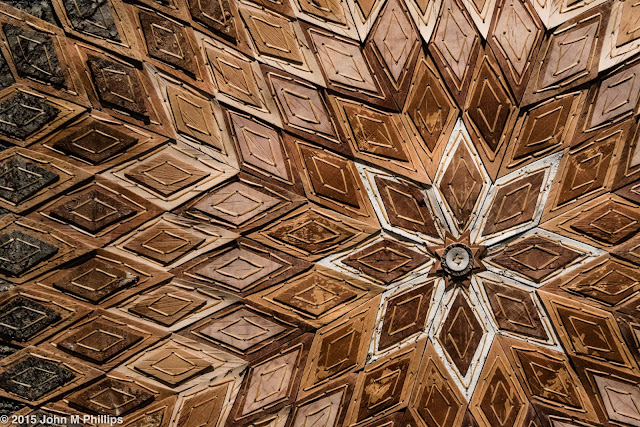
An abstract Native American artwork comprised of diamond-shaped pieces of birch bark that had been stained different colors.


A grizzly bear that was simply too large to try to capture in one shot, so I decided to focus on what I thought was its most fearsome feature, one of its paws, including four-inch claws.


A portion of a totem pole.


One of the exhibits on pseudoscience, this one on phrenology--reading personality based on the bumps on one's skull.


A couple of exhibits on light that allowed for some abstracts.


And, finally, the obligatory T-rex skeleton that I converted into a black& white.


Highly recommended.

John