Friday, April 17, 2015

ST. JOSEPH CHAPEL, 2015

Last spring I had the opportunity to visit St. Joseph Chapel on the campus of the headquarters of the School Sisters of St. Francis on the near south side of Milwaukee.  The post from my prior visit can be found here: http://skepticphoto.blogspot.com/2014/06/st-joseph-chapel.html.

This spring I again obtained permission to photograph the interior, this time with my newish camera, my Nikon D750, which allows for wider angled shots and superior resolution.  The School Sisters again graciously gave me free rein in the chapel and turned on the lights for me.  I was very pleased with the results.

The first photo is a standard symmetrical wide-angle shot from the rear of the nave.


As with nearly all of the photos of this series, this was shot at f/8 and an ISO setting of 100.  I used my tripod for nearly all of the photos, so, assuming I was careful, shutter speed was not much of an issue.  This was shot at an exposure of 1.0 second.  White balance is always an issue with interior venues.  I shot this with the white balance on auto, which I realized was not quite right.  In post processing I adjusted it to what I recalled as the best representation of the color balance, but I don't think I quite caught it right.

I decided that it might be more dramatic to set the camera closer to the floor and got this shot.


I think the minor difference in height makes a major difference in impact.  A major reason, I think, are the pews, particularly those in the rear that serve to create foreground elements to help with the overall composition.

Partly because it is there, I took a ceiling shot.


Again, the ornate pillars in the upper corners help to create foreground interest and context.  This was also shot at f/8, this time for a 2.0 second exposure.

One of the key features of the chapel is the apse, and I spent a significant amount of time shooting that area, particularly the ceiling.  Here are a couple of shots of the ceiling, the first taken at an angle; the second from directly underneath, looking straight up.


The D-shaped skylight features a dove, symbol of the Holy Spirit, I think.  Because these are relatively "tight" shots, they become abstracts.  The first was shot at f/8 for 0.5 seconds, the second at f/9 for 0.4 second.  And here are wider angled shots, the first again at an angle and the second from directly underneath.


I really like this last image, which was shot at 24 mm, as wide-angled as I can get with my 24-120 mm lens.  Again, it was shot at f/8 for 0.6 seconds.

The apse includes a number of mosaic murals, as well as a very elaborate, ornate altar piece.  Here is a shot of the altar piece in context followed by a shot of the mosaic mural above the altar piece.


The chapel includes a number of lovely stained glass windows.  Below is a shot of one of those.


The light streaming through the window differed significantly from the general light in the chapel.  Here is another, much tighter shot of a portion of another window.


I thought the arches in the side aisles were beautiful.  Here is a shot of one of those.


This was a 0.4 second exposure at f/8 at an ISO of 400 (for some reason).  I also got a nice photo looking up from one of those aisles.


The pillars and arch in the foreground that repeat the archwork on the other side of chapel help to make this shot, I think.  This was shot at f/8 for 1.6 seconds at an ISO of 100.

As with the prior visit, I was given access to the balcony at the rear of the nave.  Following are three of the wide-angle photos that I got.  The first two are symmetrical shots from the center of the balcony.  Despite having wider angle capabilities, I still had to choose between including a portion of the pews on the lower level or including the beautiful circular stained glass skylight above the sanctuary.  The third shot is from the corner of the balcony.  All three were shot at f/8 for 1.3 seconds.


As I was finishing my shoot I took a photo of the archwork at the rear of the nave.


I was drawn to how the light streaming through the stained glass was reflecting off the polished floor tiles.

I was delighted with my experience at St. Joseph Chapel.  The space is, in short, stunningly beautiful.  Moreover, despite being nearly 100 years old, it appears to be in pristine condition.  Anyone who has an opportunity to visit the chapel should do so.

John

Sunday, April 12, 2015

WALKER'S POINT IN BLACK AND WHITE

Walker's Point is a neighborhood on Milwaukee's south side.  Historically, it emphasized industrial manufacture, such as metal fabrication and leather tanning, as well as churches and taverns.  In the last half of the 20th century it had undergone a lengthy period of decline but is now undergoing a revitalization, with the conversion of abandoned factories into commercial and residential developments.  Over the last couple of years I have found myself wandering around in the neighborhood, looking for photo opportunities, and that is what I was doing on a recent sunny Saturday morning.

The neighborhood still has a gritty feel to it, and I thought I would convert into black & whites some of the images I that I took.  Admittedly, these are just a little outside the lines.  But, if nothing else, they give a flavor of the kind of things I find myself attracted to.

First up is a pile of abandoned tires.  Yes, that's right.


Given the black tires and bright sunlight, this was a natural to convert to a black & white image.  Whether it has any aesthetic merit is questionable, but I liked that I caught the image "as is."

And here is an abstract of the steel steps of a new stairway to a pedestrian bridge crossing a local boulevard.


Too simple, I'm afraid.

Milwaukee has its share of (unauthorized) street art, and below is an example that caught my eye as I was driving by.  The building had been painted gray and the "art" was also done in blacks, whites, and grays.


Following is an example of a factory building that is still waiting (hoping) to be rejuvenated.  It stood at the far end of an open field, allowing me to get an image with very little perspective distortion.


I liked the play of light and shadow on the petroleum tanks in the shot below.  It was Saturday morning, and there appeared to be no one around when I took this shot.  Even so, I was concerned because the last time I tried to photograph petroleum tanks, I was warned to leave before security called 911.


Things didn't go as well when I returned to one of my other haunts, an abandoned tannery.  Within 10 minutes a security guard approached me and told me that I would have to leave, that, among other things, the lot where my car was parked was private.  This, even though the lot had spaces for well over 100 cars and mine was the only car parked there.  So I left, but not before getting a couple of shots of a bridge that spanned little-used railroad tracks.


I took these shots hurriedly because I had spotted the pedestrian and wanted to capture her silhouette against the bright sky.  Ideally, I would have gotten the shots a few seconds earlier as she was walking into the scene rather than leaving it.  Even so, I thought the photos worked fairly well.  I like the first shot a bit more for the simplicity of the compositional elements: the bridge cables, the industrial buildings, and the pedestrian.  But I liked the second for the tracks running underneath.

John

Sunday, April 5, 2015

NIGHT AT THE (MILWAUKEE ART) MUSEUM


I returned to the Milwaukee Art Museum last Thursday, not to see the exhibits, which are essentially closed to visitors during an ongoing extended museum expansion project, but because admission is free on the first Thursday of the month and because I wanted to check out how the Calatrava addition would photograph at night.

I actually arrived before sunset and took a few exterior photos handheld while there was still adequate light, including the shot above and the two that follow.  I liked the colors in the sky in the above shot, which, for the record, was shot at f/8 for 1/80 second at an ISO of 320.

The moon was nearly full (in fact there was a lunar eclipse the next night), and I wanted to incorporate it in the photo, as in the following shot.


I like the overall shot OK, but incorporating the moon didn't work particularly well.  I think it would have been better when the moon was closer to the horizon, but then the sky would have been even lighter.  As usual, the moon looked a lot smaller in the photo than it did to the eye.  I think this has something to do with the moon illusion.  This image was shot at f/8 for 1/40 second at an ISO of 160.

And here is a tighter shot that I converted to a black & white to emphasize the lines in the brise soleil.


Shot at f/8 for 1/125 second at an ISO of 900.  Pretty crisp, actually.  As a trade-off, it is generally better to accept the increased graininess of a higher ISO, which can be corrected at least to an extent, over motion blur, which cannot.

I usually set my camera on aperture priority, which means that I control the aperture and let the camera decide on shutter speed.  However, I have an additional setting on my camera that keeps the shutter speed above a certain level by automatically elevating the ISO.  The camera decides on a minimum shutter speed based on the focal length of the shot--the higher the focal length (more telephoto) the shot, the faster the shutter speed needs to be to minimize motion blur.  I know, kind of technical.

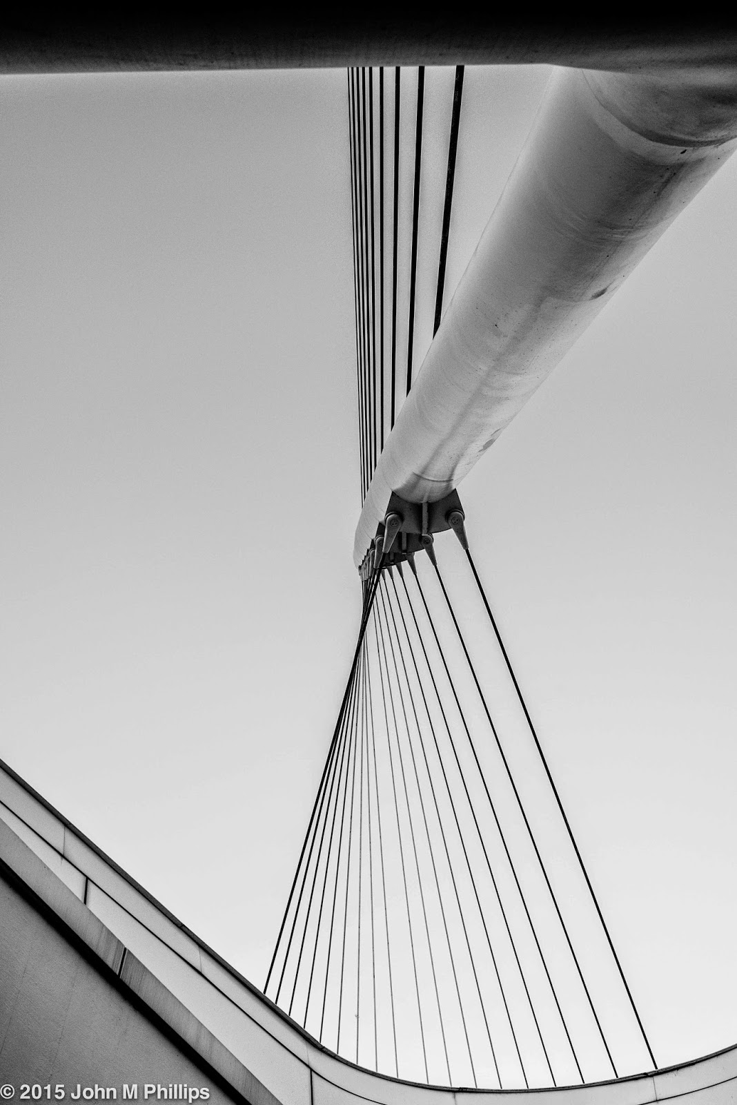
Before moving inside, I tried to get a couple of artsy shots involving the struts supporting the "mast" extending above the brise soleil.  I didn't think the first shot, taken very asymmetrically, worked.  It's hard to know what's going on.  Note, though, that I did manage to tuck the moon under the tip of the brise soleil.


But I thought the shot below, which I converted to a black & white, worked better, at least as an abstract.


This last was taken at f/8 for 1/50 second at an ISO of 400.

Then I moved inside to shoot the familiar Quadracci pavilion.  As sunset was approaching, the amount of available light was substantially reduced, requiring a ratcheting up of the ISO.  Here, first, is a relatively bland shot looking east toward Lake Michigan.  By this time the sky was becoming a deep blue, which I liked, but, at f/8 and despite a very slow shutter speed of 1/15 second, the ISO was ramped all the way up to 3200.


Because I caught this photo without anyone in the picture, something could be said for it as an abstract.  But the problem was a lack of scale.  The following asymmetrical shot does a better job of providing people . . . and scale.


This was shot at f/8 for 1/25 second at an ISO of 2000.  And here is a shot of the skylight, this time looking west.  The extended brise soleil is visible as horizontal bars beyond the skylight windows.


I also took a shot of one of the skylights in the west corridor, again primarily as an abstract.  If nothing else, it has an airiness about it.


Taken at f/4 for 1/125 second at an ISO of 160.

Leaving the museum, I took the following shot of the cranes involved in the construction of the new Northwestern Mutual office building a couple of blocks to the west.  I thought it worked as an abstract that told something of a story.  Shot at f/8 for 1/60 second at an ISO of 3200.


Because of the diminishing light, I ran to my car to retrieve my tripod, which would allow me much longer exposures at much lower ISOs.  Here is one last shot of the Calatrava that I particularly liked.  Shot at f/8 at an ISO of 400 for a whopping 4.0 seconds.


And finally, a shot looking down Wisconsin Avenue toward the west.  The "star" visible in the upper center of the image is actually the planet Venus.  Taken at f/8 for 1.3 seconds at an ISO of 400.


I really liked the blue light in the sky at the dying of the dusk.

John

Saturday, April 4, 2015

ABANDONED FARMHOUSE AND THE QUALITY OF LIGHT

Anyone who has done even a little photography understands that differences in the quality of available light can have a profound effect on photographic results.  This is especially true of landscape photography, and I have been repeatedly disappointed when trying to capture scenes in the middle of the day, particularly when it is overcast.

I thought I would illustrate those differences in the case of some photos I took of an abandoned farmhouse (a favorite "haunt" of mine) on two separate days under quite different lighting conditions.   I chose to render these shots as black & whites, though I think the same general differences would be apparent if the photos were rendered in color.

I have shot this farmhouse, situated a few miles from my home, a number of times over the last few years but hadn't been back for over a year.  Not much had changed.  For one thing all of the No Trespassing signs were still in place.  On my first visit the early afternoon sky was overcast, creating a relatively flat light that emphasized the mid-tone grays.  My second visit, two days later, was on a cloudless morning with the sunlight streaming nearly horizontally.  Here first are similar closeups of the house, the first taken on the cloudy afternoon, then second on the cloudless morning.


You might note that the two images were not taken from identical positions.  The first was taken from a closer distance, creating more of a "tumbledown" effect.  But beyond that, in my view the much greater contrast in the second shot evokes an emotion not present in the first.  My primary quibble with the second shot was that the sunlight was actually streaming through a stand of trees, and their shadows are visible on the front of the house, if one is looking for them.

The qualitative differences may be more apparent in a second pair of photos presenting a wider angle view.


Finally, here are photos showing an even wider angle that I cropped horizontally.


I feel there is an element of mystery in the photos taken on the sunny morning that is missing from those taken on the overcast afternoon.

I have found myself lately being pickier about light when choosing opportunities for photography.  Either that or I am simply getting a bit lazy.

John