Tuesday, January 27, 2015

REFLECTIONS AT THE MILWAUKEE CENTER

The Milwaukee Center is a 27-year-old complex in downtown Milwaukee that houses a hotel, an office tower, and a theater complex.  It features a central rotunda with corridors leading off in three directions.  It includes some interesting architectural details for a building of its recent vintage and I have been interested in doing a little photography there.  However, the other time I took my camera there, I got kicked out.  The guard told me I could not take photographs without a permit and that it would cost $150 to obtain such a permit.  But on that occasion I had my tripod and perhaps looked a bit serious for the guard.  In any event, I decided to return, perhaps posing as a guest of the hotel, without my tripod.  No guard this time.

To begin, here is a shot of one of the corridors, this one leading east toward the Milwaukee City Hall.


I thought that the corridor ceiling supports would make an interesting abstract, but here decided that I wanted to include the larger scene for context.

Following are a couple of photos of corridor archwork.


Visually, the first shot has more power because of the sharp shadows.  However, the black & white, taken from the side, has more of a "historical" feel to it that I also liked.

It was then that I noticed that the highly polished corridor floors were creating some interesting reflections of the bright sunlight streaming through the entrances and skylights.  Here is one of the shots I took of those reflections.


I liked this as an abstract.  However, I realized that the different colored tiles were too close to the bottom edge of the image and took another shot that was more centered.


And following are a couple more shots that don't have the interest that the above shot has.  Perhaps they lack the needed diversity of color that the proper shot has.


The best of these was one involving a small child who was enjoying the afternoon in the rotunda.


John

MILWAUKEE CITY HALL

I know I have posted shots of the Milwaukee City Hall before, but I was feeling restless in the heart of winter, the day was mild, and I wanted just to get out.  Plus there was semi-big news: the scaffolding that had enshrouded the building for several years had been removed!  The building, well into its second century, had experienced significant problems with deterioration of its terra cotta facade and repairs had taken several years, requiring the erection of elaborate scaffolding that had obscured the building's exterior.

So here, first, is an exterior view of the building.


Not a great shot, really.  It is taken from the rear of the building and does not do justice to the clock tower above the main entrance.  I guess I am just going to have to return.  The building's footprint is a trapezium, by the way (a four-sided figure no two sides of which are parallel, as distinguished from a trapezoid, which has two of its four sides parallel).

Here is a bit of a closer look at some of the building's detail.


The exterior facade is amply decorated with cherub-like figures, as in these detail shots.


A little weird to my way of thinking.

As I have shown before, the building's interior includes a central atrium encircled with balcony walkways on each of the seven floors above the ground floor.  Here are a couple of shots that I have taken numerous times in the past but I thought were worth revisiting.


And here is a shot looking down on the main floor from the eighth floor.


The lone figure helped provide context and scale.

All of the walkways are faced with ornate bronze guardrails that sport a dragon motif.


I thought this shot worked better as a black & white.  Unfortunately, the guardrail across the atrium creates a background distraction.  Here is another shot of a portion of the guardrail in shadow, allowing me to create a silhouette effect.


A little better, I think, although this sacrifices much of the detail.

John

Wednesday, January 7, 2015

NATURAL HISTORY MUSEUM OF UTAH

On the last day of our trip to Utah over the holidays, we visited the Natural History Museum of Utah, which sits in the foothills of the Wasatch range east of the University of Utah campus.  The museum is only a few years old and both the building and the exhibits have a fresh look to them.  Although the museum doesn't match up with Chicago's Field Museum, in my view it easily outshines its counterparts in Milwaukee and Denver.

Its setting is superb, as it faces the Salt Lake Valley to the west, providing a spectacular view of the snowcapped Oquirrh Range to the southwest of the city.  Here are a couple of shots of that view, the first a shot I took outside of the museum.


I like the following shot better, which I took from inside the museum, as it provides a better perspective for the overall scene.


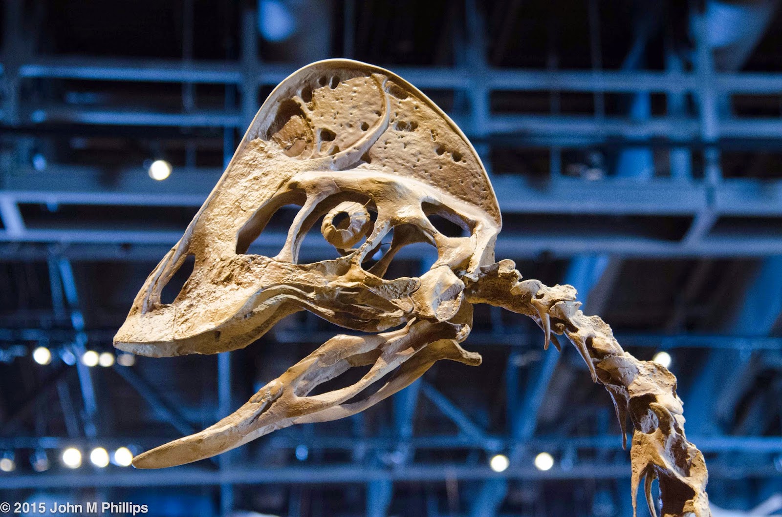
Utah is prime dinosaur country, and their fossils play a central role in the museum.  Here are a few of the shots that I got.


Note how the eyeball of this last guy was encased in protective bone.  

These "fossils" are, for the most part, faithful reproductions, but I didn't mind that, as the museum also included some actually fossils in controlled settings.  The exhibits included a number of clear and well designed explanations to help educate the interested patron.  They also included this "artist's conception of the head of one of the dinosaurs.


If nothing else, it was a fun speculation.

Of course, the museum had exhibits in other natural history areas, including this ceremonial mask . . . 


. . . and this sculpture of a horse, which was part of a larger horse exhibit.


And then there was me being me, trying to capture some of the building's architecture and amenities as abstracts.


Overall, I was very much impressed by the museum.  Perhaps that is in part a function of the fact that my interests favor paleontology over, say, cultural history, and perhaps it is in part a function of the fact that the Utah museum is quite new and isn't populated with a number of really tired exhibits, such as dioramas, as is its Milwaukee counterpart.  

John

Tuesday, January 6, 2015

ZOO LIGHTS

Salt Lake City has a modest sized zoo only a few minutes from our son's home.  And while we were in Utah over the holidays we visited the zoo one night to see their light show, Zoo Lights.  I brought my camera along.


Our son and daughter-in-law met two other couples there who had children of about the same age, making for a nice tableau.


Most of the light displays featured zoo animals, naturally, including the following.


OK, this last might have been of questionable authenticity.

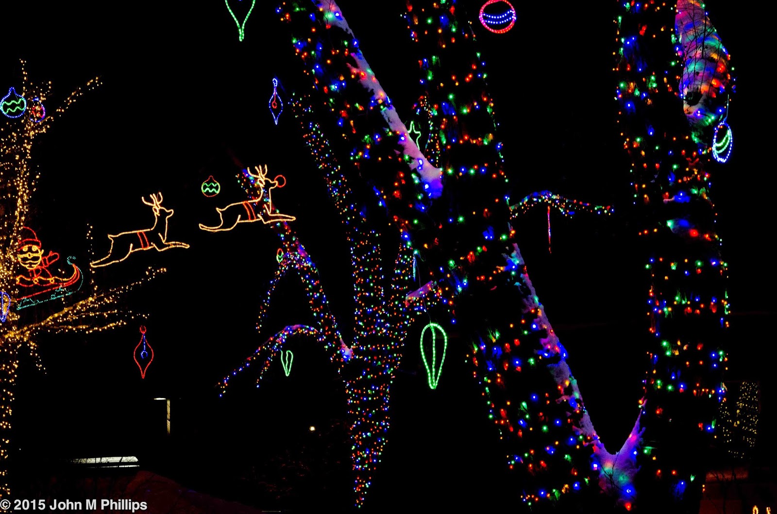
For the most part, I took these shots by underexposing them by one full f-stop.  Not only did that help to keep the background black, it also allowed me to take the shots at a lower ISO for a given shutter speed.

I also took some shots that incorporated some of the lights-wrapped, snow-clad trees.


Of course, zoos are about animals and there were some in the enclosed buildings, which also gave us the opportunity to warm up a little on a very cold night.  The one interesting animal photo I got was of four monkeys huddled together against the cold who had entwined their tails.


John

LESSONS IN FAMILY PHOTOS: STANLEY AT 19 MONTHS

During our visit with our family over the holidays, I took quite a few photos of our grandson, Stanley, an active 19-month old.  I recognize that portraiture is one of my weaker skills, and that's when the subjects are knowingly engaged in the photographic process.  Stanley's not yet at the age where he understands that process, so he is not particularly interested in posing or even sitting still for any length of time.  And that just added to my challenges.

I thought in this post I would show some of the photos I took and attempt to sort out and comment on my success and lack of success, with the hope of learning something in the process that I can apply the next time around.

It should be kept in mind that I probably took between 60 and 80 photos of Stanley during our four-day visit.  I considered a large number of those to be "busted" shots because of movement, poor lighting, or compositional problems, and many of the rest were duplicative or otherwise forgettable.  But I did come away with a few shots that were at least "keepers."

I took any number of shots of Stanley by himself, as in the following.


Forget that he has a prominent colic at the top of his head; at least he is displaying his infectious smile.  There is also a chair in the background, but I'm OK with that because it is out of focus and adds a bit of context.  On the other hand, I wish that Stanley had been looking into the camera, as he was in the following shot.


This shot conveys more personality, I think, than the prior one.  Too bad that it's not quite crisp and that the lower part of his face is obscured.

I was beginning to get the message that props could be helpful, as the following photos illustrate.


Stanley really didn't want to be wearing this hat, and each time his mom put it on he immediately took it off.  Hence the movement in his left hand in this shot.  But he is almost looking into the camera, which helps the shot.


Although Stanley is not looking at the camera at all in the above shot, the fact that he is engrossed in working with his toys helps to tell a bit of a story.


This last is my favorite of these shots, as he is (almost) looking at the camera and is definitely telling  us something about his green block.

There are situations that call for solo portraits and others where having other family in the shot serves to advance the story.  Here are a few of those shots.


Not a great composition, but, hey, this was Christmas present opening time.


Stanley with Grandma.  The fact that she is holding him gives the impression of his being younger than he is.  Otherwise, it's a pretty good shot of both, as they are more or less looking into the camera.  Grandma's face is partially obscured, but I decided that having their faces close together helps to create a sense of relationship that can be lost when each person in the shot is in their own space, so to speak.

The following shots of Stanley with his dad, even though they are not as close together as in the above shot, seem to work because they are engrossed in a common activity.


Finally, I took a few shots of Stanley with his mom and dad.  They turned out OK--for planned family portraits.  But they had the problem that they looked staged.  However, I did like the following shot where dad decided to turn Stanley upside down, something that it is evident he still thoroughly enjoys.


So what did I learn?  First, getting Stanley to look into the camera seems to convey the most personality.  Otherwise, using physical props can serve to create a sense of candor and story.  Finally, having other family members in the photo can also help, particularly when it is apparent that they are engaged in a common activity.

John