Thursday, June 27, 2013

CRUISING THRU MILWAUKEE & THE IRON BLOCK BUILDING

The other evening I drove through downtown Milwaukee on my way to the near south side.  I was out to do a little evening photography and had my camera handy in the front seat of my car.  One of the shots I took en route was of an older building just to the north of downtown.  I had spotted this building in the past, but this time I actually parked my car and took a couple of shots.  Note the 1890 date in the upper left.


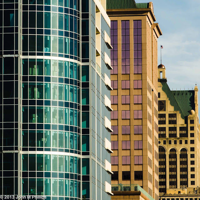
I also caught the following three buildings situated on North Water Street in this foreshortened shot.


These buildings are actually each separated by a few blocks.  I liked this composition for the diversity of architectural style and color in the three buildings.

Driving past the Marcus Center for the Performing Arts, I noticed that the sun was casting a shadow of a pedestrian bridge connecting the Center to a parking ramp to the north and took a couple of shots through the window of my car while waiting for a traffic light.  Because of the angle of the sun, the ramp appears to be sloped, even though it actually is more or less level.


The pedestrians made the difference for these shots.

 I also passed City Hall and took another shot through my side window.


I could have zoomed in on the "nudie" on the right, but decided that I wanted to include some of the other lines of this remarkable building.

Driving on down Water Street in the bright evening light, I couldn't help but notice that the facade of the Iron Block Building, which is located directly across the street from where I worked for 33 years, had been restored--again.  I took one photo through the windshield of my car while waiting for a light to change and then found a parking space to take a few more photos before heading on to the south side.

The Iron Block Building dates back to 1860 and is unusual for its facade, which consists of cast iron blocks.  When freshly painted in light cream the detail in the blocks can present an arresting sight.  However, the cast iron is subject to rust and over time the building can begin to look pretty shabby.  The building's current owner has just completed a many-months-long restoration of the facade, consisting of sandblasting, rustproofing, and repainting, and the building's surface was just re-exposed to the public within the last couple of weeks.

Here is a photo of the entire building, something I usually forget to do.


The west side of the building was in full sun, leaving the most of the north side in fairly deep shadow.  I was able to do a decent job of bringing out the shadowed portion through post processing magic.

Here is the shot I took through the windshield of my car.


I was fairly happy with this shot, as the windshield was relatively clean.  (This was before a bird nailed my windshield a little later in the evening.)

And here are a few more shots of the building once I was able to find a parking space.


Both of these photos were shot "straight on" but from street level.  I was able to rectify the perspective in post processing.  For the shots below, I didn't bother or else would not have been able to.


I believe the Iron Block lettering in the pediment of this last shot is new to this restoration effort.

The building's facade last underwent a major renovation in 1983.  The current owners are hopeful that the current renovations will be more enduring.  The building has been on the National Register of Historic Places since 1974.

John

BULL'S EYE GLASS

As I was wandering around the Pabst brewery campus the other evening, not being sure what I was looking for, I spotted what I believe is called bull's eye glass in the door to the entrance of a pub still in business in the area which is otherwise fairly deserted.  What caught my attention was not so much the bull's eye glass as the fact of the buildings behind me that were being reflected in the glass.  The light from the evening sun was warming the buildings' colors which were being caught by the glass.

Here is a shot of the doors.


I probably should have taken a photo of the full double doors, but I wanted to make sure the reflections in the two bull's eye panes were highlighted.

Here is a close-up of one of the four-paned panels to show more detail.


The overall concave surface of the glass has flipped the image upside down so that the blue of the sky shows in the bottom portion of the pane.

Finally, here is a close-up of just one of the bull's eye panes.


In this case most of the pane is flat enough that the building behind me was right side up but mightily distorted.  However the concave bull's eye itself is throwing that portion of the reflection upside down.  I think that's a tree in the lower right of the bull's eye.  I did like the abstract patterns that the glass was creating.

As I said, it was the warm evening light that brought this to my attention.  Recognizing this, I have found myself venturing out more often on these summer evenings when I have the advantage of the warm horizontal light.

John

Tuesday, June 25, 2013

LAKEFRONT FESTIVAL OF ART

Each June Milwaukee is home to a premiere juried art festival featuring the work of over 170 local, regional, and national artists.  The festival is held at the Milwaukee Art Museum.  My wife and I go every year and usually wind up buying something.  This year was no different.

As soon as we got to the festival, I realized that I should have brought my camera.  We had gone Saturday morning and after we returned home I decided to return with my camera in the afternoon to take a few photos. I didn't feel comfortable taking photos of the art at the artists' booths.  I think that would be inappropriate, since in a sense I would be "taking" an aspect of their art.  However, the festival includes a large open space outside of the booth area in which there were sculptures by a number of the artists, as well as other activities intended to draw visitors, and that is where I spent my time.

The first shot I got was of the linear series of fountains in front of the Calatrava addition to the museum.  I have taken this shot any number of times, but this time I noticed a little girl who was busy balancing on the small concrete border to the fountain.  At first I thought I would wait until she had finished, but then I realized that she could be the real subject of the shot.  Her bright pink skirt and shoes helped to make the shot.


The festival also featured a juggler and mime.


When I took these shots I was not paying much attention to the camera's aperture setting and I could have done a little better job of reducing background clutter by opening up the aperture.  Even so, despite the clutter, I was happy enough with the expressiveness I caught in the face of the mime.  I could have cropped the shot down to his face, but I thought his posture was also important to the shots.

As long as I am dealing with activities, one such was sand sculpturing sponsored by the Kalahari resort in Wisconsin Dells.


Pretty impressive, really.

OK, on to the art.  The first is of a couple of abstract pieces.


Here I wanted to feature some of the detail in the foreground piece and to keep the background piece out of focus, simply as a marker of context.

This next is of a small portion of a ceramic piece that I liked simply for the interplay of colors.


But the real stars of this area, at least in my mind, were some "human" sculptures.  This first series was, I believe, all by the same individual, who obviously had an unusual, even surreal, artistic sensibility.


Was this guy's "beak" strapped on or organic?  And what happened to his right arm?


And there is the hint of the zombie in the above character.  A full shot of the above piece would reveal that the figure appears to be wearing a canoe.

And then there is the following sculpture of a figure of many faces.


I wasn't sure how best to capture this piece and finally took a shot that featured just a portion of his face(s).


I thought this also made an interesting black & white.  This matches one of my favorite motifs: the intelligible abstract.


Finally, here is a shot of another sculpture of a face by an artist with a completely different sensibility.  I tried capturing this from a number of different angles, finally deciding on a close-up that I converted to a black & white.


John

Monday, June 24, 2013

ARCHITECTURAL DECREPITUDE

Like a lot of other Midwestern cities founded on an industrial base, Milwaukee enjoyed its greatest commercial expansion from the late 19th century through the middle of the 20th century.  With the decline of heavy industry in the latter part of the 20th century, the city has lagged other cities in architectural development and innovation.  In other words, a lot of Milwaukee's architecture is older and a fair amount is vacant or underutilized and continues to molder.  That's not necessarily a bad thing for architectural photography; it just means that the subject matter may be a bit different.

Not really sure what I was looking for, I found myself back at the old Pabst and Schlitz campuses.  Both campuses are undergoing a slow but palpable revitalization, as a number of commercial (as opposed to industrial) businesses have been moving into renovated buildings that for years had lain vacant.  That's not to say that the renovation is complete, as there are still ample opportunities for images that illustrate a continuing decay.

The foundations of many of the buildings show signs of structural issues that have (or have not) been plastered over, as the two following shots from the Pabst campus illustrate.


And the following, also from the Pabst campus, demonstrate a number of attempts to paint over problems.


Rust presents another opportunity to illustrate decline.


I particularly liked the above shot because, in addition to the obvious rust problem, it illustrates a secondary problem of paint residue running down the piece of sheet iron.  In short, I liked it as an abstract.

Here is another shot, also from the Pabst campus, that I liked.


This was of a window at sidewalk level (if there had been a sidewalk, which had actually disappeared years ago).  The window had originally been "protected" by an iron grillwork which had then been covered over by screening.  More recently, the window had been covered over on the inside by plywood sheeting.  At some point the screen had been torn, leaving the above gash.  I took this shot when the warm light from the evening sun was bathing this west-facing window.  

My regret on this shot is that the gash occupies too much of the overall image.  I wish I had taken a shot with a wider view, leaving more "negative space" around the gash.  This raises the issue of the conflict between, on the one hand, taking a close-up that makes clear to the viewer the primary subject of the shot and, on the other, taking a broader shot that provides a context for the subject.  More often than not, I find myself focusing on the detail that I am interested in at the sacrifice of the larger context.  It is an issue that I have to keep reminding myself of.  The following pair of shots illustrates this idea.  Here, again from the Pabst campus, is a shot that focuses in on the unusual way in which a paint failure manifested itself.


OK as an abstract, perhaps, but I think the following broader shot does a better job of creating a context but without losing sight of the primary subject.


On to the Schlitz campus and environs.  The following is of a door knocker at the entrance to what had been a pub at some point in the past.


Although the door had seen much neglect, the elegant knocker would certainly be salvageable.  I thought a close-up of the knocker worked well as a black & white.


The following is of the back (north side) of a what had been a large commercial/industrial building adjacent to the Schlitz complex.  The building appears to be housing a number of smaller commercial enterprises, but, for the most part, stands vacant.


Finally, on the west side of this building there were a number of drain pipes that had an interesting construction and that had seen some deterioration and/or decoration.


Here, again, I thought the second shot did a better job of providing context.  I used my tripod to take each of these shots, as the evening light was beginning to fail, particularly in the alley in which these were located.  I was pleased with how sharp the images came out.

I'm not sure why I am being drawn to these scenes of decay.  Perhaps it is because there is a story, even if the photos just give a hint of its plot.

John

Wednesday, June 19, 2013

PIONEER VILLAGE

Ozaukee County boasts its own Pioneer Village, a pleasant collection of buildings and other objects dating back to the period between 1870 and about 1910.  For the most part, the buildings had been disassembled at their original location, moved to the Pioneer Village site and reconstructed and/or restored to the condition they had been in when they were in active use.  Most of the structures were originally located in Ozaukee County or in one of the adjoining counties.  All of the buildings are located on a relatively small parcel of land, so it is relatively easy to look through the entire village in a reasonably short period of time.

I am a sucker for highly weathered wood that is showing off its grain, and there was an ample supply of that in the village.  The following are blacks & whites, but it wouldn't have made a great deal of difference because of the silver weathering of the wood.


And here is another shot of old wood that also features an old (or at least rusty) door hinge.


I liked that there was a hint of paint in various places on the wood, such as underneath the hinge.

To save on lumber, a lot of buildings were constructed with some sort of plaster filler between the pieces of structural wood, as shown in the following.


I liked how the long pieces in the above building were basically curved over the top of the door.  Engineering precision was not critical.

In addition to the buildings there was a wealth of farm implements scattered around the property, including this modest-sized plow on the porch of one of the buildings.


I turned the following shot of the interior or a trapezoidal corn crib into a black & white to emphasize the contrast between the wood slats and the exterior light flowing in.


I liked the quality of the light in the following shot of a corridor in an "office building" that consisted of a few shops, as well as dentist's and doctor's offices.  The light coming through the door to the left was being reflected in a glass panel to the right.


I actually visited the Pioneer Village on two separate weekends.  (It is only open during the summer months on Saturday and Sunday afternoons.)  The first time I did not bring my tripod, so everything I shot was handheld.  The second time I determined to bring my tripod because a lot of the interiors were fairly dark.  That is when I ran into a minor problem.  As I set up to take a few detail shots of some old pieces of luggage in a reconstructed train station, I was questioned whether I had permission to take photographs inside the buildings.  After we got that straightened out, I was able to take all of the interior shots that I wanted.  Here are some of the shots of the luggage.


As I explained to one of the docents, I have trouble capturing larger scenes and find myself taking detail shots to make sure the viewer is directed to see what I am trying to show.

Here is a close-up of a pot-bellied stove, also in the train station.


I also got a couple of photos of lace, one of window curtains and one of lacework draped over a piece of furniture.


I couldn't help wondering if the message in the following sign was a double entendre.


And just a bit more detail: a portion of the radiator of an old farm tractor.


One of my favorite shots was of a screen door of one of the houses.  The spokes in the lower right were repeated in each of the four corners of the panel of screening.


I liked that there was just enough detail in the background to determine that it was a couple of trees.

Finally, as I was leaving I took a shot of the lichen on a gnarly piece of the wood fence that encompassed the village.


The cost of admission at the Pioneer Village is very modest (particularly if you are a "senior"), and I would highly recommend it as a pleasant way to spend a weekend afternoon.

John