Wednesday, April 24, 2013

HUBERTUS OUTBUILDING

On my way home from the Holy Hill basilica last weekend I came across a building in the community of Hubertus that looked like I was the one who had built it, both in terms of the quality of its workmanship (extremely poor) and in terms of its overall architectural style (ugly).  So I stopped and took a few photos.  In addition to the general overall dilapidation of the building, I was attracted to the grain of the wood siding.  I thought a number of the shots benefited by conversion to black & white.

Here is what the building looked like from the front.


And from the side.


Yes, the camera was level for this shot.

I also took a few detail shots.  I wanted to feature the wood grain and at the same time include one or more features of interest.  Here are a couple of shots that included windows.


I think both of these shots would have benefited by having the windows represent a smaller portion of the overall image.

Here are a couple of other detail shots that I left in color.


I did like the weathering of the red paint on the door.

A close look at these shots reveals that some of the wood seems relatively new (for example, the vertical piece next to the hinge in the above shot) and some appears old and very weathered (for example, the pieces on the right side in the shot featuring the rusty latch.  And that raises the question of why anyone would continue to keep this building standing.  I peered inside but the building didn't seem to be serving any function at this point.

Monday, April 22, 2013

RETURN TO HOLY HILL

On Saturday morning, April 20, the weather was sunny and crisp, and I made my way back to the basilica at Holy Hill in Hubertus, Wisconsin, a place I had visited last November.  At 8:30 a.m. the church was quiet, and I was able to take photos for over an hour.  Although the sun was starting to stream in the stained glass windows and most of the lights in the sanctuary were on, the amount of light in the church was still quite low relative to the outdoors.  Moreover, for a number of the shots I was using a fairly narrow aperture, which translated to relatively long exposure times (10 seconds or more for some shots), so I was using my tripod.

I did take a few wider angle shots.  (I say "wider angle" rather than "wide angle" because I do not have a true wide angle lens--the lens I use is a Nikkor 24-120mm f/4--and my Nikon D7000 camera has a sensor that crops down the image being captured by the lens.)  Here are views of the front . . .


back . . .


and side of the sanctuary.


I also took a shot of the exterior of the church . . .


although, given the temperature (high 20s) and blustery winds, I spent most of my time on the interior.  In this shot I was trying to take advantage of the angle of the simple, low wall in the foreground to lead the viewer to the complexity of the entrance.  Unfortunately, the wall was not particularly attractive, so I don't think the shot worked very well.


I also took a few shots of the intricate plaster work abundant throughout the sanctuary.


In this first shot I centered the face in the upper part of the image.  In the shot below, I decided to place it off-center, which seems to work a bit better to my eye.


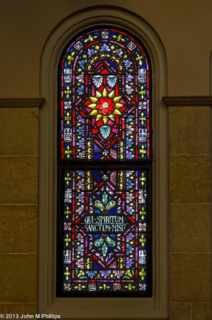
I did note the light coming through the stained glass and caught a few shots of individual windows.


In the original images, because the windows were set significantly higher than my camera, there was a perspective problem in that the windows' tops were further away than their bases, so the sides of the windows were not parallel.  My software allows me to correct for this in post processing, giving the appearance of having the camera situated directly across from the windows.  Looks OK, I think.  I tried to underexpose these shots overall to avoid "blowing out" the light from the windows themselves.  As a result, the walls appear somewhat underexposed.

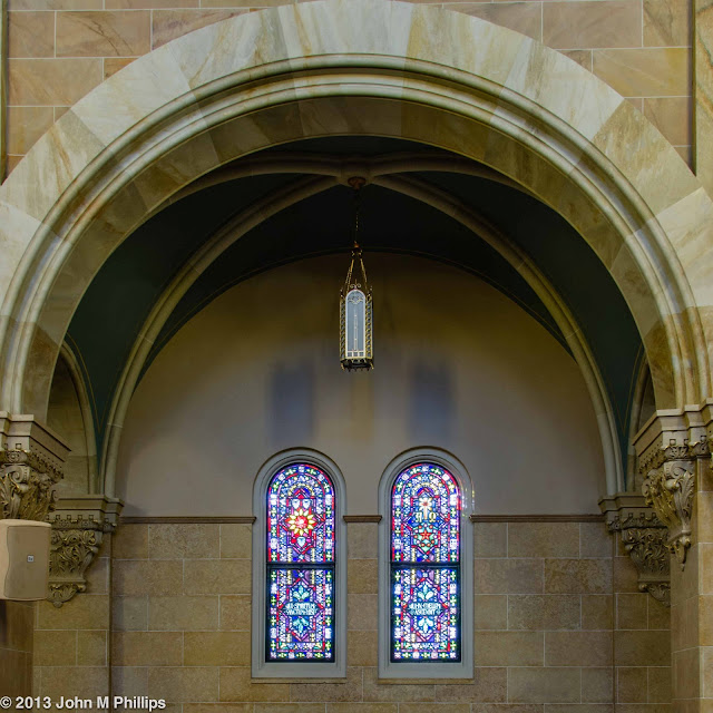
I probably should have spent more time with the windows, but what caught my attention on this visit were the many arches throughout the interior of the sanctuary, and I wound up with a plethora of images of those architectural features--with a mixture of success and failure.  Here, for example, is an image of one of the classic roman arches that frames two of the windows.


A problem with this shot is that I have clipped off the top of the arch.  Below is a better shot.


Here there is ample space above the top of the arch.  I like the additional space at the bottom of the windows also.  These two shots are of the same arch, and the windows are virtually identical in size in the two shots.  The "secret" is that the second shot was taken from farther away.

(I am not sure what has caused the darker areas above each of the windows.  At first I thought it might be some sort of artifactual problem relating to the camera lens and the light coming through the windows.  But the same darker areas appear also in other images taken from a very different angle, so the cause remains a mystery.)

The "corridors" on either side of the sanctuary have a very interesting ceiling structure.  Here is a wider-angle shot of one of the corridors.


I spent a good deal of time trying out various perspectives in an attempt to capture the detail in these ceilings.  Here is an off-center shot.


It's kind of nice that the photo includes some of the ornate plaster work at the bases of the arches, as well as the hanging light fixtures, but I can't get over the feeling that the lack of symmetry is creating an overall imbalance in the shot.

Here are a couple of more detailed (and symmetrical) shots of the ceiling areas.


Of the two, I feel the latter is the more interesting image, as in incorporates more of the lower arch. The two sides, strictly speaking, are not symmetrical, but I am OK with that.

I seem to have spent even more time trying to capture the complex arches involved with these corridors.  Here are two similar shots, using a landscape orientation.


One of my goals with these shots was to place the light fixture in the lower right of the image.  In the first shot I have isolated the light against a relatively plain background.  (These are photos of two different arches and light fixtures.)  Although something could be said for isolating the light fixture in the first shot, overall I believe the second shot is the better of the two.  Incidentally, the second shot was taken at an aperture of f/13 and an exposure of a whopping 15 seconds.

Here is another, similar shot taken in a portrait orientation.


I liked the way the sconce lighting was reflecting off the wall in the lower right.  There was a great disparity in the amount of light across this shot:  The green of the ceiling was very dark relative to the lighter color of the marble walls and arch, and I had to work quite hard in post processing to bring some definition to the dark ceiling without washing out the marble.  The problem with this shot is that I have clipped off the top of the arch as well as a portion of the support pillar on the left.  Here is a better shot of the same structure.


Finally, I took some shots intended to feature the support columns.  Here is one of those.


The plaster detail at the base of the arches is quite sharp in this image, which was shot at f/8 with an exposure of 3 seconds.  However, the marble appears a bit washed out.  I decided that this image might be more interesting as a black & white.


And here are a pair of similar shots taken in a landscape orientation.


Again, the focus on the detail work was quite good.  In this case, I think there enough variation in the coloration of the marble to make this an interesting shot both in color and in black & white.

Of the Milwaukee area's two Roman Catholic basilicas, Holy Hill has by far the best location, being set at the top of a hill in the middle of the Kettle Moraine and surrounded by a large woods of deciduous trees.  (The color in the fall can be stunning.)  However, the interior of the other basilica, St. Josephat's on Milwaukee's south side, is much the more spectacular.  Holy Hill's interior is interesting, though, and I am thankful that both churches permit amateur photographers like me to come in and take pictures.

Sunday, April 14, 2013

MITCHELL DOMES: COMPOSITION

After spending March in Arizona, I finally made my way back to the Mitchell Park Domes on April 13.  There was enough new to shoot that I felt good about the outing.

One of the things I have been working on (or at least thinking about) is including a context in some of my macro shots.  Here is a shot of a lily in which I did not manage to do that.


In this shot I was focusing on featuring the way the flower's petals were curving back.  I chose to shoot the back of the flower because the front of the flower was rather messy, what with its stamens and pistil.  For some reason the petals appear dark.  I tried ramping up the exposure in post processing, but then the petals appeared "blown out," that is, overly bright.  Perhaps I felt it was more important to bring out some of the texture in the petals.

And here's a shot where I did intentionally create some context.


I liked that the buds had the very same color palette as the blossom.  In a sense, the buds were just as much the subject of the image as the blossom.  I didn't mind that the flower was off to the left or that the lower portion of the largest petal was cut off.  I tried this shot in a variety of apertures.  This was shot at f/16, focused on the center of the flower, which kept the buds in adequate focus.  I wish that there had been better definition between the petals of the flower.

Here is a shot of a very red rose that didn't quite work.  


The upper edges of the flower were all pretty much in a plane, and I thought that if I opened up the aperture only the edges would be in focus.  That was true but perhaps there were just too many edges and the effect was simply to make the rest of the flower look out of focus.  The above image was shot at a very small aperture of f/51, keeping everything in focus.  I liked that I placed the heart of the rose off-center and that I just barely left a bit of space to the left.  I did not crop this shot in post processing.

Here is a plant in the tropical dome that has very attractive leaves, which are perhaps 10 inches long.


I took a few shots of individual leaves of this plant, including the leaf on the right that is seen nearly edge-on.  In the end, I thought the unstaged look of multiple leaves in the above shot was the most interesting, as it provided a context.  It looks a little unbalanced, but I wanted to include all of the edge-on leaf in the image.  The leaves were fairly dark, as was the background, so I unexposed this shot some to avoid having the camera think it had to overexpose the shot.

In the following shot I was more interested in the texture of the main stem and in the curve of the smaller stem leading to the blossom than in the blossom itself.  But I did want to include a portion of the blossom for context.


Here again I played with a number of apertures.  I wanted to keep as much of the stems and blossom in focus as I could without creating a distracting background.  This was a compromise, at f/16.  The background is sufficiently blurred out, I think, to minimize its distraction quotient.

Here is a flower from the tropical dome that I have shot many times.  I was attracted to this particular flower for its wart-like central stalk, and that is certainly where I set the focus, which is really quite sharp.


But I was also attracted to the green tip of the flower's otherwise red "petal."  This was shot at f/18 which kept most of the petal in relatively good focus, including the blend of colors in the petal.  This shot was not cropped in post processing.  I'm not sure whether I should have left some space above the petal edge on the left.

The Domes were featuring an exhibit of Japanese flower arrangements in the common area between the exhibit domes.  The rose in one of the shots above is from that exhibit, as was the following shot.


Again, I played with a number of compositions to find one that would create some context, namely, that there were other examples of the ball-like flower in the display.  I also played with a number of depth of field choices.  I finally settled on this one, with a wide-open aperture of f/4, which nicely blurred out the other flowers.  It resulted in leaving only a portion of the featured flower in good focus--the margins were out of focus--but I was OK with that.

Finally, here is a shot of a flower in one of the other floral arrangements.


Originally, I did not intend this as a square composition, although the original image didn't include much more of the flower.  In truth, in post processing I noted that there was a light background in the lower left of the image and decided to crop the shot down to include nothing but the flower and that light background.  The colors in this flower seemed almost surreal.  And, in fact, I significantly underexposed the shot to tone down the colors.  In post processing I tried to investigate some definition in the flower's dark center, but there simply wasn't much there.

Tuesday, April 9, 2013

PHILIP HAAS: FOUR SEASONS

The Italian Renaissance artist Giuseppe Arcimboldo created four paintings that were made up of flowers, vegetables, and other plants that collectively created men's faces in profile.  Contemporary artist Philip Haas has recreated those faces as three-dimensional fiberglass sculptures.  Currently, those sculptures are located at the Desert Botanical Garden and I took a number of photos of them during my visits there.  The sculptures are quite large, standing perhaps 12-15 feet high.  Here is a wide-angle view that illustrates how large they are.


And here are each of the sculptures individually, beginning with Spring . . .


Summer . . .


Autumn . . .


And Winter . . .


Pretty impressive.

SCOTTSDALE SCULPTURES, AGAIN

I wanted to do a couple of more posts relating to our time in Scottsdale.  Toward the end of March I returned to downtown Scottsdale one more time to get some more shots of sculptures.  One was of the Don Quixote sculpture in the civic center plaza.


I like this sculpture a lot because of its abstract representation of the literary figure.  I think it is important to position the sculpture as a silhouette figure agains the white of the fountain behind it.  However, this is more difficult that it looks as ideally the camera should be about 10 feet off the ground, which is not possible without a ladder.  This was about the best I could do.

Here is a similar shot of "Woman and Fish" which is located near the Don Quixote sculpture.


Again, I thought the best approach was to position the sculpture in front of a fountain.  Here I intentionally positioned the sculpture off-center.

And here is another well-known sculpture that I have shot numerous times before.


There are a number of LOVE sculptures scattered around the world and I am sure that it has been shot many thousands of time, so it is difficult to think of a different look.  Here I decided to crop out part of the sculpture, leaving just enough to make it recognizable.  Not sure if this works.

There are a couple of bronze sculptures of "western" figures that I had not shot before.  One is of a man and his dog.  For some reason I decided to feature just the man's back, featuring the rope that he was carrying.


There is also a sculpture of a couple of men on horseback with one rider attempting to pass a bag to the other.  It's a great sculpture, but it is hard to capture because the backgrounds around it are very busy.  I could only isolate the sculpture by presenting just a portion of this large piece.


Doesn't really work.  But I do like the intensity on the face of the second horseman.

There is a plaza in the northwest section of Scottsdale's business district that includes an interesting if weird sculpture made of fabric stretched over a wire framing.  The sculpture stands perhaps 15 feet tall and is open on one side so that one can stand "inside."  Here are a couple of shots of the figure from the inside.


Strange, but I liked the abstract pattern that the structure was creating.