Sunday, March 31, 2013

CADILLAC RANCH

Cadillac Ranch is located just to the west of Amarillo Texas and is visible from the interstate.  It consists of 10 classic Cadillacs that have been buried nose-down in a cow pasture.  Although this "work of art" is located on private land, it is publicly owned.  The work was created in 1974 and the Cadillacs all date from 1948 to 1974.  On a couple of occasions the cars have been painted either all white or all black.  However, generally, the cars have been the continued subject of graffiti, which the city of Amarillo tacitly encourages.

We were rolling into Amarillo after a hard day's drive from Flagstaff AZ when I spotted the cars, which are situated perhaps 250 yards off the road.  I took a quick shot before we headed on to our hotel.  Here is what the sculpture looked like from the highway.


 Observe the incredible flatness of the prairie and the absence of trees.

After we checked into the hotel, we returned for a closer look.


There were a number of people wandering around the entire time we were there, and it would have been futile to try to get a clear shot unless I had come back at sunrise (and we were way down the road by that time).  The site was also littered with hundreds of spent spray paint cans left by the graffiti "artists."

Here are a couple of closer in shots showing the graffiti.


Not super great.

And here are some even closer in shots.


These last shots illustrate how thick the paint was, indicating that the cars have been painted dozens--perhaps hundreds--of times over the years.

To my mind the work would have been more powerful if it had not been covered with graffiti, but apparently that would have been a losing cause, so the city went the other way and instead encouraged it.

According to Wikipedia, the cars were buried at the same angle as that of the sides of the Great Pyramid of Egypt.  Huh?

Saturday, March 30, 2013

AMARILLO TEXAS

On our trip back to Wisconsin from Arizona, we stayed one night in Amarillo, the largest city in the panhandle of Texas, with a population of 200,000.  The city sits on a virtually flat and treeless plain, a stark and, in some ways, stunning landscape for someone like me who is accustomed to a rolling, wooded terrain.  Here is a photo of a water tower (actually two towers) across the freeway from our hotel that illustrates my point.


The dramatic quality of this shot was helped by having an overcast sky behind the towers but with the late afternoon sun lighting up the towers through a gap in the clouds.  Placing the horizon near the bottom of the photo increased the amount of sky as negative space, helping to draw more attention to the towers.  I just wish there had not been a building in front of the larger tower.

I also noticed a house across from the hotel.  (OK, so there were a few trees next to the house, but they had evidently been planted at some time in the past and, besides, they were all dead.)  Not sure whether anyone was living in this house.  There was a great deal of this sort of scene as we drove across New Mexico and Texas.


The hotel we stayed at was practically brand new but was situated right next to a large, fully dilapidated warehouse constructed of corrugated metal that was now quietly rusting.  I took a number of close-ups of the corrugated metal.  Here are a couple of those shots.


Interesting as abstracts, perhaps, but I have done a number of this sort of shot recently, and these don't seem to add much to what I have done before.  I did also take a number of wider-angle shots.


I like these shots more than the close-ups, in part, I think, because the light from the evening sun had enhanced the contrast in the corrugation, particularly the sections that had been bent out of vertical.  In addition, these shots tell more of a story that do the close-ups.  How did this destruction/deterioration happen and why?

I also took a shot inside the building.


I was really happy with this shot, but only after I spent a good amount of time with it in post processing.*  I was particularly happy with the detail in the scene out the entryway on the opposite side of the building.  The image almost has the appearance of an HDR shot, but it is not.  This shot was taken at an aperture of f/9 for 1/80th second at an ISO of 400.

Finally, as I was looking for shots two persons walked out from behind the building.  One was a young African American dressed in a tux and a black stetson hat and carrying a saxophone.  Not who one would expect to seen in that setting.  The other, as it turns out, was a female professional photographer.  They apparently were looking for contrasting backdrops to take portraits of the saxophonist.  Before I had figured out what was going on, I had asked to take the saxophonist's picture, and he was gracious enough to let me.  


This is not a good shot technically, but I'm glad I got it anyway.

*Here's how that interior shot looked initially.  


Even though I had instructed the camera to "overexpose" the shot some to try to compensate for the light coming from the holes in the roof and the entryway on the other end, the interior was still badly underexposed.  However, by cropping down the top and left side, brighting the dark areas, and fiddling around with the sharpness and the general contrast, I was able to produce the shot as it first appears above.  Yes, this is the same shot.

Wednesday, March 27, 2013

RUST

On this visit to Scottsdale, I somehow became enamored with rust as a source of texture.  It was most evident at Scottsdale's Arabian library (see my post of March 20).  As a reminder, the library building is completely sheathed in iron plating that has been allowed to rust.  Here is the entry to the library.


And here are a couple of additional photos of that sheathing.


One of the shops in downtown Scottsdale was similarly clad in iron plating, as the following illustrate.


And here are a couple of wider angle shots.


It helped, I think, that the seams appeared to be on an angle.

Finally, I also spied some wrought iron work that had been allowed to rust.


As my wife has pointed out, none of these shots is a stand-alone image.  In other words, they will not be framed and hanging on our walls any time soon.  But I do like the texture that the rust creates, and the rich, warm color also helps.

Tuesday, March 26, 2013

CLASSIC CARS SCOTTSDALE

In March of 2012 when we were in Arizona, I visited a classic car dealership in Scottsdale and posted photos from that visit (see post of 3/22/12).  In 2013 I did the same thing.  I would have to say that the quality of cars at the dealership this year was not as strong as it had been the prior year.  One of the employees told me that the dealership was moving to a different location shortly, and that may explain why things looked a bit neglected. I did, though, take photos of some of the cars that were on site.  Here are a few of those shots.

There was an Edsel on the lot that was in excellent condition.


I liked that I took this second shot off-center.

Not sure what would possess someone to own an Edsel, other than the novelty of owning an iconic loser.

Most of the cars in excellent condition were in the showroom, including a Porsche . . .


a Ford . . .


and a Corvette.


It was a Saturday afternoon and there were a few prospective customers wandering around.  I would assume that most individuals looking to purchase a classic car would have a specific make and model in mind--their heart might be set on a late 50s Ford, for example.  However, the individuals I saw seemed to be wandering around looking at any or all of the cars on offer.  That leads me to think that they were just curious and not really serious.  But what would I know?

Monday, March 25, 2013

MUSTANG LIBRARY III: SEARCHING FOR ABSTRACTS

I couldn't help myself.  I returned to Scottsdale's Mustang Library yet again to take some more photos.  I chose Sunday morning because the library was closed and I felt comfortable spending some time on other parts of the building without the distraction of other people.  After I looked at what I shot, I was asking myself, What am I trying to do?  For the most part, my intention was not to capture the overall building or its architecture.  Instead, I was looking for abstracts, but not necessarily pure abstracts, rather, abstracts that were recognizable--what I have referred to as intelligible abstracts.

Why am so focused on abstracts?  First, I am looking for something that I have control over.  By closing in on abstract detail, I can generally eliminate extraneous elements that I feel will detract from the overall composition.  Second, I still have the fantasy that I can to do something artistic, something that could be framed or at least that others might find interesting.  Third, I simply think I can do abstracts better than broader landscape, nature, or architectural photography.

Scottsdale's Mustang Library offers all sorts of opportunities for abstracts.  It is filled with complex lines and includes multiple bright colors.  Bright sunshine casting sharp shadows adds to the possibilities.  But the fact that the building offers ample opportunities for abstracts doesn't mean that they "work."  Here is a photo of a door at the rear of the building (actually, a portion of a door).


I like the colors, but I guess I would have to ask what is the point.

Here is another shot that has, I think, a bit more interest.


This shot has more color and it helps that the lines are at contrasting angles.  The dappled shadows on the back wall also add some interest.

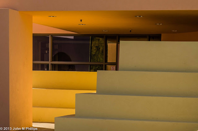
Here are a couple of shots from the front of the building that feature some low stacked walls that appear to serve no utilitarian purpose.  The first shot includes a background area that adds depth.  I liked the quality of light on the underside of the exterior ceiling.


Here is another closer shot that is focused in on the lines of the stacked walls.


Although the colors create some interest, maybe it's a bit simple.

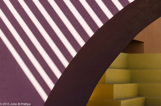
Here are shots that feature both the stacked walls and the shadows created by the sun streaming through the pergola above the main entrance to the building.


I like this first shot for its lines and simplicity.  However, the violet portion is too dominant resulting in a composition that lacks balance.  Besides, what's the point?  Here is another shot that I feel has more balance at least.


But that six-sided bright spot is too strong and creates a distraction.

In the following shot I limited the composition to just the stripes.


OK, so this is really abstract.  I'm not even sure what this is a photo of, and I'm the one that took the shot.  I do like it, but there's no story.  Too simple, I think.

Although the scene in the background of the following shot doesn't have the clean lines that the rest of the shot provides, the depth does help to create some sort of meaning (I think).


And the following shot also evokes some depth, though it is a bit "simple."


I have to confess that there was the branch of a tree that intruded on the lower left side of this shot and I excised it in post processing.

One side of the building featured an extensive pergola that was casting interesting shadows, and I started taking shots of the pergola itself.


I liked that the slanting streaks of light on the supporting joists extended only halfway across the image in this shot.

Then I realized that the sky could add another color to the mix.


I thought this last was the most powerful of this group of shots.

Finally, I noticed that the library was being reflected in a nearby glass-faced building.


Usually, in reflection shots, it is a challenge to keep me and my camera from appearing in the image.  Here I was able to solve this problem by arranging the shot so that my reflection would have appeared in the nonreflecting portion of the wall on the right side of the image.

So what are my conclusions?  Most importantly, the photo needs to be more than simply an abstract; it needs to tell a story, either through creating depth or through context.  Second, the shot needs to have balance.  Third, it needs to have sufficient complexity.

One more note:  I had brought my tripod for this shoot, but decided that the Arizona light was bright enough that I could take the shots handheld.  I was happy with the overall clarity of the shots; they are really quite crisp.

Wednesday, March 20, 2013

SCOTTSDALE APPALOOSA LIBRARY

Appaloosa is the newest and northernmost branch of the Scottsdale library system, opening in 2009.  Although it doesn't have quite the architectural impact that the Mustang and Arabian branches have, it does have some notable features.

The most noticeable is that the color of the finish of the steel cladding of the building varies between aqua and lavender, depending on the angle between the viewer and the surface of the building, as in the following shots.


At a perpendicular angle, the color is lavender; as the angle becomes oblique, the color changes to aqua.  It is difficult to illustrate this feature with still photos, but it is obvious once you walk around the building and see the colors changing.

The second unusual aspect is that the building features rows of windows that spell out in Morse code the library's name: Appaloosa Library.


I didn't confirm this; I am taking their word for it.  Here is a view of some of the windows from the interior.  Just a bit weird.


The other feature of interest in the interior was the ceiling ductwork.


One may debate the wisdom of ceiling's "unfinished" look, but at least it makes for interesting abstracts.