I have photographed Milwaukee's Public Library before. But since the weather is cold and I am too much of a wimp to look for outdoor venues, I decided to return to the library. The library building was completed in 1898 and originally housed both Milwaukee's Public Museum and its Public Library. The museum got its own building in the 1960s, but I recall that when we first moved to Milwaukee in the 1970s the library building still housed a hands-on children's science museum, which eventually moved out sometime in the 1990s.
The building was designed in a neo-renaissance style that includes robust pillars in front and a central dome above an entrance atrium. Incidentally, Frank Lloyd Wright was one of the architects who bid on the project and lost. The building would undoubtedly have had a very different design had Wright won the bid.
I spent virtually all of my time photographing the interior of the very ornate entrance atrium; that is, after being questioned by library personnel who wanted reassurance that I would not take pictures of people and would not use the photos for commercial purposes. Not a problem.
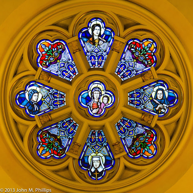
Deciding what to photograph made me think about what I should do to capture the building's architecture. Of course, one of the first things I did was to shoot the central dome simply by putting the camera on the floor pointing up.
I could have cropped this as a square and included just the circular dome. However, I did want to show as much of the side walls as my lack of a true wide=angle lens will allow. The widest I can do is 24mm, which is fairly "wide." However, my camera has a "crop" sensor, which makes the field of view equivalent to 36mm, not really wide-angle.
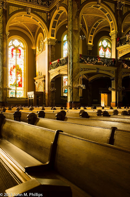
Since I could not get a shot of the ceiling as well as all of the side walls, I decided to shoot what I could, as in the following.
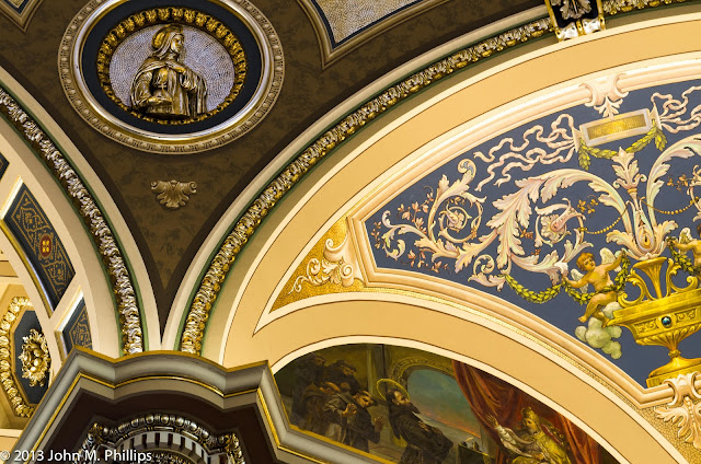
I think this shot actually gives a better sense of the atrium space. and some of the architectural detail. In trying to capture the architecture, I felt there were two components. One was the richly textured detail in the hallways and granite stairways, as in the following.
The stonework is gorgeous, but I'm not sure my photos have done justice to it.
The other component consists of the symmetrical designs of the upper walls leading to and including the dome. I found myself compelled to try to capture those symmetries in effect as abstracts. One thing I had learned was that to shoot those symmetries, it was important to get the camera lined up accurately. If the camera is off center by even an inch or so, the imbalance is noticeable in the image and just cannot be fully corrected in post processing.
In this shot I liked that I was able to include both the patterns in the background as well as the arch in the foreground (although a close inspection reveals a lack of symmetry).
Here is an HDR shot that I attempted.
And a wider shot . . .
that I also turned into a B&W.
Finally, here are a couple of wider angled shots.
In the end, I am still wondering how best to shoot architecture. Am I just creating abstracts out of the symmetrical detail or am I reflecting the character of the architectural design.
Friday, January 18, 2013
Thursday, January 17, 2013
MILWAUKEE CITY HALL RE-REVISITED
I was not entirely happy with my last visit to City Hall, earlier this month. First of all, there were Christmas decorations all over the place, including evergreen boughs on the railings of each of the balconies. Second, there was a very large Christmas tree positioned in the center of the atrium. As a result, it prevented me from taking certain shots, including one straight up from the floor of the atrium. And, third, in looking over my last set of photos, I realized that what most got my attention were the curved railings at either end of the atrium and that wider views of the balconies were too busy.
So . . . Here is my ceiling shot.
And here is a shot of the curved railings.
The other thing I did was to experiment with some high dynamic range (HDR) shots. As a reminder, these involve taking multiple shots of the exact same scene that are different only in terms of their exposure. These differences are in terms of the length of the exposure; the aperture remains constant so that the depth of field does not change. Then the images are blended using post processing software. In these shots I blended three images, one at a normal exposure, one exposed for four times as long (overexposed), and one exposed for one-fourth as long (underexposed). I really didn't know what to expect. Here is one of the shots. First, as a comparison, is the single, normal exposure.
And here is the HDR shot.
I was expecting a significant increase in contrast in the HDR shot, but I didn't really see much difference. What I did see was an increase in color, particularly in the upper floors.
Here is another shot that illustrates that result even more strongly. First is the normal shot.
And this is the HDR version.
Here the colors are ranging from yellow at the bottom to a pink hue at the top. I kind of like it.
Sunday, January 13, 2013
TIGERS
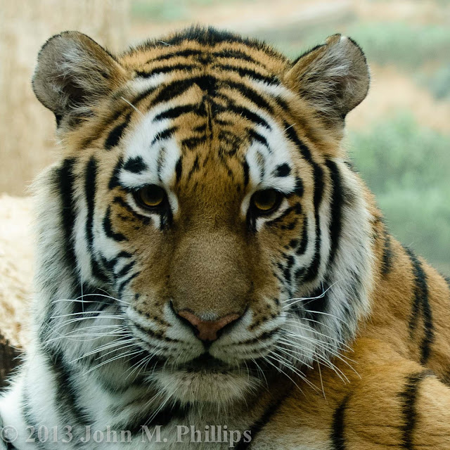
On my recent visit to the Milwaukee County Zoo, with only a couple of exceptions, I was a little disappointed with the opportunities I had to get good shots of the animals (or at least my ability to take advantage of the opportunities I had). One of those exceptions was the tigers. They were inside for the winter--or at least for the day--which means they were behind glass, and that can present its own problems of glare and smudges, but it can also mean that the animals are a lot closer. The enclosure included three cats, one of which was sleeping and not really in a position to be photographed. A second cat was lying toward the rear of the enclosure but very photogenic.
But the real star was a third cat lounging about six feet behind the glass and looking totally bored.
But at times he or she was also looking directly at my camera.
Here is an essentially uncropped close-up.
And here's the cat just showing off.
But the real star was a third cat lounging about six feet behind the glass and looking totally bored.
But at times he or she was also looking directly at my camera.
Here is an essentially uncropped close-up.
And here's the cat just showing off.
Pretty nice, eh?
MANDARIN DUCK
Last week I took advantage of the unseasonably warm weather to pay a visit to the Milwaukee County Zoo--with my camera, of course. Even though I took quite a few photos, I was happy with the shots of only a couple of animals.
The first of these was the mandarin duck. I am sure I have seen these before, but this time their brilliant colors blew me away. Plus, in the zoo's aviary they let me get within about six feet. They must be very accustomed to human contact. Here are some of the shots I took.
The first of these was the mandarin duck. I am sure I have seen these before, but this time their brilliant colors blew me away. Plus, in the zoo's aviary they let me get within about six feet. They must be very accustomed to human contact. Here are some of the shots I took.
Thursday, January 10, 2013
ST. JOSEPHAT'S REVISITED
Given that it's winter in Wisconsin, I have been looking for indoor venues to do some photography and stay warm, and on Monday, January 7, I found myself back at St. Josephat's Basilica, a stunning Roman Catholic church on Milwaukee's South Side. I have visited St. Josephat's before, most recently last October. To some extent, that makes this post repetitious but I have also tried to capture different aspects of this amazing place.
I spent perhaps two hours taking photos this time and, interestingly, there were fewer than half a dozen other people in this large church during the time I was there. And no one questioned my taking photos, including the use of a tripod. They must just have assumed that I was authorized to do so or else they are just accustomed to having photographers coming to take pictures.
OK, so one of the great aspects of this basilica is it's dome. Here is another shot of the interior of the dome. I still wish I had more wide-angle capability.
Reminds me of the old TV test patterns from the early 1950s.
And here are some wide-angle shots (as wide-angle as my lenses permit, anyway) of the general interior.
It keeps amazing me how virtually every square inch of the complex interior walls are covered with murals, images, and other patterns.
Although the above images are not symmetrical, I still keep finding myself making sure that many of my shots take advantage of the building's symmetry, as in the following shots of the ceiling above the sanctuary.
And here are a couple of shots that feature portions of the dome as well as other portions of the ceiling.
In addition to its stunning walls and ceiling, St. Josephat's is blessed with wonderful stained glass windows. Capturing stained glass is more difficult than it might seem. First, there is generally a great difference between the amount of light coming in the windows and the church's interior walls, which may be quite dark. In many cases this means that the walls need to be left black to avoid "blowing out" the light from the windows. Second, the windows may extend quite high above the floor. As a result, the top of the window may appear much narrower than the lower portion, although there are post-processing tools that can help to correct that appearance. Here are a few of the shots that worked out OK.
I took this last shot in a foyer area where the interior lighting was much stronger.
On this visit I tried to pay more attention to the vaulting between the support columns and the ceiling. Here are a few of those shots.
I particularly liked this last shot because of the lines curving from the column to the upper right hand and lower right hand corners of the image.
Finally, as a technical point, I took a few high dynamic range (HDR) shots. This requires taking multiple shots of the exact same scene but at different exposure times and then using post-processing software to blend the images together. A typical arrangement would be to take one shot at a normal exposure, one significantly overexposed (say, 4 times the exposure time), and one significantly underexposed (say 1/4th exposure time). I thought I would show how one of these turned out.
First, here is the shot taken at normal exposure.
And here is the shot in HDR.
I was impressed by how much more the HDR photo "pops," hopefully, without being garish.
I spent perhaps two hours taking photos this time and, interestingly, there were fewer than half a dozen other people in this large church during the time I was there. And no one questioned my taking photos, including the use of a tripod. They must just have assumed that I was authorized to do so or else they are just accustomed to having photographers coming to take pictures.
OK, so one of the great aspects of this basilica is it's dome. Here is another shot of the interior of the dome. I still wish I had more wide-angle capability.
Reminds me of the old TV test patterns from the early 1950s.
And here are some wide-angle shots (as wide-angle as my lenses permit, anyway) of the general interior.
Although the above images are not symmetrical, I still keep finding myself making sure that many of my shots take advantage of the building's symmetry, as in the following shots of the ceiling above the sanctuary.
And here are a couple of shots that feature portions of the dome as well as other portions of the ceiling.
I took this last shot in a foyer area where the interior lighting was much stronger.
On this visit I tried to pay more attention to the vaulting between the support columns and the ceiling. Here are a few of those shots.
I particularly liked this last shot because of the lines curving from the column to the upper right hand and lower right hand corners of the image.
Finally, as a technical point, I took a few high dynamic range (HDR) shots. This requires taking multiple shots of the exact same scene but at different exposure times and then using post-processing software to blend the images together. A typical arrangement would be to take one shot at a normal exposure, one significantly overexposed (say, 4 times the exposure time), and one significantly underexposed (say 1/4th exposure time). I thought I would show how one of these turned out.
First, here is the shot taken at normal exposure.
And here is the shot in HDR.
I was impressed by how much more the HDR photo "pops," hopefully, without being garish.
Sunday, January 6, 2013
CALATRAVA REVISITED
Call me cheap. The Milwaukee Art Museum has free admission on the first Thursday of each month, and this January I decided to take advantage of that offer to do some photography. I have shot various aspects of the Calatrava addition to the museum numerous times because of the abundant interesting architectural lines that the structure offers. I just can't help myself, I guess.
As a reminder, here is a shot of the exterior of the addition with its brise soleil extended.
For me, the star of the show architecturally is the large central atrium. On this free admission day the atrium was very crowded, so it would not have been possible to get a clean shot of the atrium's front prow.
But, in fact, I think the people in the scene help to provide perspective.
Here is another, vertical shot.
I took both of these shots from the atrium's exact center line to ensure symmetry. But I also took a number of shots off-center to see what kind of effect that would produce.
I also took some shots of the atrium's "ceiling."
OK, I realize that these shots are very difficult to interpret for someone who has not been to the museum. Even so, I like them for their abstraction and for their symmetry.
In addition to the atrium and meeting rooms and eating areas to the south, the Calatrava includes a special exhibit area, gift shop, offices and other spaces running north to the museum's main exhibit halls. These spaces are flanked both east and west by long corridors. In terms of architectural detail, I have been fascinated by the recessed lighting along these corridors. Here are a couple of shots of that lighting.
These corridors also feature striking support ribs. Here is a shot of those.
I liked the way these ribs converged in the right of this shot. Somehow, as I was trying to get the right color balance for this shot, the supports came out a bit blue-green, while the walls were turning a bit pink. Not the "true" colors, but I like the effect anyway.
I didn't ignore the actual art work, although I did not attempt to get into the special exhibit because there were long lines owing to the free admission and because no photography was allowed in the special exhibit anyway. I have found that I am drawn more to sculpture and other three-dimensional art than to wall art because there are more options available in shooting those objects.
Here is the head of a dragon being slain. I liked the emotion that the artist had caught.
And here is a "sculpture" that features chrome-plated objects situated in front of mirrors that created multiple images.
Below is one of my favorite sculptures, a nude woman (obviously) that is positioned in the west corridor, leading north from the atrium. Note the structural supports in the background.
The museum is situated on the shores of Lake Michigan and there are ample opportunities to incorporate the lake views. This is an outdoor sculpture.
And this is a general scene of a point of park land extending out into lake to the north.
I liked how this shot came out, including the use of negative space.
Subscribe to:
Comments (Atom)


