Tuesday, October 30, 2012

ST. FRANCIS OF ASSISI CHURCH

The St. Francis of Assisi Church was completed in 1877 by the Capuchin Franciscan order of the Roman Catholic Church.  The church is situated in the Brewer's Hill section on the near north side of Milwaukee.  Originally, the parish was established to serve Milwaukee's German immigrant population.  Over the years, the surrounding neighborhood has become predominantly African American and Puerto Rican, and the parish now especially caters to those populations.

A friend had mentioned to me that her son was going to be married in the church in a few weeks and that the church had a beautiful interior.  So I called the parish and asked if I could take some photos for personal purposes.  They were very gracious in letting me spend an hour in the church on Monday morning, October 29th.

Churches make good photographic subjects because they often offer a great deal of ornamental detail.  Their architecture also cries out for shots that take advantage of the structure's abundant symmetries.  I'm a sucker for those symmetries.  Here are a few of the wide angle shots I took that feature the church's overall symmetry.


The church personnel were generous in letting me take photos from the organ loft, and this second shot is from that location.


And here are a couple of detail shots of the altar area.


I brought my tripod for this shoot, and I was grateful that I did because, as usual, while the interior lighting was above average for a church, it was still low relative to outside.  The walls and ceiling were light, which made my job a little easier.  By using the tripod, I did not have to compromise the quality of the shots in terms of the choice of aperture and ISO rating.  As I have learned from experience, to nail the symmetry, I needed to position the camera directly on the axis of symmetry.  Even an inch or two to one side or the other can mean that it just is not possible to balance the shot by cropping in post processing.  Am I a little compulsive, or what?

The ceiling of the sanctuary was not great but interesting nevertheless.


I really liked the warm light coming through the windows on the left.

Here is a shot of the rear of the church, which included an impressive pipe organ.


As usual with interiors, there was a great difference between the amount of ambient interior light and the light streaming through the stained glass windows.  As I have done in the past, I opted to give more attention to the exposure of the interior and allowed the light from the windows to get "blown out."

Except that is, when I was shooting the windows themselves.


And here are a few more "detail" shots of the statuary in the church.


It would be nice to know when the various statues were added.  The first of the above shots appears to feature an African-American figure.

Although I am generally obsessed with symmetry, I did try a number shots taken at oblique angles.


I really liked this last shot because of the relatively simple curved lines that it features.  It makes a nice abstract.  I also converted it to a B&W, which also stresses the lines.


I wish I had "seen" more shots like this while I was at the church.

Before I left, I remembered to take some shots of the church's exterior.


Wow.  What a difference sunlight made in ease of shooting.

And here are a couple of shots of the lovely front entrance.


This last shot nicely illustrates the fact that the church serves both English- and Spanish-speaking parishioners.

And finally, a nice close-up featuring the church's simple wooden cross.


Taken with my Nikon D7000 with Nikkor 24-120mm f/4 lens.

Sunday, October 28, 2012

NATURE MACRO: CONVENTIONAL VS. ABSTRACT

Whenever I take my camera to the Mitchell Domes, I see lots of other visitors taking pictures also.  I have the feeling, though, that the pictures they wind up with are generally very different from the ones I come away with.  A lot of what I see others taking are photos of larger displays (as well as, of course, of fellow visitors).  I have never had success taking such displays.  They always come through as too mundane.

I also see others taking photos of individual flowers.  Not that I never take such photos, as shown here from my last couple of visits to the Domes.


I liked this first shot because of the background lighting (except for the minor flare just above the flower) and because of the way the stem fades into the dark of the lower background.  This flower, by the way, was only about 1/2 inch across.


Peace lilies are plentiful in the tropical dome.  I liked this one because the petal portion was nicely perpendicular to the large stamen (or whatever it's called) and the background was dark and nondistracting.  As a result, I was able to narrow the aperture (f/16) to maintain good focus for the entire flower.  Because the petal was so uniformly well-lit, it was difficult in post processing to bring out the petal's texture.


The above small (2-3 inches across) orchid was complex and interesting, but I found it very difficult to capture.  Just too much going on.

I guess you could call the following shot traditional in the sense that it captures all of the business portion of the plant.


A close look at this shot reveals hundreds of tiny, sticky globules on the leaves that I believe are intended to capture unsuspecting insects.  OK, so maybe this shot isn't exactly traditional.  But the following are even less mainstream.

I liked the following leaf because of the juxtaposition of very different colors that it included.


I also noticed a number of curly-cued vines on some of the plants, particularly in the desert dome.  In the following shot, I thought there was some interest in a vine crossing in front of plant stem.


The bottom portion of the vine was heading away from the camera and is out of focus, despite the lens's relatively narrow f/11 aperture.   There are distracting elements in the lower right that I was not able to eliminate without more work than I was willing to do.

Here is a traditional flower (OK, a portion of the flower) that I thought was interesting because of the petal that was curled up next to the center section of the blossom.


Because I was interested in the curled petal, I didn't want to include the whole floweras I thought the feature of interest might get lost in a larger image.  Besides, enough of the flower is shown that the viewer would not have any problem in extrapolating the rest.

Here is a portion of a petal of one of the orchids in the tropical dome.


I didn't think this shot worked very well.  My goal was to focus on the front edge of the petal and to allow the remainder to fall out of focus.  I wanted to feature the petal's complexity.  However, there just wasn't enough contrast to give balance to the overall composition.

The domes include a number of large-leafed plants, some of which can be nicely backlit by the sun.  Here is one of those leaves.


I set this shot to have the rib run on an angle and to have that balanced by the large brown splotch in the upper right.  Great Halloween colors.

I also found myself attracted by the following unassuming plant that had no blossoms but did have some interesting texture and colors in its leaves.  I wound up taking a large number of shots trying to capture those colors.  Here are a few.


And here is a close-up of one of the leaves that I liked because of its curled edges.


I really liked the rose color of the leaf next to the curl on the left.

One would have to admit that this collection of images is quite different from what most of the Domes' visitors would come away with.  As I have said before, particularly in macro photography, I find myself attracted to abstract patterns that are, nevertheless, recognizable (intelligible) at some level.  In part, this stems from the fact that I am not very skilled at capturing larger scenes without them looking very cliched.  Also, I am always trying to satisfy a need for artistic expression--or at least my notion of what might be artistic.

Taken with my Nikon D7000 with Tamron 90mm macro lens.

Wednesday, October 24, 2012

GHOST TREE ON A FOGGY DAY

Almost everyone who shoots landscapes likes a foggy day.  I think the main reason is that the fog simplifies the photographic process, effectively eliminating what might otherwise be major background distractions.

Tuesday, October 23rd, began with a dense fog, and as soon as it was light enough, I grabbed my camera to see if I could take advantage of it.  After cruising around looking for opportunities (and worrying that the fog would lift before I found something), I finally ended up in front of a modest stand of evergreens in Virmond Park.  I took quite a few shots, not being sure of what I would wind up with.  Here is an example.


Two things had caught my eye.  First was a tree with a curved trunk that I thought might be a point of interest.  Second was that while most of the trees were roughly the same distance from the camera, one of the trees was set further back, creating a "ghost" feel.  What I didn't like in this shot was the relatively large weed in the lower right of the image that I felt was a significant distraction.  I also didn't like that there was no separation between the base of the tree with the curved trunk and the tree to its right.

Here is another shot that excludes the distracting weed but fails to separate the curved tree from its neighbor.


Here is another shot, which I cropped as a square, in which the curved-trunk tree is nicely separated from its neighbor.


Now, however, there is no separation between a slender tree in the center of the image and a larger one to its right.

The following is probably the best shot of the bunch.

 
The curved-trunk tree is nicely featured, the slender-trunk tree at least has some separation from the tree to its right, and there are no major weeds to serve as distractions.  Plus the ghost tree is still featured on the left.  My one disappointment is that the there is some foliage from the tree in front of the ghost tree that detract from the latter.

A few more points:

First, I probably should scout out some locations that I know would include attractive subjects in a fog situation.

Second, it pays to move around a little and look for fresh perspectives.  What works and what doesn't isn't always clear until you are reviewing the shots in post processing.  What had attracted me to this general scene was not the ghost tree but the curved-trunk tree.  But once I realized that the ghost tree provided some depth, I felt that only those shots that featured it were worth retaining.

Third, in cropping these shots in post processing, I had to decide how much of the grass/ground to incorporate in the image.  I had shot all of these photos from a very low angle, assuring that the field behind the trees would not interfere with the general pattern of trunks against the fog.  However, I finally decided that including at least the base of the tree trunks provided more depth and context than cutting off the trunks above ground level.

Finally, I thought these shots would work best as B&Ws.  After all, the fog had muted nearly all of the colors from the shots.  However, I wound up feeling that the color that was there added significantly.

Taken with my Nikon D7000 with Nikkor 24-120mm f/4 lens and Nikkor 70-300mm f/4.5-5.6 lens.

Saturday, October 20, 2012

FALL COLOR AT HARRINGTON BEACH

Fall is my favorite season of the year.  The air can be bracing, but if one dresses properly that is not a problem.  Besides, the fall colors can be amazing.  Our summer had been hot and dry, and that probably contributed to fall colors that were more vibrant but also earlier than usual.  I kept admiring the colors but not doing anything about it.  Finally, on Friday, October 19th, I took my camera out to shoot some of what was left of the color.  Even though a lot of the trees had dropped their leaves, there were a fair number that we hanging on.

The day I chose was not one of those bright sun-drenched days where the sun could be counted on to backlight the trees, creating brilliant, splashy displays.  Rather, it was overcast and threatening rain.  The result was a drabness punctuated with muted color.  I was not discouraged because I knew that I could help things a bit in post processing.  Besides, in another week or so, the rest of the color would most likely be gone, and I would have missed my chance.  So I headed to Harrington Beach State Park, where I knew there were extensive woods that might provide some color opportunities.

On the way i spotted an open field with a line of trees and shrubs at one end and pulled over to take a few shots.  Here is the first.


What caught my eye was the layering of color, beginning with a grass field, a line of taller brown grass, then shrubs, then trees, and finally the sky.  The original shot included a lot of sky which held some interest, but I decided to crop it down to emphasize the fall colors.

Here is a close-up of a portion of the vegetation.


Nice, I think.  I very much liked the texture of the light colored grass at the base of the shot.

Here is a similar panoramic shot.


I especially liked the bright yellow tree toward the left and the maroon tree in the center.  This is testimony to the fact that even if most of the trees have dropped their leaves, there can still be enough color to make an interesting shot.  In fact, in some ways the rareness of the color helps to emphasize the color that remains.  I wish that the line of trees had not petered out on the right.  However, cropping the right side of the shot seemed to leave the composition out of balance.  The shrubbery extending to the right in the foreground helped to compensate for the absence of background trees.

When I got into the park, I first headed for the Lake Michigan beach.


A pretty angry and foreboding lake--and sky.  I turned this shot into a B&W and increased the contrast a bit to emphasize the ominous quality of the sky.


The park includes, not just a beach on Lake Michigan, but a lovely small tree-lined lake formed from an abandoned quarry.  On my way I spotted a young white birch set in front of a background of varied color.


I intentionally opened the aperture on the lens to isolate the birch from its background and to limit the background to color rather than to texture.  A little disappointing, I'm afraid, particularly considering the work it took to get the camera positioned where I wanted it.

I was also looking for opportunities where I could capture multiple fall colors.  Here is the best of those.


The small tree on the left was the most interesting, and perhaps I should have composed the shot around it, instead of trying to capture reds, yellows, and oranges in one shot.

On to the quarry lake.  Here are a couple of shots illustrating the remaining color bordering the lake.


It might have been a lot better if the waters of the lake had been still, but there was a fair amount of wind that effectively robbed the shot of reflections in the water.There was a bit more reflection opportunity in the following shot.


After circling the lake and because it had started to rain, I headed back toward the car, cutting through a woods of maples and oaks.  Here are a few of the shots from this portion of my shoot.


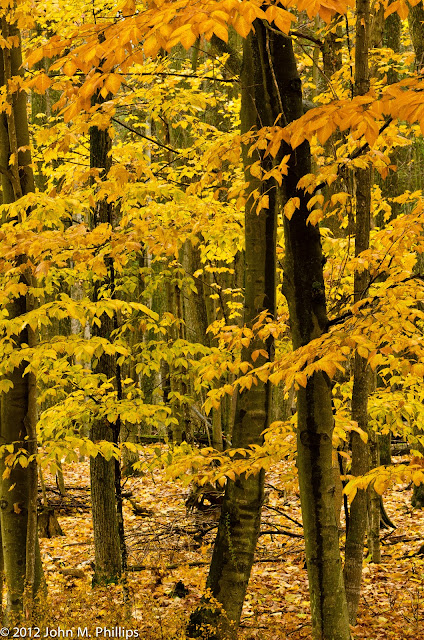
My goal here was to flood the image with color, punctuated by the dark of the tree trunks.  I thought that, by including the leaf-strewn floor of the woods, I was able to give the shot a better sense of depth.  But my favorite shot was the following.


I especially liked that the vertical tree trunks are balanced by the horizontal quality of the branches of leaves.  I also liked that there was some variation of color in the leaves.  The shot also shows some depth.  It was shot at an aperture of f/11.  Keep in mind that these shots were taken on a very overcast day that included off and on rain.

And here is a close-up shot.


I liked the simplicity of this shot.  I just wish that the branches and the leaves had fully filled the image, without leaving the gaps evident on the left.

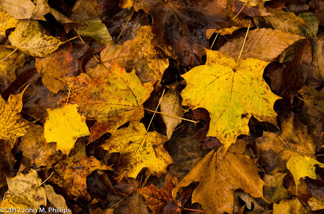
Finally, in my walk through the woods, I took a few shots of the leaves on the floor of the woods.


It always amazes me that visible light represents an extremely narrow portion of the overall range of wavelengths of electromagnetic radiation.  Even so, we humans are able to distinguish a multitude of colors within that narrow band.  Fall colors put an exclamation point on that fact.

Taken with my Nikon D7000 with Nikkor 24-120mm f/4 lens and Nikkor 70-300mm f/4.5-5.6 lens.