Friday, September 28, 2012

DOORS OPEN MILWAUKEE 2012: MACKIE BUILDING--GRAIN EXCHANGE

The Mackie Building, in downtown Milwaukee, was built in 1879 and originally housed the chamber of commerce and a grain exchange.  The Grain Exchange Room, three stories high and on the second floor of the building, included what is believed to have been the first ever commodities exchange trading pit.  The room was in use as a grain exchange until 1935, after which time it fell into some disrepair.  It underwent extensive restoration in the early 1980s and the grain exchange room now serves as a venue for various public and private events.  It is a glorious space that is not generally open to the public, so I was eager to take advantage of the Doors Open event to get some photographs.  I was not disappointed.

As stated, the Grain Exchange Room is located on the second floor of the building.  Here is an early shot of the second floor landing window. looking to the north out the front of the building.  It is a harbinger of the nice architectural touches to come.  The only distraction here was the fact that the building across the street was under construction.


One's first look at the Grain Exchange Room is stunning.  Here is a early shot of a corner of the room.  The light coming into the room was terrific.


The room has the twin advantages of having extremely ornate details, while appearing very large.  The sense of size is enhanced by the fact that the ceilings are perhaps 36 feet high, giving the impression that the room is cube-shaped.  In addition, the faux marble columns add to the majesty of the space.  Here are a couple of looks at those columns, which are highly ornate in their own right.


Here is another shot from the same location in which I was able to back off more to give a better sense of space.


And here is a shot looking up at one of the arches between columns from directly below, revealing the extreme attention to detail.


The room was filled with touches such as this mural . . .


and this decorative sheaf of grain, symbolic of the room's original use.


The amount of skilled labor that went into the creation of this room had to be enormous.  I cannot imagine that being duplicated in any contemporary construction.

I took a number of shots in an attempt to capture the size of the space.  Here are the best of those.  These first two were taken from the floor of the room.  


I was able to include a bit of the skylight in the center of the room.


This last shot was taken from a gallery one floor up from the main floor.  Even thought this was the widest angle I was able to capture, I fear that the shot appears a bit "sterile." I did like, however, the way light was reflecting off the column to the left.  In general, based on past experience, I took care to center the camera on the intended shot, as no amount of post-processing can compensate for a shot that is not centered.

I thought the best shot, the one that captured best both the ornate qualities and the size of the space, was the following "corner shot."


Visiting this place was when I really could have used a true wide-angle lens.

Taken with my Nikon D7000 with Nikkor 24-120 mm f/4 lens.

Thursday, September 27, 2012

DOORS OPEN MILWAUKEE 2012: SKYLIGHT THEATRE AND PABST THEATER

Two of the locations I was most interested in visiting and getting photos of were the Pabst Theater and the Skylight Theatre.  I have to admit that, in the end, I was a bit disappointed in what I was able to shoot in each.

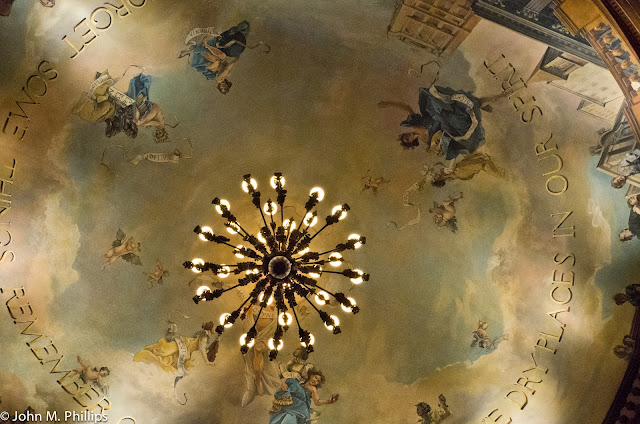
I visited the Skylight Theatre on Saturday, the 22nd.  I have had some personal history with the Skylight.  Early in my career I handled the estate of Mildred Lindsay, who was a major benefactress of the Skylight.  She had owned the property where the theater was housed at the time of her death in 1979, a converted garage in downtown Milwaukee.  She was also a good friend of Clair Richardson, the individual most important to the founding of the theater company in 1959, and set up a trust for him at her death that I administered briefly until his premature death in 1980.  Twenty-some years ago the Skylight, along with a couple of other theater companies acquired property in Milwaukee's Third Ward and converted it into a gorgeous theater space, and the Skylight has been there ever since.  The theater seats about 350 but feels much more intimate, I think because of the way the multiple balconies are structured.  The Skylight's ceiling is of special interest as it appears to be domed and has been hand-painted with various characters that were important to Milwaukee's political and cultural scene.  I thought the Doors Open event would provide me with a special opportunity to capture some of that beauty.  Not so easy.

First, the lighting in the theater was very low, requiring that I push the ISO up substantially.  Most of the shots were taken at an ISO of 2000 to 4000.  Second, because the space is so intimate and includes not just the ceiling but the sides and stage, capturing this requires a true wide-angle shot, and I simply do not have the equipment (yet) to do that.

Here is a shot of the area above the stage that includes a portion of the ceiling.


And here is an attempt to photograph the ceiling.


Not great, as I could not get the entire ceiling in the photo.  One comment about the ceiling.  When I entered the theater, a docent for the event asked if I was familiar with the theater and particularly with the domed ceiling.  I said that I was and that actually the ceiling only appeared to be domed; it was actually flat.  I said that the illusion was a good one but that you could see that the ceiling was flat by visiting the upper balconies.  She replied that she had been ushering at the theater for 16 years but had never known before that the ceiling was not domed.  Later, while I was trying to get shots of the theater, she remarked to some other visitors that the ceiling appeared domed but was actually flat and that she had learned this from "the gentleman taking pictures."  Unfortunately, I was not able to capture the dome illusion in these shots.

Here are a couple of shots in which I tried to give a flavor of the role that the balconies play.


I also thought it might be interesting to take some shots of the seating patterns.


Not great, but I also took a few shots from the rear of the auditorium of the backs of the seats.  I liked these a lot better, probably because of their abstract quality.


The Pabst Theater is located in downtown Milwaukee, and I visited it on Sunday, the 23rd.  The Pabst has a much longer history than the Skylight.  The current theater initially opened in 1895 and is the country's fourth oldest continuously operating theater.  It has a seating capacity of 1,350, about four times the size of the Skylight.  It hosts a wide range of live performing arts acts from individual musical performers to ensemble-cast theater productions.   In 1976, after a long decline, the theater underwent a major renovation and now is considered one of the premiere theater venues in the city.  In 1989 it became part of a larger complex that includes the three venues of the Milwaukee Repertory Theater, as well as an office tower and hotel and restaurant.  

I had passed by the theater on Saturday, the 22nd, and had taken a few exterior shots in the brilliant sunlight.


It was a different story on my visit to the interior on Sunday.  Again, the light was very low.  Also there were great numbers of other visitors.  Finally, my lack of a true wide-angle lens made capturing the space very difficult, despite its larger size.  Here is an attempt at shooting the balcony areas.


And here is a photo of the main floor seating.


Visitors were allowed up on the stage and could view the inner workings of the theater.  Here is a shot of that area.


I actually liked this shot.

The auditorium features a two-ton chandelier, and here a a couple of shots of that feature.


A word about these photos.  The first was taken from directly below the chandelier and includes some shadows created by lighting from the side.  The second was originally significantly underexposed, and I had to ramp the exposure up considerably in post-processing.  I kind of like the effect.  

Here, finally, is a shot that features some curved lines from the balconies that I thought worked out OK.


Taken with my Nikon D7000 with Nikkor 24-120 mm f/4 lens.

Tuesday, September 25, 2012

DOORS OPEN MILWAUKEE 2012: CITY CENTER AT 735

My next stop on the Doors Open Milwaukee tour was the office building at 735 N. Water Street.  This edifice, though now lost amongst the other commercial and office buildings in downtown Milwaukee, has some historical significance.  At one point, before Milwaukee began constructing legitimate high rise office buildings, this building had been the headquarters for what had been Milwaukee's largest bank, First Wisconsin (now part of US Bank).  It has also been home to a number of law firms that I have worked with over the years.  Beginning several years ago, the building had undergone very significant renovation, especially in the lobby areas.  That renovation has now been completed, and I was interested to see what had been done.  I was not disappointed.

The building, which now goes by the name City Center at 735, is a relatively nondescript turn-of-the-20th-century building on the exterior that backs up onto the Milwaukee River.  It has the advantage that it has generous windows on its east side that allow ample light into the lobby areas.  I found it to be very tastefully done, with an understated color palate and classic fixtures.

The first shot is not so impressive, but I wanted to capture the reflection of the light fixtures in the marble floors.


Here is an attempt to capture the fixtures against the high ceilings.


And here are a couple of closeups of the lighting fixtures.


I liked the surreal look of this second shot.  Given the ample available light, most of these shots were taken at an ISO of 100.

One of the walls in the lobby area was mirrored, or at least highly reflective, and I was eager to try to capture that reflection.  In this first shot my goal was to have the reflection carry through the windows.


Not bad, but the better shots, I thought, were ones that featured the mirrored wall straight on, as shown in the following shots.


I wish I could have excluded the bands of direct sunlight slanting across a part of the floor.

Here is a closer shot of the mirroring.


This shot does serve to exclude those bands of light, and it does a nice job of carrying through the reflections of the lighting fixtures in the mirroring.  However, I thought it lost some perspective.

The best shot, I felt, was one that took a wider view.


There is a lot going on here, but the different elements seem to hold together well.

Taken with my Nikon D7000 with Nikkor 24-120 mm f/4 lens.

DOORS OPEN MILWAUKEE 2012: AMBASSADOR HOTEL AND IRISH CULTURAL CENTER

Doors Open Milwaukee 2012 was presented by Historic Milwaukee, Inc.  This was its second year, and, by all accounts, it was a terrific success.  Held on the weekend of September 22-23, it featured approximately 125 buildings and other locations in and around the city that might not have been generally open to the public but that opened their doors to visitors for this event.  The locations many times featured tours, guided and self-guided, providing historical information.  I was interested more in getting some photos than in taking the tours--one of my persistent problems in such situations.

On Saturday, the 22nd, I made a list of locations I wanted to visit and didn't get to all of those.  I went back downtown on Sunday and caught several more.  In general, I was really pleased with what I was able to get.  I thought I would break this series up into several posts. The first two places I visited were the Ambassador Hotel, a recently renovated boutique hotel on the west side of the Marquette University campus, and the Irish Cultural and Heritage Center of Wisconsin.  These were not great locations, but could be considered as warm-ups.

There were a number of nice touches at the Ambassador Hotel, including the door to the men's room.


I wanted to get a shot of the ladies' room door also, which was equally as stylish, but I was afraid that a woman would come out just as I was snapping the shot.

Here are a couple of closeups of a nicely restored brass elevator door.


My next intended stop was a small chapel on the Marquette campus (which I actually visited the following day).  However, I spied another building on the list and decided to stop in.  It turned out to be the Irish Cultural Center, also near the Marquette campus.  This building was originally a protestant church that had fallen into disrepair and was acquired by the Irish Cultural Center for a total of one dollar.  They are still in the process of restoring the building, but it clearly has strong potential.

The structure include some very nice stained glass windows . . .


Including a nice semicircular group behind the balcony.


Here is a closer view of that window.


As the docent pointed out, although there are Christian elements in the windows, they are subtle and unobtrusive.  The windows also feature a frosted quality that I found interesting.  Here are a couple of closeups.


I also liked the juxtaposition of the stained glass and wood stairways leading to the balcony.


The building also featured a fairly impressive pipe organ.


And here is a closer look at the organ.


A couple of comments on the photography.  Interior shots generally pose difficulties because there generally is a lot less light.  I had brought my tripod but left it in the car.  I just wasn't comfortable trying to set it up, especially considering the number of people moving around in these facilities.  I certainly did not see anyone else with a tripod.  As a result, I had to ramp up the ISO rating to compensate.  Most of the above shots in this post were taken at an ISO of 800, and the pipe organ shots were taken at an ISO of 2000.  Close inspection reveals a fair amount of graininess, but the alternative would have been motion blur, which would be worse.  In addition, the color of the light may vary quite a bit, depending on the type of lighting used.  So I found myself continually changing the camera's white balance setting to capture an accurate a rendering as possible of what my eyes were seeing.  I knew that I could always modify the white balance in post processing, and did some of that, but I also knew that I might not remember later what that color should be.

Taken with my Nikon D7000 with Nikkor 24-120 mm f/4 lens.

Sunday, September 23, 2012

ATWATER PARK

A while back I found myself driving past Atwater Park, a small park located on Lake Michigan in the village of Shorewood.  I noticed a relatively large metal sculpture consisting of what looked like pieces of metal in the shape of various letters that were soldered together to form the figure of a man sitting with his legs drawn up and facing the lake.  The next time I went out with my camera, I decided the sculpture might be worth a few shots before I moved on to something else.  So on Friday, September 21st, I returned to the park on my way back to the Mitchell Domes.  I wound up spending a couple of hours at the park and never made it to the Domes.

The sculpture, created by James Plensa and known as "Spillover II," sits on a low pedestal and is perhaps 7-8 feet high.  It is located on the south side of the park on the bluff above the lake and does indeed look out at the lake.  Here is one of the early shots that I took.


Unfortunately, the morning was pretty overcast, so I don't believe the sculpture showed as well as it might have on a sunny day.  I tried this shot as a B&W also.


Because the sculpture was essentially monochromatic, I thought the B&W worked pretty well.  Here is a closeup of the letters that make up the sculpture.


I played around with these closeup shots a bit, finally deciding the best way to handle this was to place the camera relatively close to the sculpture and to use a wide open aperture to reduce the depth of field in order to create a better feeling of depth.  The above shot was taken at f/4.

One of the key features of this sculpture is that it is facing the lake, so here is another shot that better incorporates the lake into the picture.  I felt this shot does a better job of blending the sculpture with its environment.


The bluff sits about 100 feet above the surface of the lake.  When I looked out at the lake, I noted that the park featured three large piers extending from the shore.  The park had gone through a recent makeover a few years back, including wooden stairs leading down to an uncluttered beach.  Here was an early shot of the middle of the three piers.


Unlike the two side piers, this one featured arms.  Although I like the composition--and color--of this image, I also liked a cropped version that I converted to a B&W.


To pay more attention to the detail in the structure of the pier, I cut off a portion of the left arm.

I decided to walk down to the beach and look for some closer shots of the piers.  Here is one of the pier at the north end of the park.


I like the negative space in this and the subsequent shots.  Here is a shot of the north side of the center pier.


And here is another shot taken with the camera situated about a foot off the beach.  Better, I think.


It appears that the arms of that pier have sunk into the lake somewhat.

And here is a shot of the south side of the center pier, which shows the curve in the pier's shape.


The lake was placid that morning, which was good.  But the general overcast muted the contrasts.  It also softened the horizon on the lake.  I think the effect might have been more dramatic in bright sunshine, so I know that I will be returning when the lighting conditions are better.

Eventually, I started back up the bluff stairs.  Here is a B&W shot of those.


When I got back up I took a couple more shots of the center pier, including one turned into a B&W.


The B&Ws seem to do a better job of showing the detail in the structure of the pier.  Note the barrier extending across the pier, announcing that it was closed.  Of course, this would not stop anyone who could scale the two-feet high pier from the other side of the barrier.

Finally, I took a few more shots of the sculpture, this time from the side and against a background of dark evergreens.  Now the sculpture showed light rather than dark.


I also liked this as a B&W.


Taken with my Nikon D7000 with Nikkor 24-120 mm f/4 lens.