Monday, April 30, 2012

MACRO IN THE WILD

In winter there are fewer nature macro opportunities outdoors, not to mention that it's not a lot of fun shooting photos in freezing temperatures, so most of my macro photography (other than when we were in Arizona) occurred at the Mitchell Domes.  With the return of warmer weather, I have been spending time in more natural settings.  It is more of a challenge to find interesting subjects in natural settings.  In addition, the shooting conditions are not as ideal in terms of lighting and wind conditions.  But in a sense, it is more fun because it is more challenging (even when it is not totally successful).

The other morning there was a heavy frost, abundant early morning sun, and little wind, and some of my shots were attempts to capture the frost, even if one of the main subjects was a dandelion.


I also liked the following leaf, which was being backlit by the sun.


By taking the shot at an aperture of f/10, I was able to preserve most of the detail in the leaf without introducing much background clutter.  I also liked that I placed the leaf off-center, leaving more negative space.  Even though the leaf was backlit, the texture in the leaf created some interesting shadowing, particularly on the right side.  Because the fine texture of the leaf was interesting,   I also did a close crop of this shot.


I also decided to put the central stem of the leaf at an angle to provide more interest.

A couple of days later I went to Schlitz Audbon nature center to look for more macro opportunities.  It is still early for most flowering plants, so some of the shots I took were of leaves.


The following shot was taken at an aperture of f/5 to eliminate the background.  As a result, the lower leaves have some focus problems; however, I felt the lower leaves added balance to the overall shot.

 
I like that the primary subject leaves are not centered in the shot.  My regret is that the tip of the upright leaf on the right is somewhat lost in the light background in the upper right of the image.  Overall, though, I thought this shot worked out pretty well.

Here is another leaf shot.


And here is a close-up shot of the same leaf to show the leaf's texture.


Here is another more traditional early spring macro shot.


OK, but pretty mundane.  Just not enough going on in this shot, and I had to work hard in post processing to bring out the "dimples" in the flowers' petals.

My remaining choices appeared to be limited to dandelions.  Rather than looking at those in full bloom, I chose a few that were just starting to open.


This shot was taken at an aperture of f/13.  I tried to soften the background by opening up the aperture.


This flower is a bit of a tangled mess, but I liked the little curlicue on the petal on the left.

I shot the following dandelion directly head on.


I chose to focus on the top of the flower rather than on the lower petals.  The flower was somehow topped by a large drop of dew, which is in very good focus.  This was shot at an aperture of f/10.  I wish that the brown band in the upper left (a twig, I think) was not there.

Here is another shot taken at a much narrower aperture of f/51.  As a result, the lower petals are in much better focus, but now there is way too much clutter in the background.


I tried to minimize this by cropping the shot more tightly.


This illustrates how good the focus is on this shot.

Here is another shot, taken at an aperture of f/13, sot of a compromise to soften the background without losing too much of the focus on the subject flower.


Still too much clutter, I think, although I like that I put the flower off-center.  Here is this same shot more tightly cropped.


There is really great focus on the dew drop in this shot.  I think that dark shadow in the lower center is me.

Friday, April 13, 2012

MACRO: WORKING THE SHOT


One of my photography instructors kept reminding the class to "work the shot."  What he meant was that we should not be satisfied with the initial shot of a subject.  We should be looking for different angles, different exposures, different apertures, etc.  In thinking about my most recent trip to the Mitchell Domes, I thought I would look at my efforts to work the shot with respect to a couple of the flowers that I shot.

Here is the first photo I took of this tropical flower (whatever it's called).


There are a number of problems with this shot.  First, it is taken at a very narrow aperture of f/40, leaving a great deal of the background clutter in focus.  Perhaps more importantly, there is no definition in the red petal--it is essentially a solid red.  I decided I would underexpose the next shot by 1-1/3 f-stops to try to get some more variation in the red petal.


Better.  Here is a third shot underexposed by 2 full f-stops.


Now there is good texture in the red petal, but at a cost of a little muddiness in the hue.  I did two other things to this shot.  I darkened the background some to reduce the clutter, and I cropped the shot to cut off the extreme left of the red petal.  For some reason, I felt this created a better composition.  To work the shot a bit more, I repositioned the camera for a fourth shot to be more directly above the flower.


By doing this, I was able to eliminate some of the background clutter.  In post processing I also cropped this shot to cut off the left and lower edges of the petal.  I think, again, that this creates some depth to the shot.

The other flower I wanted to feature is what I think is some sort of lily, a flower that I have shot before. Here is the first shot I took of this flower.


There are numerous problems with this shot.  First, it was taken at a wide open aperture of f/3.5, with the focus on the nearest petal extending to the lower right.  Everything else is out of focus.  Moreover, the main portion of the flower has no definition--it is almost completely blown out.  Finally, despite the shallow depth of field, there is a distracting white area just to the right of the main flower.

The next shot was not much better.


I was able to postion the camera to eliminate the white distraction, but the flower is still mostly out of focus, and there is not much definition in the main portion.  For the next shot, I focused on the main portion of the flower rather than the nearest petal.


This gave me better definition in the flower, but I was still disappointed with its lack of texture.  I also decided that I should "straighten up" the flower a bit for better balance.


Not satisfied, I decided to reduce the aperture to f/10.  I also underexposed the shot by 1-1/3 f-stops to try to pull out more texture in the flower.


Better texture, but now I was annoyed by a bright green leaf showing up in the lower left of the image, so I repositioned the camera a bit to move the green spot out of the way.  I also was able ramp up the depth of field with an aperture of f/40.  Finally, I cropped the shot a bit more closely.


This, I feel, was the best shot of the bunch.  Before leaving this flower, I decided to to shoot it straight on.


This was taken at f/16 to try to keep both the center and the edges of the flower in good focus.  But this created a distraction in the upper background.  I also thought the flower looked a bit over exposed, so I underexposed the following shot to try to maximize the texture of the flower.


Technically, this shot is good (with the exception of the "junk" in the upper portion of the image.  However, it just doesn't have the compositional quality of the earlier shots that do a better job of showing off the graceful curves of the linear petals.

Finally, in the first image of this post and the image below, I wanted to include a couple of other shots that I took in this session.


Sunday, April 8, 2012

RETURN TO THE DOMES: MACRO

Saturday, April 7th, was the first time I returned to the Mitchell Domes following our return to Wisconsin.  This was the day before Easter, and the Show Dome was decked out in Easter lilies and tulips.  However, perhaps my best shot was of an orchid in the tropical dome.  


This and similar orchids were positioned high off the ground (at least seven feet), and I wound up standing on a bench in front of the flower to catch the shot.  It was quite dark behind the flower, and I did not worry about background distractions, so I set the aperture at f/14.  I focused specifically on the curl, which is in very sharp focus.  On my first shot, the curl was directly in front of the straighter portion behind.  In this second shot I was able to keep them separate.  I really did very little to this image in post processing other than to crop it down to the essence of the blossom.  There is a lot of contrast because of the bright sunlight striking the flower, but I am OK with that in this situation.

I only took one or two shots of the Easter lilies.  I just didn't think they made very interesting macro subjects.


I chose to take this as a tight shot to emphasize the pistil and the pollen covered stamens.  I increased the dark tones slightly in post processing which brought out the green tones in the otherwise white blossom.

Here is a whimsical shot of a fern, distinguished by the one dead leaf.


And here are a couple of other shots of standard tropical flowers.


In the above shot, I had to decide between focusing on the red portion or on the texture of the vertical portion.  Here I favored the textured portion.

I had a similar decision to make with respect to the flower below.  There was just too much clutter behind the flower to try to maximize depth of field.  This was taken at and aperture of f/8.  Here the focus is on the light part of the red leaf, which leaves the vertical portion a bit out of focus but not badly.  And the portion of the red leaf reflecting the light is in very good focus, as is the large water drop hanging off the front edge.


I also revisited a dried leaf that I had tried to capture twice before.  I really liked the way the spiked edges had curled together.  The problem was to try to get both edges to be in good focus without allowing the background to rob attention from the subject leaf.  Here is a shot taken at an aperture of f/4.5.


The right edge of the leaf is in very good focus, but not the left.  Here is another shot at an extremely narrow f/51.


Now both edges are in good focus but so is everything else.  I've decided this may be the best I can expect.

Finally, what most caught my eye was a large bed of orange tulips in the show dome that were backlit by the bright sunlight streaming through the dome.  The individual leaves of tulip blossoms generally do not have a lot of texture or coloration differences, so they present some challenges in creating compositional interest.  I realized that while the tulip blossoms were predominantly orange, they did have a yellow underside and I had to get very low to capture that color.  I took a lot of shots sitting on the gravel path of the dome to get down to the same level as the tulips.  Here is one of the shots I got.


Although all of the background tulips are out of focus, the similar coloration creates some confusion, so I wasn't totally happy with this shot.  Here is another shot.


There is some confusion with this shot.  On the one hand, there are some other out of focus orange tulips on the left that provide some context. On the other, there are some blue flowers directly behind and to the right of the subject flower.  In retrospect, it might have been possible to position the shot so the background was filled with blue flowers to provide better contrast.

Another solution to the problem was simply to isolate the subject tulip and take a tight shot.


Not great, especially the asymmetrical internal shadow at the base of the flower.  The background is dark and void of distractions, but the shot just isn't very interesting.

Here is another shot that I think worked better.


This shot was taken at a nearly wide-open aperture of f/4.5.  As a result, there is some point in the image that is in focus, but much of the shot is pretty "soft."  Even so, I like the abstract quality of the shot, predominantly orange but with a couple of hints of green.  My wish would be to have more of the subject tulip in good focus--very difficult given how close the lens was to the subject.

MILWAUKEE PUBLIC LIBRARY REVISITED

On Saturday, April 7, I had a chance to return to the central branch of the Milwaukee Public Library.  (See the February 23rd post.)  My aim was to take some shots I had not had time to get the last time and, if possible, to improve on the shots that I took last time.  

I started by taking another shot of the central dome.  As before, I did this by placing the camera face up in the very center of the floor under the dome.  This is a blind shot in that I am not able to compose the shot through camera's viewfinder but, instead, have to rely on the accuracy with which I am able to position the camera.  Here is the shot.


Not really any better than the shot in February.  I really need a true wide-angle lens to capture more of the side walls of the library's foyer.  The camera was positioned relatively well, but I did have to do a little cropping in post production.  

Here is another shot of a portion of the dome.  


This was also taken from the first floor but was taken at tripod height.  Here is a shot of the arches leading up to the dome.


And another shot taken using my lens's widest available angle, 24 mm.


This is my favorite shot from this series, as it gives some hint of the majesty of the architecture.

On this visit, I moved up to the third floor overlooking the foyer and took the following shots.


One thing I learned from the last visit was that I need to be careful in how I position the camera to ensure symmetry in the compositions of the shots.  If the camera is not positioned well, then no amount of cropping adjustments in post processing can fully compensate.  I was pretty pleased with the symmetry I was able to create.  Generally speaking, I don't think I can improve appreciably on these shots without upgraded equipment.

Monday, April 2, 2012

SANTA FE AND THE TRIP HOME

On our trip back to Milwaukee from Scottsdale, we stayed the first night in Santa Fe, New Mexico.  We had spent a few days there several years ago and were looking forward to staying there on the way home, if only for one night.

Besides having the third largest art market in the US, Santa Fe, as the country's second oldest city, boasts the Cathedral Basilica of St. Francis of Assisi.  This is a gorgeous church both inside and out.


I liked this monk statue, situated outside the cathedral.


We happened to be there on the day of the Chrism Mass (I had to look this up).  One of the significant aspects of this service is that it apparently involves all of the clergy of the archdiocese.  We happened to be walking back to our hotel from dinner at the time the service was concluding.  There had to be at least 50 priests, most dressed in white robes, that exited the church as we were walking by.  Unfortunately, I had not brought my camera to dinner and did not get any photos of the event.

Santa Fe has unique architecture, enforced by city ordinance, requiring an adobe facade.  It makes for interesting photo opportunities.  I wish I had been better able to take advantage in the brief time we were there.  Here are a few shots that I got.


Santa Fe also has a "street life."  On the north side of the central plaza, each day native American artisans lay out their wares, looking for tourist shoppers.


We even spotted a couple hoping to make it as street musicians.  They looked just a tad out of place in this upscale city.


Finally, I took a few photos along the road.  Here is one I shot just after sunrise on the first day, as we were leaving Phoenix.


The obvious problem with this shot was the utility poles.  I was attracted to the layers of mountains in the distance.  I just wish I had had a clear shot at them, but I would have had to have gotten to the other side of the poles and it was not going to happen.

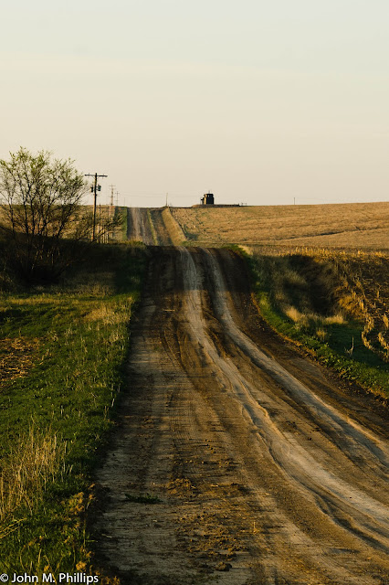
Early on the third morning, as we were heading along a quiet country road from northwestern Kansas into Nebraska, I stopped to take a few photos of the gently rolling, nearly--but not entirely--treeless countryside.


I liked the emotional quality in the above shot.  However, it would have been a lot better, I think, without the shadow running across the road.  Here is another take on the same scene.  Again, I wanted to capture the receding line of the road.


To maximize depth of field on this shot, I set the lens to its narrowest aperture of f/22.  This was shot in low light with a shutter speed of 1/5 second--extremely long for a hand-held shot, though I think I had braced the camera against the roof of the car.

Here is another shot that included the clump of trees on the left in the above photo.


And here is another shot of this scene cropped more horizontally.


These two photos were taken five seconds apart with an aperture setting of f/10.  In the first shot, I had set the horizon low in the image to emphasize the sky.  In the second, I had set the horizon high to emphasize the land.  However, in the end I did not think much of the land shot, which led to cropping the shot more horizontally.  I thought this shot worked OK as a B&W also.


My quibble with these shots is that the base of the trees is below the line of the horizon.  In the best of all worlds, I would have worked the shot to position the base of the trees at just the point of the horizon, but, again, that was not going to happen on this trip.