The building was constructed so as to allow very large exhibit spaces rather than being divided into smaller exhibition rooms. The larger spaces were then divided by movable panels allowing flexibility in the presentation. Here are some examples of the overall layout.
I did take some photos of the wall art, even though the artists were not as familiar to me. Again, I often took images of only portions of the pieces.
The artist of the above piece seemed to have trouble getting eyes right. The painting below appears to be a highly symbolic--and powerfully stated--representation of a funeral for a young girl.
I found it a lot easier to take photos of the three-dimensional pieces, including one of Rodin's copies of The Kiss, this one in dark bronze.
Here are a few other sculptures--of varying antiquity--that I shot.
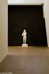
I had checked on the museum's policy on taking pictures, and it appeared to be similar to other museums--generally non-flash photography is allowed except with respect to special exhibits. However, it turned out that photography was forbidden re a large number of what appeared to be permanent exhibit items. This was indicated by small signs located near those items. In a number of cases, I did not notice those signs until I had already taken a shot. Here is a shot for which I was gently reprimanded by one of the museum guards. I was really interested primarily in photographing the overall space, although I did want to highlight the all-white nude against a black background. I was at least 50 feet from the sculpture when I took the shot, but the guard informed me that photography of the statue was forbidden. I kept the shot anyway.
I thought it also worked as a B&W.
The following shot is of a large exhibit that consisted of pieces of the charred remains of a church that had been struck by lightning. The pieces were then suspended by wires in a cube-shaped array, with the larger pieces toward the center of the cube.
Here is a self-portrait of Geri and me reflected in one of a number of unusually shaped class pieces.
My favorite shot, though, included two separate pieces. One was of a whimsical "statue" that was positioned in front of an unusual piece consisting of many thousand colored cards that were packed so that only the outside edges of the cards were visible. This piece could be viewed from either side. On one side the edges of the cards were primarily green and yellow, and on the other--the one visible in the photograph--the edges were predominantly red and orange.
The museum also included a number of sculptures scattered outside the building, including a number in an internal courtyard.
Finally, Geri wanted me to include a photo of the following piece that hung in the museum's entry foyer.
A close inspection reveals that this is actually another self-portrait.


No comments:
Post a Comment
Note: Only a member of this blog may post a comment.