A few weeks ago I found myself at the Lake Michigan lakefront trying to capture some interesting early morning cloud formations. I mean really early, as in 5:30 a.m. The results were disappointing. However, the effort did reinforce a compositional rule in landscape photography that I had understood but that is easily forgotten. That rule is that, where possible, the composition should include a foreground element to serve both as a point of interest and as a way of creating perspective. Too often I have zoomed in on something distant that I wanted to emphasize and neglected this rule. The few photos I retained from that early morning I think illustrate this point.
What had caught my attention and what I was trying to capture were some interesting cumulus clouds that were being nicely illuminated and colored by the early morning sun. And here is the first shot that I took.
The clouds that I was interested in were the puffy ones in the lower right of this shot. They were just too far away for the lens that I had and in this shot were overwhelmed by the clouds higher in the sky.
But to my point, there is essentially nothing in the foreground in this shot. Compare this with the following, similar shot in which I held the camera much lower to the ground to incorporate the grass at the edge of the bluff overlooking the lake.
Better, I think. Now I have given up on those puffy clouds that I wasn't going to be able to emphasize anyway, and I have turned the shot into one incorporating the overall scene. Even though the grass in the lower part of the shot occupies a large part of the overall image, the compositional balance and interest are, I think, much stronger.
Here are a couple more shots that I took attempting to capture the morning sun in the frame.
In both of these I think I did an OK job of incorporating foreground elements in the composition, whether they were along the bottom or along one side.
John
Saturday, June 27, 2015
Sunday, June 7, 2015
ST. JOSAPHAT'S IN HDR
Yes, I returned once again to St. Josaphat's, the stunning Roman Catholic basilica on Milwaukee's south side. This time I wanted to give Lightroom 6's new HDR capability a more serious try. And the above shot of the basilica's dome is an example.
As a reminder, HDR stands for high dynamic range, a technique that involves blending a number of separate shots of the same scene into a single file. The key is that the blended shots are to have different exposures, including both under- and overexposed shots. The blending software then attempts to emphasize the darker areas of the overexposed shot(s) and the lighter areas of the underexposed shot(s). The results can be interesting or garish, depending on the specific software employed and how it is manipulated. Here is an example.
I think these give a good idea of what the files might look like before blending. The first shot was underexposed by two f-stops and the last overexposed by two f-stops. Here is the blended file.
This was an interesting view across the nave. I wanted to center the shot on the stained glass windows on the opposite side and came pretty close. I also wanted to include the reflection of the windows on the floor between the pews.
But the question is whether the HDR shot has anything to offer that the middle (standard exposure) shot didn't. Frankly, it's hard to tell. Maybe there's a little less noise in the darker areas of the HDR shot. Still, I'm not sure it's worth it, considering the extra work involved with HDR. First, the camera needs to be set up properly to take multiple shots. To avoid changing the depth of field, the changes between shots need to involve shutter speed, not aperture. The shots need to be of virtually the same scene, so it is essentially mandatory to use a tripod. And it goes without saying also that the scene cannot change between shots--it can't be of a moving object. Generally, none of those limitations posed much of a problem in my case. Lightroom has made blending the files into a single shot very easy--just a few clicks on the computer. However, the process takes time and the resulting file is VERY large, and that fact alone slows things down some.
Here are a few additional HDR shots that I took during the session.
And here, finally, is a non-HDR shot that I liked.
I am going to keep trying HDR, if only to satisfy myself that it is not worth the effort, at least in most situations. St. Josaphat's interior is extremely busy, and it may be that HDR simply doesn't provide much of an advantage over normal post processing in such situations.
One final note: I was pleased that the basilica was fully illuminated. Even though I can work in lower light, higher illumination makes things a lot easier and adds a certain interest factor. About 15 minutes after I began shooting I discovered the reason why the church was illuminated--a tour group came through. It was interesting to see the reactions of those who had not visited the basilica previously. One visitor had come with camera and tripod, and all he could say was, "Wow. Where do I even begin?"
John
Thursday, June 4, 2015
FLORAL SHOW
The Mitchell Park Domes consist of three separate botanical domes, a desert dome with plants from arid climates, a tropical dome with plants from high humidity climates, and a show dome that has changing exhibits. The domes are connected by a pavilion area. On my most recent visit to the Domes I was initially disappointed to learn that the show dome was, once again, undergoing a transition and was closed to visitors. However, once I entered the pavilion I realized that it was featuring a Japanese floral show that included perhaps 30 or so arrangements, giving me an opportunity to photograph both the arrangements and the individual flowers in those arrangements.
Here is an example of an arrangement.
A good thing was that the arrangements were posed against essentially white, neutral backgrounds, a real plus. On the other hand, in showing the entire arrangement, I am sacrificing attention to some of the details. I will say that I thought this arrangement in particular had pleasant composition. However, I decided early on to focus on individual flowers rather than on the full arrangements.
There were a number of entries that featured "daisy-like" flowers, including the following.
My one complaint with the red flower is that it is too monochromatic. It took a good amount of effort in post processing to bring out what texture there was in the petals. The yellow flower exhibits more variation--and interest--in color. But there are some minor defects in a few of the petals on the upper left. These flowers were quite large, and I was happy to present only a portion of the flowers in the image. But I also wanted to include a portion of the flowers' edges. I also worked to "neutralize" the background on the edge to eliminate it as a potential distraction. That didn't mean that it had to be monochromatic as in the second shot, but darkening the background in that shot did help the composition, I thought.
Here is one of the roses that I shot.
This photo, of course, breaks the "rule" that I just discussed in the prior shots, as it does not include any edge. The original image did in fact include the flower's edges, and I cropped them out. All I can say is that here I was focused on the complex petal structure of this still-opening rose and the remainder of the flower was a lot less interesting.
The updated version of Lightroom, which I use for post processing, includes a high dynamic range (HDR) option. This involves blending several duplicate images that feature the same lens aperture (and thus the same depth of field) but different exposure times, so that the shots are either under- or overexposed. The blended result can be richer in dynamic range. Sometimes the results can be, in my view, garish, depending on the post processing. On this occasion, I decided to experiment a bit with this HDR option. HDR files can be quite large, as they are a composition of three or sometimes more shots. In this case, I was not particularly impressed with the results; they didn't appear that different from a single file that has been through post processing. One of the HDR shots that I took was of the above flower. However, both of the above images were of a single shot. Their HDR-like appearance stems not from post processing but from the unusual nature of the flower.
John
Here is an example of an arrangement.
A good thing was that the arrangements were posed against essentially white, neutral backgrounds, a real plus. On the other hand, in showing the entire arrangement, I am sacrificing attention to some of the details. I will say that I thought this arrangement in particular had pleasant composition. However, I decided early on to focus on individual flowers rather than on the full arrangements.
There were a number of entries that featured "daisy-like" flowers, including the following.
My one complaint with the red flower is that it is too monochromatic. It took a good amount of effort in post processing to bring out what texture there was in the petals. The yellow flower exhibits more variation--and interest--in color. But there are some minor defects in a few of the petals on the upper left. These flowers were quite large, and I was happy to present only a portion of the flowers in the image. But I also wanted to include a portion of the flowers' edges. I also worked to "neutralize" the background on the edge to eliminate it as a potential distraction. That didn't mean that it had to be monochromatic as in the second shot, but darkening the background in that shot did help the composition, I thought.
Here is one of the roses that I shot.
This photo, of course, breaks the "rule" that I just discussed in the prior shots, as it does not include any edge. The original image did in fact include the flower's edges, and I cropped them out. All I can say is that here I was focused on the complex petal structure of this still-opening rose and the remainder of the flower was a lot less interesting.
The following shot is of some delicate desert flowers that were still in the process of opening up. I confess that I like this shot in part because my macro lens did such a superb job of capturing these: the resolution is outstanding. This was shot at f/16, and the larger leaf in the background is out of focus, which was fine. But the main lateral stem, as well as the bases of the leaves as they connected with the stem are close to the same vertical plane as the flowerets and are in excellent focus. In short, I liked this shot not so much for its subject as for its technical qualities.
The last shots in this series are of an unusual--and relatively large--flower in one of the other arrangements.
Although it is difficult to tell with the limited resolution of the images on this post, the lighter areas on the margins and backs of the petals are really extremely fine colorless "hairs."
The updated version of Lightroom, which I use for post processing, includes a high dynamic range (HDR) option. This involves blending several duplicate images that feature the same lens aperture (and thus the same depth of field) but different exposure times, so that the shots are either under- or overexposed. The blended result can be richer in dynamic range. Sometimes the results can be, in my view, garish, depending on the post processing. On this occasion, I decided to experiment a bit with this HDR option. HDR files can be quite large, as they are a composition of three or sometimes more shots. In this case, I was not particularly impressed with the results; they didn't appear that different from a single file that has been through post processing. One of the HDR shots that I took was of the above flower. However, both of the above images were of a single shot. Their HDR-like appearance stems not from post processing but from the unusual nature of the flower.
John
Monday, June 1, 2015
MILWAUKEE POTPOURRI
Over the last few weeks I have been wandering around Milwaukee looking for photographic subjects . . . with mixed success. Here are some photos from those meanderings that aren't part of a larger study or post.
What? This is a bank of electric meters for an apartment complex bathed in strong mid-day sunlight. I thought it worked best as a black & white.
I liked the deterioration of this doorway to an old warehouse in the Walker's Point south of downtown. Note, for example, the mismatching hinges. What was interesting was that the door was only about five feet high.
Every few years Milwaukee, as do other cities, decorates its downtown area with novelty "sculptures" that are similar to one another but that differ in terms of decoration. This year it is classic bicycles laden with baskets of flowers that have been painted in multiple primary colors. Following are detail shots of a couple of other examples.
Like many older Midwestern cities, Milwaukee's architecture is a blend of older and newer styles. In the following shot I was attempting to capture examples of both in a single shot.
These buildings, the Northwestern Mutual headquarters building on the left and the US Bank building on the right, feature differing styles. The NML building was built in the late 19th century, while construction of the US Bank building was completed in the early 1970s. This was shot in the evening in somewhat fading light. I wanted to keep both buildings in reasonable focus, but even at f/11, the US Bank building seems a little "soft."
In the same location was a nondescript building that caught my eye not for its architecture but for its paint job.
It might be difficult to figure out, but the blue-gray wall is perpendicular to the red-orange one.
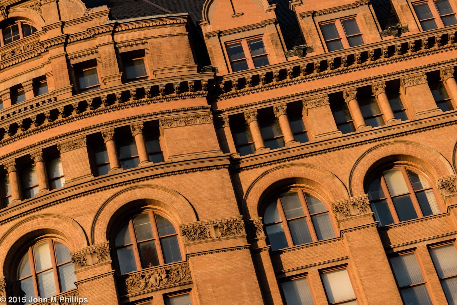
I also couldn't resist taking another shot of the Milwaukee City Hall, bathed in warm evening light. I turned the shot on an angle just to create some interest.
If nothing else, it is interesting to compare the complexity of architecture of the City Hall with the oversimplified lines of the building in the prior shot.
One final shot of buildings was this one that I "saw" in an industrial area on the city's near south side.
I thought the multiple, nonparallel lines helped this shot. To accentuate these lines and avoid the distractions that color can cause, I converted the image to a black & white.
Milwaukee has its share of public art, including this mural located off a bike path on the south side.
Well done, I think.
My wanderings also took me to the Lakefront. Here is a shot of a small marina at Lake Shore State Park, located east of the Summerfest grounds.
On this same excursion I also got a shot of a cargo ship on Lake Michigan, viewed through the rigging of the Denis Sullivan authentic replica sailing ship that makes its home on Milwaukee's lakefront.
It was nearly 8 p.m. when I took this shot, and I really liked how the light was still warming up the ship's superstructure and at the same time was creating an interesting rose color in the evening sky. I wanted to keep both the cargo ship and the rigging in good focus, setting the aperture at f/11.
Finally is a shot of the walkways and seating of an amphitheater behind the Discovery World building, also on the lakefront.
The curving lines of the wooden construction helped to make this shot.
John
Friday, May 29, 2015
LOOKING UP
Based strictly on my personal observation, Milwaukee, at 600,000, the nation's 31st largest city, is blessed with a below average skyline for a city of its size. The commercial district is quite spread out and does not feature a distinct cluster of office towers common to other cities of its size or larger. So the thought of capturing clusters of towering skyscrapers was not a promising one. What occurred to me, however, was the fact that two of the city's newer condominium towers, the University Club Tower and the Kilbourn Tower, were built unnaturally close to one another. So I wondered if I might get into the space between the two towers and get some shots looking up. It worked.
This was an evening shot, with the sun coming from behind me as I faced east. Even though the buildings are only around 30 stories high, the shots look impressive (sort of, anyway) because the buildings are only about 25 feet apart.
Here is similar shot, which I liked better actually. The evening was partly cloudy, which meant that the intensity of the direct sunlight varied from moment to moment. And in this shot the intensity was stronger than in the prior shot.
I converted the following shot, favoring a curved section of the University Tower on the right, to a black & white.
And here is a shot taken from the eastern fronts of the buildings looking west.
I thought that "leaning" the buildings to the left made the shot more dynamic, improving the overall composition.
I was feeling on a roll and decided to try my luck with the US Bank Building, a few blocks away, at 43 floors, the tallest in Wisconsin. Here, first, is a shot of the front of the building, which faces north.
Even though this shot features nearly perfect symmetry, it really isn't doing what I was looking for, which is to provide a sense of height. The following shots do a much better job, I think, including one that I converted to a black & white.
The question with these shots is whether the tower should point up or "lean over." Up, I think.
Clouds can have an impact for such shots. If I do this again, ideally I would look for an evening with dark clouds overhead but with horizontal sunlight streaming from the west. That's asking a lot, I suppose.
John
This was an evening shot, with the sun coming from behind me as I faced east. Even though the buildings are only around 30 stories high, the shots look impressive (sort of, anyway) because the buildings are only about 25 feet apart.
Here is similar shot, which I liked better actually. The evening was partly cloudy, which meant that the intensity of the direct sunlight varied from moment to moment. And in this shot the intensity was stronger than in the prior shot.
I converted the following shot, favoring a curved section of the University Tower on the right, to a black & white.
And here is a shot taken from the eastern fronts of the buildings looking west.
I thought that "leaning" the buildings to the left made the shot more dynamic, improving the overall composition.
I was feeling on a roll and decided to try my luck with the US Bank Building, a few blocks away, at 43 floors, the tallest in Wisconsin. Here, first, is a shot of the front of the building, which faces north.
Even though this shot features nearly perfect symmetry, it really isn't doing what I was looking for, which is to provide a sense of height. The following shots do a much better job, I think, including one that I converted to a black & white.
The question with these shots is whether the tower should point up or "lean over." Up, I think.
Clouds can have an impact for such shots. If I do this again, ideally I would look for an evening with dark clouds overhead but with horizontal sunlight streaming from the west. That's asking a lot, I suppose.
John
Sunday, May 24, 2015
SALT LAKE CITY POTPOURRI
Despite its conservative reputation, Salt Lake City is a vibrant community with a growing economy, an increased emphasis on technology, and a good deal of new construction. Following our recent visit there, I thought I would include a post of some general (though certainly not representative) scenes of the city.
First up, a shot of the LDS temple, a dominating feature of the downtown area.
This is an "end view" of the building, which I found more interesting than a broader side view. I would love to see--and photograph--the temple's interior, but, since admission is generally limited to LDS members in good (and perhaps high) standing, that is not going to happen. Still the temple has an exterior that is more than normally interesting for a religious venue, despite its lack of representational sculpture (other than the golden sculpture of the angel Maroni at the top of the highest pinnacle).
And here is one of a series of specially trimmed trees on the grounds of the LDS temple area.
What caught my eye was not so much the way the branches had been trimmed but the corresponding pattern of their shadows on the lawn.
As I mentioned, Salt Lake City has experienced a significant amount of new commercial construction. Here are a couple examples of that. The first is really more of an abstract, reflecting a neighboring structure.
The second is intended not to feature the building in the background (not the same building that appears in the photo above) but the shoes in the foreground that had been tossed over utility lines.
This was shot at a wide-open aperture of f/4 which blurred the background. My only disappointment with this shot was that I wish the shoes had been facing into the image rather than out.
Whoops. I guess the above is not exactly new construction, but I liked it for its decrepitude. It also includes those same shoes featured in the prior shot.
As a sort of interlude, here is a set of soda crates outside of secondhand shop that caught my eye.
I think these were actually for sale.
Salt Lake City appears to have a vibrant graffiti/public art community. There are pockets in the downtown area where so-called public artists appear to have been given nearly free rein. Here are some examples. These are too stylized and studied to be considered graffiti.
I especially liked these final two photos. The last particularly came out well, despite the presence of the car in the lower right that I would have preferred not be there. The building in the background actually looks fake, in part, I think, because it is essentially the color of the sky but is separated from the sky by a bank of white clouds.
John
First up, a shot of the LDS temple, a dominating feature of the downtown area.
This is an "end view" of the building, which I found more interesting than a broader side view. I would love to see--and photograph--the temple's interior, but, since admission is generally limited to LDS members in good (and perhaps high) standing, that is not going to happen. Still the temple has an exterior that is more than normally interesting for a religious venue, despite its lack of representational sculpture (other than the golden sculpture of the angel Maroni at the top of the highest pinnacle).
And here is one of a series of specially trimmed trees on the grounds of the LDS temple area.
What caught my eye was not so much the way the branches had been trimmed but the corresponding pattern of their shadows on the lawn.
As I mentioned, Salt Lake City has experienced a significant amount of new commercial construction. Here are a couple examples of that. The first is really more of an abstract, reflecting a neighboring structure.
The second is intended not to feature the building in the background (not the same building that appears in the photo above) but the shoes in the foreground that had been tossed over utility lines.
This was shot at a wide-open aperture of f/4 which blurred the background. My only disappointment with this shot was that I wish the shoes had been facing into the image rather than out.
Whoops. I guess the above is not exactly new construction, but I liked it for its decrepitude. It also includes those same shoes featured in the prior shot.
As a sort of interlude, here is a set of soda crates outside of secondhand shop that caught my eye.
I think these were actually for sale.
Salt Lake City appears to have a vibrant graffiti/public art community. There are pockets in the downtown area where so-called public artists appear to have been given nearly free rein. Here are some examples. These are too stylized and studied to be considered graffiti.
I especially liked these final two photos. The last particularly came out well, despite the presence of the car in the lower right that I would have preferred not be there. The building in the background actually looks fake, in part, I think, because it is essentially the color of the sky but is separated from the sky by a bank of white clouds.
John
Subscribe to:
Posts (Atom)