I hadn't been to the Milwaukee County Zoo for a couple of years, but Saturday, March 7, was the final free admission day until the fall, and the weather had suddenly turned from unseasonably cold to sunny and, believe it or not, unseasonably warm. So I grabbed my camera and spent a couple of hours trying to take reasonable photos of the animals.
Not as easy as it looks. First, many of the animals are in almost constant motion, making it nearly impossible to get a nice composition. Also many of the animals are indoors at this time of the year, and the interior lighting is relatively dim. Moreover, the white balance of the light can vary from venue to venue. In addition, the animals may either be small or far away. Finally, many of the animals are enclosed either in glass, which is often dirty or reflecting light glare, or behind fencing, which tends to confuse my camera's autofocusing system. Excuses, excuses. Actually, at least I had fun trying.
There are things I can do to compensate for some of these problems. First, I decided to use my 70-300 mm telephoto zoom, giving me more "reach" for those animals that are either smallish or farther away. Second, I generally kept my lens aperture wide open. This allowed for faster shutter speeds at a given ISO rating. In addition, my new camera includes a setting that keeps the aperture constant but automatically adjusts the ISO--within limits that I set--to keep the shutter speed as fast as possible. That helped a lot for interior shots, since all of the shots were handheld. Finally, I kept the white balance on "Auto," knowing that I could always adjust color in post processing.
Given all that, let's just say that I was more successful with some of the animals than with others.
Surprisingly low on the success list were reptiles . . . for a couple of reasons. First, the zoo was mobbed with patrons who were there for many of the same reasons as me. Second (and this caught me by surprise), my telephoto has a minimum focal length, which means that I can't get closer than about five feet and still keep the subject in focus. Because of that, I sometimes had to back up when the animal was close to the front of the glass cage, allowing the younger patrons to get between me and the intended subject animal. Here is the only surviving shot of a reptile from my excursion.
And, frankly, I only kept this shot because the lizard was opening its mouth, I presume in anger. Ugly, really.
I did capture some of the larger animals, including this leopard, who was looking quite relaxed.
Even more relaxed--and regal--was this male lion.
The resolution on these shots was really quite good, although the ISO was quite high--2500 to 3200. But it's better to get a shot that's a little noisy than one that shows camera blur.
The African elephants were outdoors in the fine weather. However, I simply didn't have the patience to wait for them to be still, and the only decent shot I got was the following.
I know, I chose to clip most of the elephant out of the image, but I was really going for skin texture. This was shot at a relatively low ISO of 220.
Birds were something of a positive surprise. They were plentiful and not overly active, allowing me time to compose some of my shots, including the ones below.
The focus on the vulture on the left was quite good. I was hoping to get both birds in focus, but the one on the right was hanging back, and with the lens wide open, my depth of field was quite shallow. Even so, I kind of like the shot.
The problem with the above shot was that the bird's beak was posed in front of the its body and got a little lost in the bright orange of the bird's plumage.
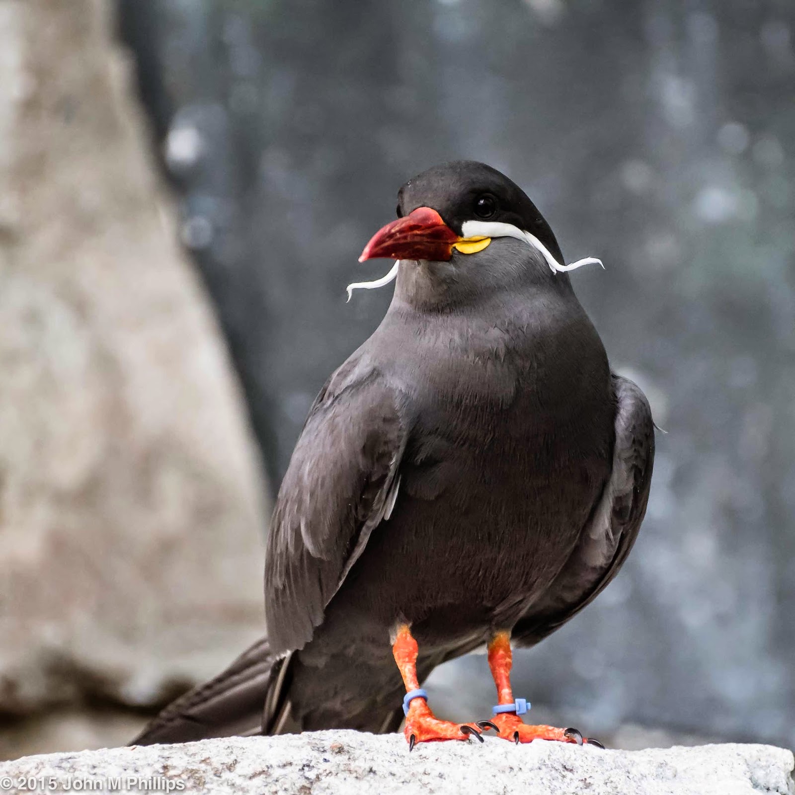
I did like the handlebar "mustache" of the following bird. (Note the ankle bracelets it is sporting.)
The best avian shots belong to the following couple of toucans (at least I think they are toucans).
But the stars of the show on Saturday had to be the mandrills. I had attempted to get shots of the gorillas and the orangutans, but they simply weren't cooperating, so I stuck with the mandrills. They seemed content to pose facing the patrons (and my camera), and the crowds were manageable.
I only kept one of the shots of what I believe was the male. Thoughtful fellow.
The female was perhaps more photogenic.
Looking directly at me. And here's another shot where she seems to be acting puzzled/worried.
Or in the following shot, signaling the pitcher for a change of pace.
I have to say that my (new) camera performed beautifully, allowing me to get better shots than my lack of patience should have permitted.
John
Monday, March 9, 2015
Sunday, March 8, 2015
RETURN TO MOWA
I had let lapse my membership in West Bend's Museum of Wisconsin Art. But a friend's mention of his recent visit there inspired me to pay another visit and to renew my annual dues. (Only members can tour the museum's collection, but membership is a phenomenally inexpensive $12 a year.)
The collection on display had not changed a great deal from my last visit, but it was nice to see some old "friends." Following are a few of those.
Probably the best know work in this modest-sized museum is a massive painting that portrays a scene of religious flagellants passing though a European city. The painting is, I would estimate, at least 12 feet high by 20 feet wide and features a number of portraits that are high in emotional content. Here are a couple of those.
There is also a relatively large lithograph work (at least it looks like a lithograph). Again, here is a "portrait" within that piece.
The museum building is distinctive in that it is wedge-shaped, with one of the corners making a very acute angle. The two sides of that angle are faced in windows. Here is a shot looking up a stairway toward the "point." I thought the lines made for an interesting semi-abstract.
One of the art pieces in that niche is a large art glass triptych that I liked for the texture of the colors.
Following is a portion of a bizarre but interesting painting that I had not recalled from my prior visits.
I also noticed a metal sculpture that somehow seemed a little confused but did incorporate some interesting aspects, including this face that I shot in profile.
I know it can be maddening when I shoot only a portion of a work of art. It's certainly not what the artist intended. (If it were, then the artwork would have only included what I shoot.) But I find myself photographing only portions of art because I want to emphasize a detail that might be lost in a photo of the entire work. The following sculpture is, I think, a case in point. It is a whimsical piece that has a lot going on. Here first is a shot of the entire piece, which stands more than six feet high.
And here are shots of "components" of the overall work.
I do feel these individual shots provide interesting facets of the overall piece that simple are not available in the shot of the work as a whole.
John
The collection on display had not changed a great deal from my last visit, but it was nice to see some old "friends." Following are a few of those.
Probably the best know work in this modest-sized museum is a massive painting that portrays a scene of religious flagellants passing though a European city. The painting is, I would estimate, at least 12 feet high by 20 feet wide and features a number of portraits that are high in emotional content. Here are a couple of those.
There is also a relatively large lithograph work (at least it looks like a lithograph). Again, here is a "portrait" within that piece.
The museum building is distinctive in that it is wedge-shaped, with one of the corners making a very acute angle. The two sides of that angle are faced in windows. Here is a shot looking up a stairway toward the "point." I thought the lines made for an interesting semi-abstract.
One of the art pieces in that niche is a large art glass triptych that I liked for the texture of the colors.
Following is a portion of a bizarre but interesting painting that I had not recalled from my prior visits.
I also noticed a metal sculpture that somehow seemed a little confused but did incorporate some interesting aspects, including this face that I shot in profile.
I know it can be maddening when I shoot only a portion of a work of art. It's certainly not what the artist intended. (If it were, then the artwork would have only included what I shoot.) But I find myself photographing only portions of art because I want to emphasize a detail that might be lost in a photo of the entire work. The following sculpture is, I think, a case in point. It is a whimsical piece that has a lot going on. Here first is a shot of the entire piece, which stands more than six feet high.
And here are shots of "components" of the overall work.
I do feel these individual shots provide interesting facets of the overall piece that simple are not available in the shot of the work as a whole.
John
Tuesday, March 3, 2015
LOOKING FOR THE UNCONVENTIONAL
Armed with my new camera, I have been revisiting some of my favorite interior (still too cold for exterior work) venues. In these visits I have had two goals in mind. One has been to find compositions that weren't available with my prior camera. For the most part this has meant shots with a wider view. The other goal has been to look for less conventional compositions. In this post, inter alia, I will try to illustrate what I mean by less conventional.
First up was the Basilica of St. Josephat. This first shot is a basically quintessential image--a wide-angle shot from the back of the nave looking toward the sanctuary.
This a wider angle than I was able to achieve in the past and includes both of the cherubim holding basins of holy water, but it is a very conventional shot, one that I have taken any number of times in the past. I also took a shot of the basilica's dome from directly underneath.
First up was the Basilica of St. Josephat. This first shot is a basically quintessential image--a wide-angle shot from the back of the nave looking toward the sanctuary.
This a wider angle than I was able to achieve in the past and includes both of the cherubim holding basins of holy water, but it is a very conventional shot, one that I have taken any number of times in the past. I also took a shot of the basilica's dome from directly underneath.
Nice and I was able to capture more of the dome and surrounding ceiling than in the past. But again it is essentially a conventional shot. Here is another shot of the dome taken off-center.
Although I have a fetish for symmetry, I found this semi-asymmetrical shot, with its promise of multiple curved structures, to be more memorable.
And here are two more vertical photos. Again, the first shot includes more of the surroundings of one of the ceilings above a side aisle.
The wider angle creates a much more dramatic look than previous shots that included only the rectangular ceiling. But here is another shot of one of the basilica's primary crucifix figures.
I guess this is what I mean by unconventional. It would have been conventional to have shot the crucifix more or less horizontally rather than from below.
[A word about the basilica. It is so ornate that it gives the impression that literally every square inch of interior is separately dealt with. My new camera allows for greater resolution of detail, for which I am pleased. But that also means an overwhelming amount of detail. Moreover, because of the great range of light intensity between bright light from the windows vs. relatively dark interior surfaces, post processing to bring out all of the available detail can result in the appearance of HDR, an effect that can look fake, to put it in the vernacular. I have tried to guard against that in these photos, but I'm afraid in some cases the effect is unavoidable.]
And here are a couple of shots of stained glass. The first is a conventional shot of a half rose window. Lovely . . . and conventional.
Here is another detail shot of a different window of a mother and child (not madonna and child because the same window scene also includes a representation of Christ).
Why is this unconventional? I think because of the focus on this small part of a much larger scene.
And then it was on to another religious venue, the Cathedral of St. John the Evangelist, which I have also shot a number of times in the past. The first image is again a wide-angle shot of the sanctuary from the rear of the nave.
The very eccentric crucifix suspended above the altar is (just barely) visible in the center of the image. Quite conventional. And the following image of a portion of the cathedral's pipe organ is in one sense conventional, as well. Even so, I liked it for its clean lines and abstract qualities.
One of the powerful architectural components of St. John's is its configuration of pairs of pillars, visible in the earlier wide-angle shot. One way to try to capture these pillars was to shoot the ceiling above a side aisle with the pillars as a side feature, as in the following image.
Sort of unconventional, and it includes a much wider view than I was able to capture previously, but I admit that I have shot this general scene a number of times in the past. What did catch my attention this time, though, was a candle that had been placed between two of the pillars.
This perspective served to incorporate another pair of pillars on the other side of the nave. I was pleased with how this shot turned out.
I also paid a brief visit to the Calatrava addition to the Milwaukee Art Museum. Here, first, is a shot of the skylight above the central atrium.
Interesting, perhaps, as an abstract, but I have taken this shot many times in the past. The only advantage of this image is that it encompasses a wider view than I have been able to capture in the past.
I took the above shot by facing west and looking up. I took the following shot by looking up while facing east rather than west.
I might have preferred that there not have been the shadowing on the panel in the upper left, but I did like the extreme abstract quality of the image overall.
I thought use of an off-center perspective in the following wider-angle shot of the atrium helped.
The figures also helped the composition.
I also visited the rotunda at the Milwaukee Center. Here is a more or less conventional image of the elevator from the opposite side of the rotunda.
I did like the symmetry, broken only by the variation in the plants between the two different pairs of pillars.
While I was at the Milwaukee Center, I spied the tower of the Milwaukee City Hall through the skylight of the corridor leading east from the rotunda.
The skylight was a bit dirty, and then there was the ice. But I decided that I would simply incorporate the ice into the composition, and in fact I set the camera's focus on the ice rather than on the City Hall tower.
Finally, I visited the Hilton Garden Inn in downtown Milwaukee. Built in 1896 as an office building, it was converted to a boutique hotel a couple of years ago. The building's interior atrium is a gorgeous surprise. Here is a typical--aka conventional--shot of one of the atrium's walls.
The facade is beautiful, but I have taken this shot a number of times previously. So here is a wider angle photo that I shot looking nearly straight up.
Much more dramatic, I think, and with a great deal more depth, and I really liked the reflection of the skylight in the windows of the facade.
One of the hotel's nicer features is the wrought iron railing on the stairways and on the balconies surrounding the atrium. Here is the sort of shot that I have taken in the past which features details of the wrought iron patterns.
OK, but I think the following shot provides better context, without losing sight of the railing's detail.
But the shot I liked the best is a wider angle shot from the center of the atrium's lower level looking up.
I thought the light reflecting off the wrought iron railing and the curving sweep of the railing were what made this shot.
John
Sunday, February 22, 2015
A NEW TOY FOR AN OLD FRIEND
I have been complaining that architectural photography is particularly challenging, given the limitations of my camera and lenses. Well, I finally got my new camera, a full-frame sensor Nikon that allows me to capture a wider view than the "crop sensor" Nikon I had.
Armed with my new camera, I visited one of my old friends, the atrium of the downtown branch of the Milwaukee Public Library. I have shot this venue a number of times previously because of its extraordinary beauty but have always lamented not being able to capture it in wider angle. My new camera helps to solve that problem.
I thought I would demonstrate the difference by comparing a couple of similar shots. One of my tactics for shooting ceilings has been to set the camera in the center of the floor pointing up and shoot with a remote release. Here are a couple of photos of the library dome taken with my prior camera.
I realize there is a significant difference in white balance, but try to ignore that (it can always be altered in post processing anyway). I think these are great shots, but I have wished that I could capture more of the surrounding walls to provide more context and depth.
So here are roughly equivalent shots with my new "toy."
I think the addition of the support pillars add a dynamic quality that was simply unavailable previously.
One "technical note": When I place the camera on the floor, it is important that it point precisely vertically. Otherwise, I need to crop out some of the image's edges so that the overall image is centered properly. I didn't do such a hot job with these photos. If I could be more accurate in getting the camera vertical and properly centered, the difference would be even more striking. I'm working on it.
In my mind the library is most notable for two features, its dome and its extensive marble work, including its numerous balustrades. Here are a number of shots of the balustrades. In this first I wanted to capture the detail of the balusters on one of the staircases, but I also wanted to include the stairs for context.
I then decided that it might be better to capture a wider view and to show the balustrades leading into a corner of the image.
I thought the lines in this shot might work as well in black & white.
I took several photos of small numbers of individual balusters straight on, but, though the balusters were beautiful, none of those shots really worked out. I did, though, get a couple of OK shots of larger arrays.
In the above shot I liked how the light was creating different colors. I also liked trying to capture the zig-zag lines that the balustrades created. I think I would have done better to have elevated the camera to reveal more of the balustrade in the rear.
Finally, here is a shot of a balustrade that I cropped severely to emphasize the robust lines of the individual balusters. OK, I thought.
Earlier I said that one of the library's outstanding features was its dome, featured in the photos at the top of this post. Here are a few more shots that included the dome. The first is a "traditional" shot taken from one side of the first floor. It serves to show off the wider views available with my new camera.
The following are less orthodox. I did like the overall feel of the shot below, even though I mis-positioned the camera just slightly off the corner of the support pillar.
The following are also unorthodox, in this case taken from the third floor balcony overlooking the atrium.
Novelty abstracts that I did like quite a bit.
Finally, here are a few shots of the third floor hallways. In the first below my goal was to highlight the varying curves extending from the right side of the image.
I didn't quite catch what I was aiming for, but I still like the idea.
I wanted to highlight the repetition of arches on the third floor and had taken a shot that only featured the arches. But it didn't really work because it needed the floor as an "anchor." The following worked better, I thought.
The final shot is of another hallway next to one of the stairways.
I felt particularly good about this shot because I thought centering the photo on the railing extending away from the camera worked really well. Also positioning the camera just above the railing served to create more depth.
One of the techniques I employed in this series of photos was to set the camera so that when I took a shot the lifting of the camera's mirror was separated in time from the activation of the shutter. This served to eliminate any vibrations resulting from the lifting of the mirror before the actual shutter release. It worked particularly well, as the images are all very crisp. Of course, this only makes sense if you are using a tripod rather than shooting handheld.
John
Armed with my new camera, I visited one of my old friends, the atrium of the downtown branch of the Milwaukee Public Library. I have shot this venue a number of times previously because of its extraordinary beauty but have always lamented not being able to capture it in wider angle. My new camera helps to solve that problem.
I thought I would demonstrate the difference by comparing a couple of similar shots. One of my tactics for shooting ceilings has been to set the camera in the center of the floor pointing up and shoot with a remote release. Here are a couple of photos of the library dome taken with my prior camera.
I realize there is a significant difference in white balance, but try to ignore that (it can always be altered in post processing anyway). I think these are great shots, but I have wished that I could capture more of the surrounding walls to provide more context and depth.
So here are roughly equivalent shots with my new "toy."
I think the addition of the support pillars add a dynamic quality that was simply unavailable previously.
One "technical note": When I place the camera on the floor, it is important that it point precisely vertically. Otherwise, I need to crop out some of the image's edges so that the overall image is centered properly. I didn't do such a hot job with these photos. If I could be more accurate in getting the camera vertical and properly centered, the difference would be even more striking. I'm working on it.
In my mind the library is most notable for two features, its dome and its extensive marble work, including its numerous balustrades. Here are a number of shots of the balustrades. In this first I wanted to capture the detail of the balusters on one of the staircases, but I also wanted to include the stairs for context.
I then decided that it might be better to capture a wider view and to show the balustrades leading into a corner of the image.
I thought the lines in this shot might work as well in black & white.
I took several photos of small numbers of individual balusters straight on, but, though the balusters were beautiful, none of those shots really worked out. I did, though, get a couple of OK shots of larger arrays.
In the above shot I liked how the light was creating different colors. I also liked trying to capture the zig-zag lines that the balustrades created. I think I would have done better to have elevated the camera to reveal more of the balustrade in the rear.
Finally, here is a shot of a balustrade that I cropped severely to emphasize the robust lines of the individual balusters. OK, I thought.
Earlier I said that one of the library's outstanding features was its dome, featured in the photos at the top of this post. Here are a few more shots that included the dome. The first is a "traditional" shot taken from one side of the first floor. It serves to show off the wider views available with my new camera.
The following are less orthodox. I did like the overall feel of the shot below, even though I mis-positioned the camera just slightly off the corner of the support pillar.
The following are also unorthodox, in this case taken from the third floor balcony overlooking the atrium.
Novelty abstracts that I did like quite a bit.
Finally, here are a few shots of the third floor hallways. In the first below my goal was to highlight the varying curves extending from the right side of the image.
I didn't quite catch what I was aiming for, but I still like the idea.
I wanted to highlight the repetition of arches on the third floor and had taken a shot that only featured the arches. But it didn't really work because it needed the floor as an "anchor." The following worked better, I thought.
The final shot is of another hallway next to one of the stairways.
I felt particularly good about this shot because I thought centering the photo on the railing extending away from the camera worked really well. Also positioning the camera just above the railing served to create more depth.
One of the techniques I employed in this series of photos was to set the camera so that when I took a shot the lifting of the camera's mirror was separated in time from the activation of the shutter. This served to eliminate any vibrations resulting from the lifting of the mirror before the actual shutter release. It worked particularly well, as the images are all very crisp. Of course, this only makes sense if you are using a tripod rather than shooting handheld.
John
Subscribe to:
Posts (Atom)


