I found myself following a familiar pattern. Although I favor shooting three-dimensional art objects, I also take some shots of wall art. But usually I find myself focusing on detail rather than trying to capture the entire piece. Here are some examples.

I liked this detail of a man and woman that was part of a much larger triptych.

I particularly like this detail of a second piece that features a woman wearing what looks like a cooking pot.
I was happy with the resolution of the following shot, which clearly shows both canvas texture and crackling of the paint. But what drew me to the painting was the quality--and size--of the subject's eyes. Each of her eyes is as large as her entire mouth.

For many indoor venues lighting can be a major problem. With an art museum the amount and quality of the light is critical, so conditions are usually better than in, say, a natural history museum. This time I used a technique I hadn't employed before, moving my camera to an auto-ISO setting. On aperture-priority mode with this setting the camera automatically adjusts the ISO upward until the shutter speed becomes at least as fast as some pre-set value. If the light is still too low, then the camera begins to slow the shutter speed. I can set the limits on both shutter speed and ISO. On this occasion I set the upper limit of the ISO at 1600 and the minimum shutter speed at 1/40th second. Things worked out pretty well with those parameters. The above shot was taken at f/4 with an ISO of 1600 and a shutter speed of 1/40th second. Right at the limits that I had set.
And here is another piece of wall art that I have shot before but that I like because for some reason it invariably makes me think of Batman and Robin.

And finally as to wall art, the following is a new piece that I liked; at least I don't recall seeing it before.

Again, this is a portion of a much larger painting, all of it very similar to this detail. I chose this portion because of the green horizontal object some of the figures are carrying, positioning it in the lower left corner of the image.
On to a few sculptures. A couple of these are nearly entirely abstract, including the following.

A kneeling figure, maybe? The shot was a little too simple, but I liked the quality of the light.
This bronze of flowers in a vase is at least recognizable.

I turned this into a black & white because I did not like the quality of the color of the bronze. Again, a little simple.
The following is of the statue of a Puritan that I have shot before.

The lighting here is very tricky, as the sculpture is quite dark and is set against a very light background. Moreover, the figure's pilgrim hat casts deep shadows over his face. As a result there is a great deal of contrast and it is difficult to bring out the sculpture's details that are in shadow. Here in post processing I lightened the image somewhat and then lightened the darker elements a bit further.. I also converted the image to a black & white. A little surreal, but I like it. Very intimidating.
One of my favorite sculptures is the following of a nude.

I've shot this piece many times, in part because of its interesting, exaggerated lines and in part because of its setting in one of the beautiful side corridors of the Calatrava addition. My criticism of this particular shot is that I should have aimed the camera to the right rather than to the left, so that the sculpture was positioned to the left of center rather than to the right. That would have brought more of the support structures into the image. Next time, maybe.
And here is one final sculpture of a Roman or Greek bust. What caught my attention were the eyes and the curly locks. Rather than trying to capture the entire bust, I chose an unorthodox shot of just those elements that stood out for me.

But the real star attraction of the Milwaukee Art Museum is its architecture, and I am always trying to capture a different nuance. Here are a couple of shots of the central atrium, ones that I have shot before.


I tried a couple of slightly elevated shots that excluded any patrons, but that converted the photos into pure abstracts. Having people in the shots creates both context and perspective, though I'm not sure I need the figure to the left in the second shot. Converting these to black & whites helped too, I think, as it helps to accentuate the lines. I especially like the difference in lighting between the left and right sides in the upper portions of the atrium's soaring upper surfaces. I also liked the reflection on the floor tiles of the light streaming through the windows, particularly in the first of the two shots.
One thing: it is very important to get the camera centered if I want to preserve symmetry. As I have said before, it is easy in post processing for me to correct a shot that is not horizontal or that is aimed slightly to the left or right. But if the camera is not positioned on the intended center line, there is no way to rectify the lack of balance.
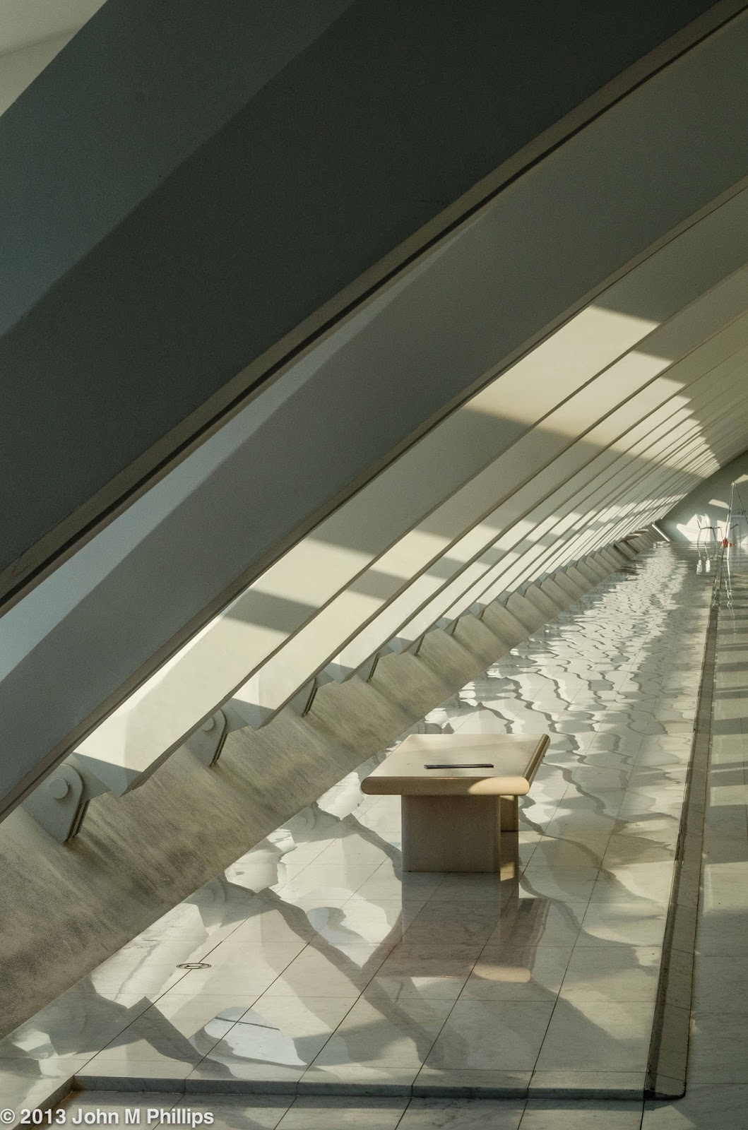
Following are two shots that feature the side corridor on the west side of the Calatrava addition. The first was taken shortly after I arrived.

I had decided to wait for the area temporarily to clear of patrons, and I really liked that I positioned the bench in the lower left to create a point of interest. I also liked the pattern that the light was creating on the floor tiles of the corridor.
Here's another shot of the same corridor and bench that I took later just before leaving the museum.
Now there was more afternoon light streaming into the corridor, creating even more complex patterns of light and shadow on the floor. I also liked the dark band in the upper left that provided more depth. These shots involved very little modification in post processing, including no cropping. Of the two, I like this second shot a bit better. (Yes, someone had left an object on the bench.)
Taking a few exterior shots of the brise soleil is virtually irresistible, especially when it is elevated as it was on this visit. Here is a shot on my way back across the bridge above Lincoln Memorial Drive.

I know these shots are legion, but the sky had a particular quality that helped the overall composition. The clouds appeared suspended just above the top of the structure and there was a hint of rose coloring in the lower clouds over the lake being created by the afternoon light. In addition, the soft quality of the clouds contrasted nicely with the hard lines of the architecture. The resolution on this shot was outstanding, particularly for handheld. This image required very little in the way of post processing, just a little tweaking of the contrast and cropping only for leveling and centering.
As I was entering the parking ramp to return to my car, I noticed that the sun had come out and I took one more, off-center shot of the Calatrava.

It's amazing what a difference in light over a three-minute span can create. The white balance settings for these two shots were identical. Again, this shot involved very little in the way of post processing. Both of these photos were shot at f/10, which kept virtually everything in good focus.
Finally, I had earlier taken the following shot of the landfill area to the north through one of the museum windows facing the lake.

The afternoon light was unusual, lending a sort of landscape oil painting quality to the image. The composition does include cars and buildings visible on close inspection, but I really like the overall feel. The clouds help a lot as well, and I'm glad that I placed the horizon relatively low in the image, establishing the sky as an important semi-negative-space component in the overall composition. This was shot with an aperture of f/6.3, but the scene is sufficiently distant that depth of field was not an issue. The overall resolution is excellent, particularly for a shot taken through window glass that was not entirely clean.
John
I still marvel at your talent of photography of all different things and subjects
ReplyDeleteI now feel the need to see this beautiful museum. The architecture is truly the star.
ReplyDeletePam
It has become Milwaukee's icon, if you will, a real gem.
Delete